How To Create a Histogram in Excel: 3 Easy Methods
Create histograms in Excel with 3 easy methods. Learn data analysis, chart insertion, and customization for effective visualization.

.png)
.avif)
If your business has so much data that you aren’t sure what to make of it, you might benefit from creating a histogram. Histograms allow you to observe trends in large datasets. This can help you more easily interpret the distribution of data, which will enable you to make better business decisions.
Are you new to histograms? Don’t worry. This article will explain what they are and how you can use Excel to create them, step by step.
We’ll also explain how to customize your histogram charts. Finally, we’ll show you how Upwork can connect you to the best data visualization professionals to help bring your numerical data to life.
What is a histogram?
A histogram shows how frequently certain variables show up in sets of data. The idea behind a histogram is to visualize complex data in an easy-to-understand manner by grouping it into what are called bins. In an Excel workbook, a bin represents a data point in the form of a bar or column chart. Each bin varies in height or length depending on the number or value it represents on your chart.
For example, you can use a histogram to analyze the efficiency of your customer care services. Let’s say you want to assess average wait times for customers on your service care phone line.
A histogram might show that your business has above-average wait times before customers connect with a representative. As a result, you might implement strategies to reduce wait times and improve customer satisfaction.
How to create a histogram in Excel
Now that you know what a histogram is and how it might be helpful with your business data, we’ll show you how to create one. This tutorial will cover three methods.
1. Data analysis method
To use the data analysis tool, click on the Data tab.

In the top right corner, you should see the Data Analysis dialog box. If you do, you can skip to below. If you don’t, continue reading below.

If you’re using Excel for Microsoft 365, Excel for Microsoft 365 for Mac, Excel 2021, Excel 2021 for Mac, Excel 2019, Excel 2019 for Mac, Excel 2016, Excel 2016 for Mac, Excel 2013, Excel 2010, Excel 2007, and Excel for Mac 2011, you’ll need to enable the Data Analysis Toolpak add-in.
To do so, follow these steps for Windows:
- Click on the File tab, then Options, and then Add-ins. (The process differs slightly for Excel 2007 in that you need to click the Microsoft Office button before selecting Excel Options.)
- Click the Manage box and then Excel Add-ins and Go.
- Once in the Add-ins box, select the checkbox for Analysis ToolPak. Then, click OK. (Note: You may have to use the Browse function to locate it if it doesn’t show up already.)
- Click Yes to install it.
Follow these steps for Mac:
- In the Tools menu at the very top, click Excel Add-ins.
- Once the Add-Ins available box pops up, select the Analysis ToolPak checkbox, and then click OK.
- If it isn’t listed, click Browse.
- Click Yes to install if you get a prompt that Analysis ToolPak isn’t installed on your computer.
- Then, quit and restart Excel for Mac.
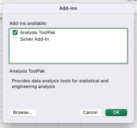
Once you’re in the Data tab and see the Data Analysis tool, you’re ready to make a histogram. To help with this process, let’s use the wait times for customers (in seconds) as an example.

With our wait times in cells A2 to A12, we’ll now need to create our bins. As explained, bins are how you’ll group your data into intervals.
In this example, we chose increments of 10. As you make your own histogram, just make sure they don’t overlap each other and you list them in ascending order.

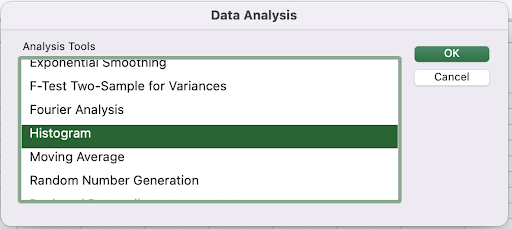
Next, click on the Data Analysis dialog box under the Data tab. A window will pop up, and you’ll want to click on Histogram. Then, click OK.
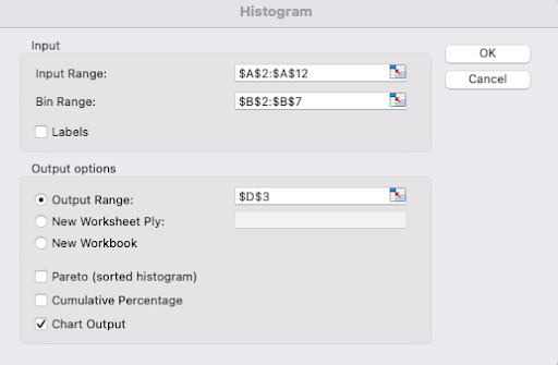
Another window will pop up with your input and output options.

- Enter the Input Range (A2:A12) and Bin Range (B2:B7).
- Click on Output Range and then click on the cell where you want the histogram to go in your spreadsheet. For this example, we clicked on D3.
- Click the Chart Output box to tell Excel to create the chart.
- Press OK.
Now, you should see a histogram plus a Bin and Frequency table. Note that any values greater than the final bin will be labeled “More.”
If you’re following our example, we had a value of a 62-second wait time, which is greater than our largest bin, which was 60. So, our value for “More” is 1.
Also, if you want to change any values in your histogram, you’ll need to manually change the table, not your original data. If you need to change the original data, you’ll also need to create another histogram.

2. Insert Chart option
The Insert Chart menu option is a convenient way to create a histogram if you’re using Excel version 2016 or later. Thanks to its dynamic properties, this feature automatically updates changes you make to the chart.
To get started, follow these steps:
- Select the data set you created in our previous example.
- Then, head to the Insert tab located on the ribbon near the very top of the spreadsheet.

- Click on the Insert Statistic Chart drop-down.
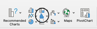
- Then, select the Histogram option in the drop-down.

Now, you should see something like this:

However, you’re not done yet. To make it easier to analyze the data, you’ll want to customize the bins. To do so, follow these steps:
- Start by right-clicking on the Horizontal Axis and then the Format Axis.
- A window should open on the right side of the Excel sheet with a couple of options, which include:some text
- By Category. This is useful for text categories.
- Automatic. This option automatically decides how many bins to include.
- Bin width. You choose how big a bin is (e.g., 20-30 if you choose 10).
- Number of bins. You specify the number of bins.

You may also see the options Overflow Bin and Underflow Bin. The overflow bin groups together values over a certain number that you decide, while the underflow bin groups together values less than or equal to a number that you choose.
For example, if we input 30 into the overflow bin and 20 into the underflow bin, the histogram will look something like this:

3. FREQUENCY function
Another dynamic way to create a histogram is by using the FREQUENCY function to generate a frequency distribution table. This will summarize the number of times each value appears in a specified range.
The syntax looks like this: FREQUENCY(data_array, bins_array).
How you approach this method will depend on the version of Excel you’re using.

If you’re using a version prior to Excel 365, follow these steps:
- Highlight the cells where you want to display your output range. In our example, it would be C2:C8.
- Use the FREQUENCY formula: =FREQUENCY(A2:A12,B2:B7).
- Press the CTRL + Shift + Enter keyboard shortcut to make sure that the formula comes out as an array formula.
If you’re using Excel 365, follow these steps:
- Pick where your output range will start. In our example, it’s C2.
- Use the FREQUENCY formula: =FREQUENCY(A2:A12,B2:B7).
- Press Enter.
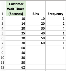
The extra number in the frequency column, located at C8 in our example, represents any values above the highest value. In this case, it accounts for 62 seconds, which is greater than our largest bin, 60.
Now, you can create a chart using the frequency list and bins. Just highlight those two columns, go to the Insert tab, and click Insert Column or Bar Chart (2D column).

Once you do that, you should see an image similar to this:

How to customize your histogram chart
You’ve created a histogram, and now it’s time to customize it. Customizing makes your data more presentable and allows you to tweak various elements to suit your organization’s needs.
Organize by category
If your data is text-based, you can customize your histogram chart by category. This allows you to indicate the distribution of specific data. For example, in a set of marketing campaign data, you can organize information based on categories like campaign type and marketing channels.
Add, remove, or change elements
When working on a new worksheet, you can add, remove, and modify your histogram chart’s elements. These elements may include grid lines, axis titles, data labels, and chart titles.
To work on these elements, follow these steps:
- Click the green plus (+) symbol after selecting your histogram chart. Doing so allows you to view the available Excel options.
- Alternatively, you can add the elements by clicking on the Design tab, at the top of the spreadsheet, after selecting your chart. You should see a Quick Layouts option.
Define bin width
Bin width describes how big your bin will be. To define it, you’ll want to follow a couple of steps:
- To get started, identify the largest and smallest data points. This step will determine your next actions if none of the numbers is a whole number.
- Reduce the minimum and increase the maximum marginally. If your minimum is 1.5, for example, it becomes 1, whereas if your max is 79.9, you’ll raise it to 80.
- Next, determine the number of bins required for your chart before calculating your range (the numbers appearing in your dataset). If your dataset has numbers ranging between 0 and 50 and your chart has five bins, the bin width becomes 50/5 = 10.
Create bins automatically
This customization option simplifies the bin creation process by automatically determining the number of bins in your histogram chart. It may add four or more bins, and you can change the results by tweaking the bin width or the number of bins option. Excel automatically organizes the bins in ascending order while ensuring that the values don’t overlap.
Specify the number of bins
When creating an Excel histogram chart, bin numbers are crucial to its appearance. That said, having less than four bins may affect how the chart displays the data, as it’s more likely to appear unrefined. On the other hand, if your graph has too many bins, some may remain empty.
Create an overflow bin
You can take advantage of the overflow bin to group data points above a particular value in your histogram chart. For instance, you can set $200,000 in monthly sales as a minimum value for specific data points to move into the overflow bin. In doing so, the worksheet can help you identify sales periods exceeding the minimum monthly target.
Create an underflow bin
With the underflow bin, you can set a value to help you combine data points below the predetermined value. For instance, if you enter $200,000 in monthly sales as the base value in the underflow bin, the chart output reveals all the sales periods that failed to meet the target figure.
Resize the chart
Resizing your histogram chart has never been easier, thanks to click-and-drag functionality. The Microsoft Excel histogram tool allows you to drag one of the eight handlebars, located at the corners and edges of the chart, to expand it. Depending on the handles you use, you can make the image narrower, wider, taller, or shorter.
Format axis elements
In the histogram dialog box, you can format axis elements using the right-click function. The worksheet presents you with multiple axis options.

Remove the space between bins
Adjusting the space between your chart’s bins will influence the appearance of your graph. You can increase or decrease the space or gap between bins to suit your specific needs.
Just make sure to try various spacing options to determine the ideal gap between the first bin and adjacent bins. However, the default gap between bins in Excel is 150%.
Need help? Hire an independent Microsoft Excel expert
Excel offers many powerful features to help you create professional-looking histogram charts. The best part is that you can simplify the process of creating your charts by getting help from experienced freelance Microsoft Excel experts.
An independent professional can help you save time by handling data entry tasks on your behalf. Fortunately, Upwork has a large pool of experienced experts in Microsoft Excel to make the process of finding the right person for your data visualization project easier.
Browse Upwork today and discover how independent professionals can help lead your business to success.
Note: The instructions are largely the same across versions of Microsoft Excel, but some steps may vary slightly depending on the specific operating system and Excel version.

.avif)

Author Spotlight

Upwork is the world’s largest human and AI-powered work marketplace that connects businesses with independent talent from across the globe. We serve everyone from one-person startups to large organizations with a powerful, trust-driven platform that enables companies and talent to work together in new ways that unlock their potential.