How to Create a Power BI Dashboard
Learn how to create a Power BI dashboard to visualize and analyze data, enabling better data-driven decisions for your business.

.png)
.avif)
Big data can enable businesses to streamline operations, enhance customer service, target marketing efforts, and drive profitable actions. However, the challenge lies in transforming this data into meaningful insights. Microsoft Power BI is a business intelligence tool that allows organizations to visualize and analyze data for effective, data-driven decision-making.
In this tutorial, we’ll walk you through how to create a Power BI dashboard, share best practices, and explore common use cases. By the end, you’ll be able to build and customize dashboards and reports, enabling you to take full advantage of Power BI’s capabilities. Plus, we’ll look at how freelancers can use their Power BI skills on platforms like Upwork.
What is Power BI?
Microsoft Power BI is a business intelligence tool that turns raw data into actionable insights with the help of intuitive, interactive visuals. Power BI connects to multiple data sources, enabling users to create dashboards and reports for real-time data analysis. With robust tools like DAX (Data Analysis Expressions) for calculations and KPI monitoring, Power BI helps businesses make timely decisions based on current data trends.
The two primary versions of Power BI are:
- Power BI Desktop. A downloadable application ideal for creating comprehensive reports from a variety of data sources.
- Power BI Service. A cloud-based service that allows users to create dashboards, share reports, and collaborate in real-time.
How to create a Power BI dashboard
A Power BI dashboard is a single-page canvas that consolidates visuals, including charts and graphs, to tell a story at a glance. Unlike Power BI reports, which can span multiple pages, dashboards offer a high-level overview, limited to one page. Dashboards are created in Power BI Service, where you can design, pin, and share them with ease. Here’s a step-by-step guide on creating a Power BI dashboard.
1: Select a dataset for your dashboard
To begin creating your dashboard, log into your Power BI Service account and import data you want to visualize. Power BI lets you work with numerous data sources, including Excel files, SQL databases, and datasets stored in Power BI Service.
- In Power BI Service, go to My workspace from the Home screen.
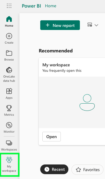
- Select Upload > Browse.
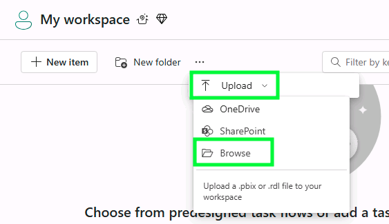
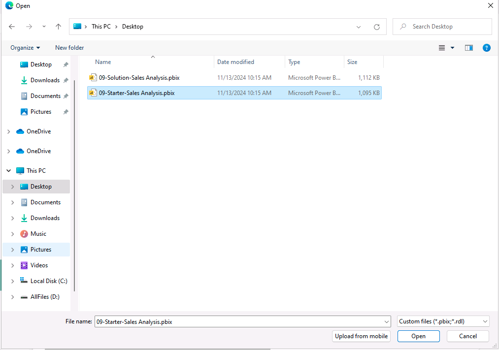
- Select the data file you'll use for this project.
2: Create a dashboard
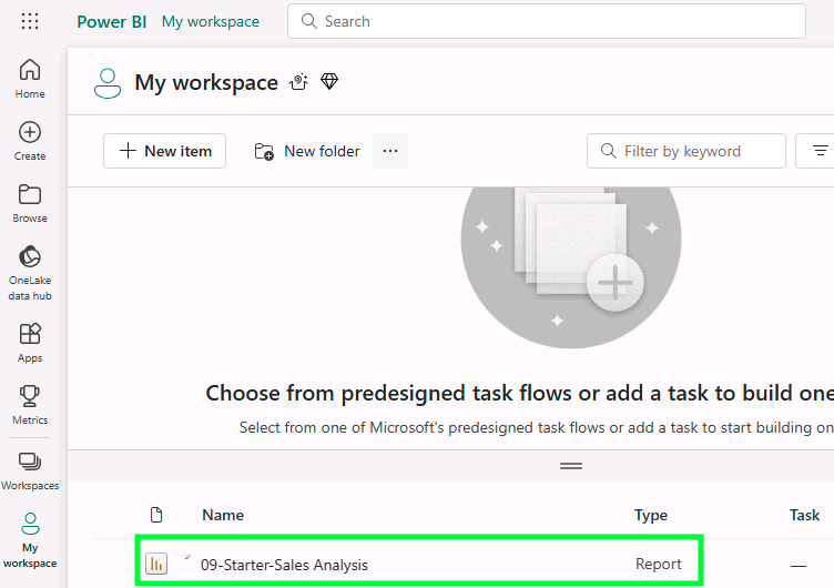
- In your workspace, select the data file you just uploaded.
- In the overview tab, adjust your dashboard settings to match your project needs. In this example, we will set the Year slicer to "FY2020" and the Region slicer to "Select All."
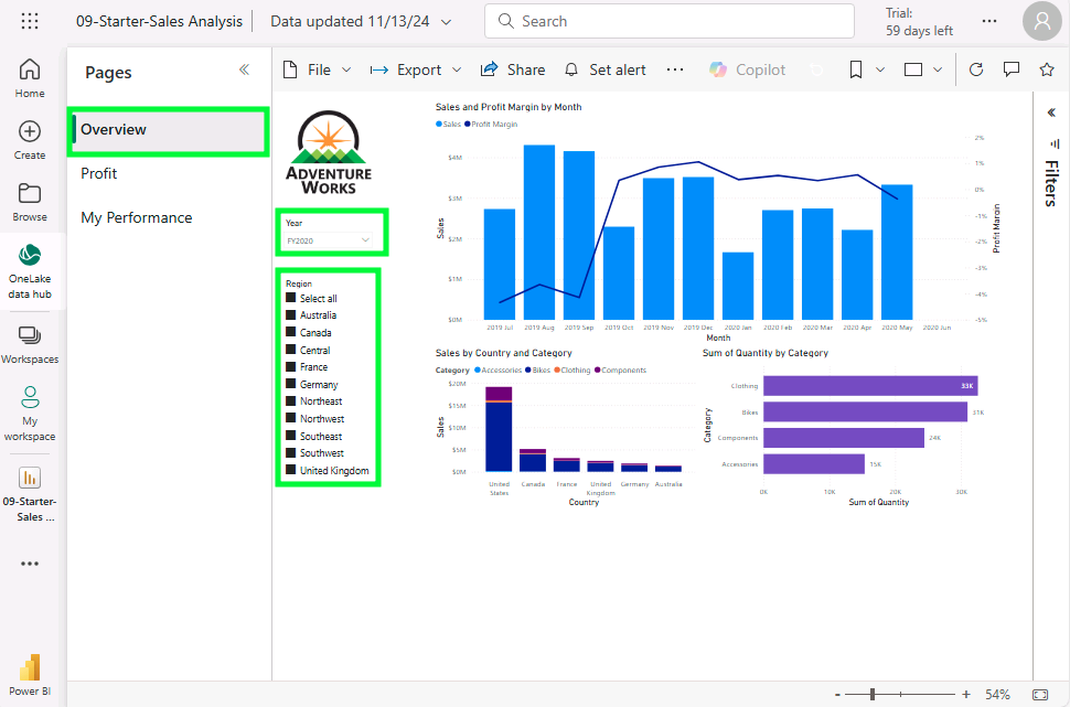
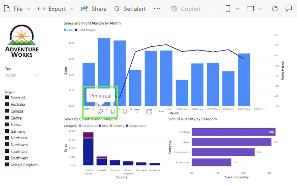
- To create a dashboard, you'll need to pin a visual. Hover the cursor over a visual, and select the pushpin.
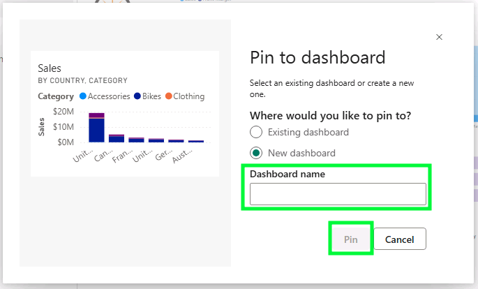
- In the Pin to dashboard window, you can pick to pin this to an existing dashboard or a new dashboard. For this example, we will pin it to a new dashboard. In the Dashboard name box, enter the name of your dashboard, then select Pin.
Now, you've created a Power BI dashboard.
3: View and edit your dashboard
Visualizations, or tiles, are the core of a Power BI dashboard. These include bar charts, line charts, pie charts, and more. There are different ways you can view and edit your dashboard, but here is the most common:
- Open My workspace and access the dashboard you just created from the list at the bottom. In this example, ours is called Sales Monitoring.
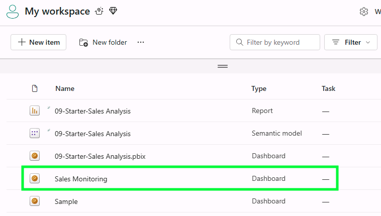
- You'll find that the dashboard has a single tile.

- To add a tile based on a question, select Ask a question about your data at the top left-hand corner of your dashboard.

- You can select any of the suggested questions beneath the Q&A box or ask your own questions in the box provided, and review the response.

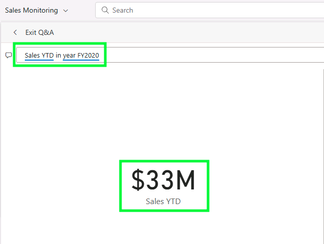
- For this example, we will ask the dashboard to give us the total dollar amount of sales year to date in FY2020.
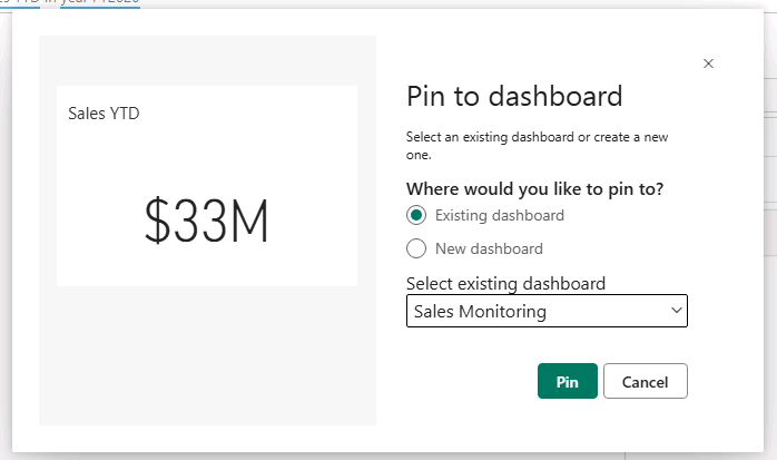
- To pin the response to the dashboard, at the top-right corner, select Pin visual.
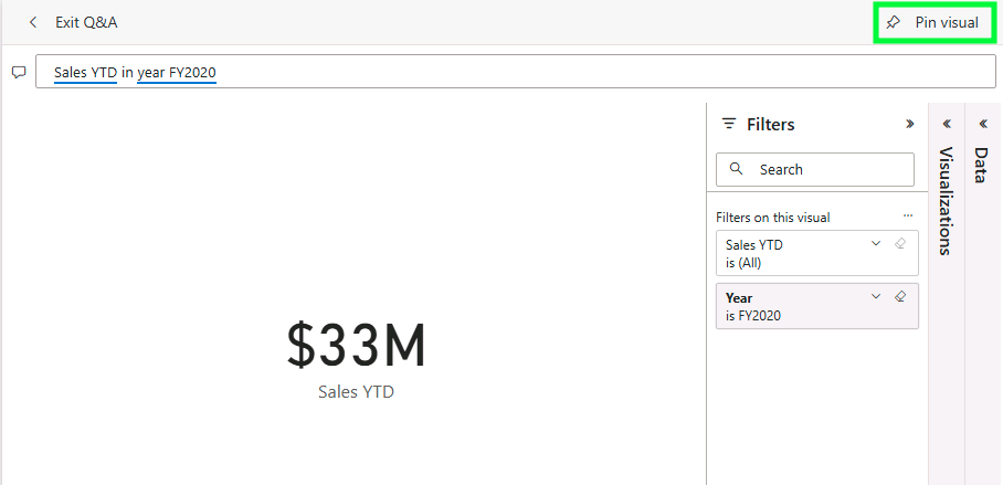
- In the Pin to dashboard window, select the dashboard you created. In this example, it's the Sales Monitoring dashboard.
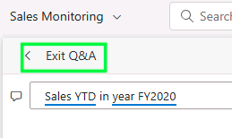
- To return to your dashboard, click Exit Q&A at the top-left corner.
4: Design the dashboard layout
Designing an effective Power BI dashboard requires attention to layout, colors, and fonts to create a visually engaging presentation. Power BI Service offers themes, colors, and custom fonts for tailoring your dashboard’s appearance. And, if you're in need of ideas, the Power BI community also has a whole suite of themes.
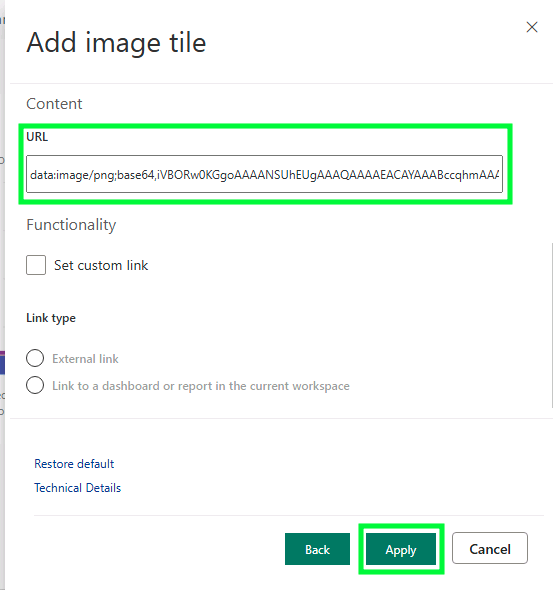
- To start, add a company logo to your dashboard. Access the menu bar, and select Edit > Add a tile.
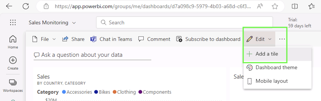
- In the Add a tile window, select Image and then click Next.

- In the Add image tile window, enter the complete URL for your logo file in the URL box, and then click Apply.
- Next, you can resize and organize the tiles to match your visual preferences and project needs.
- Follow these same steps to incorporate branded text boxes, videos, images, and other web content into your dashboard.
5: Enhance interactivity with slicers and filters
Power BI dashboards support slicers—visuals that act as filters for dashboard data. Slicers can filter data for specific time frames, regions, or other categories, allowing users to interact with data in real-time.
- Add slicers in Power BI Desktop or reports, then pin them to your dashboard.
- Users can interact with these slicers, filtering dashboard visuals for customized views.
Using Power BI reports in dashboards
Power BI reports are multi-page documents that allow for in-depth data analysis across multiple visuals. Reports can be customized with filters, interactions, and complex calculations using DAX. From these reports, you can pin essential visuals to create dashboards. Here’s how to get the most out of Power BI reports:
- Pinning tiles. Pin key visuals (tiles) from reports to dashboards. Click the pin icon on the visual to add it to your dashboard. This enables you to combine visuals from multiple reports on a single dashboard, giving a concise overview.
- Real-time updates. Dashboards refresh automatically, ensuring data reflects the latest updates in reports.
- Flexible views. Switch between report pages or pin visuals to a single-page dashboard for a streamlined view of key metrics.
Common uses of a Power BI dashboard
Power BI dashboards empower businesses by providing quick insights into many areas of their operation. Popular applications include:
- Customer analysis dashboard. Analyze customer data to understand product popularity, regional trends, and profit margins.
- HR analytics dashboard. People analytics is a top priority in over 70% of organizations. Track employee metrics, including headcount, attrition rates, and job satisfaction scores.
- Sales scorecard dashboard. Monitor sales data using treemaps, cards, and bar charts to visualize trends and performance.
- Social media analytics dashboard. Marketers can evaluate social media campaign performance through metrics like clicks, engagement, and sentiment.
- Financial reporting dashboard. View revenue, expenses, and ROI in a single dashboard, providing a comprehensive overview for financial analysis.
- Team performance analysis. Assess team metrics, helping managers identify high-performers and areas needing support.
Inventory and stock management dashboard. Track inventory levels and optimize restocking processes to improve supply chain efficiency.
Power BI dashboard examples
Power BI offers a range of dashboard templates to meet the disparate needs of its user base. Below we cover some examples to get you started.
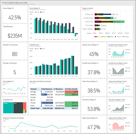
- Customer Profitability Dashboard. Understand customer profitability with metrics like revenue, gross margin, and product performance. You can create your own with Microsoft's profitability dashboard sample.
- Sales and Marketing Dashboard. Analyze market share, sales volume, and sentiment. You can create your own with Microsoft's sales and marketing dashboard sample.

- Human Resources Dashboard. Track new hires, attrition, and employee demographics. You can create your own with Microsoft's HR dashboard sample.

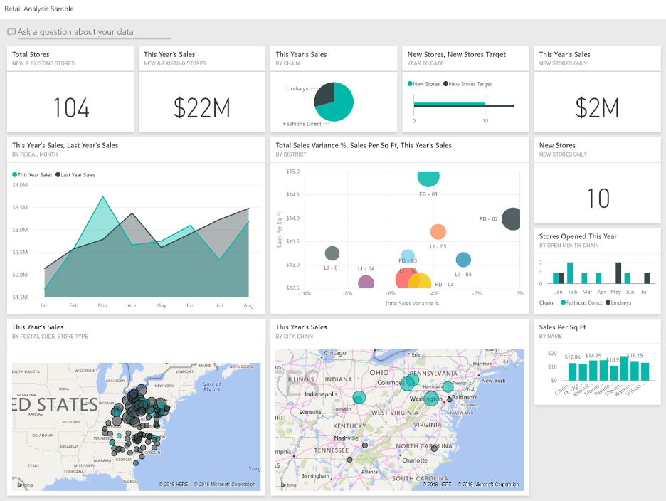
- Retail Analysis Dashboard. Compare current performance with past data, focusing on sales, gross margin, and store performance. You can create your own with Microsoft's retail analysis sample.
- Procurement Analysis Dashboard. Evaluate vendor spend, discounts, and invoice totals to optimize procurement processes. You can create your own with Microsoft's sample procurement dashboard.

Best practices for Power BI dashboards
Designing a Power BI dashboard involves more than simply placing visuals. Here are best practices for creating a clear, impactful dashboard:
- Identify the audience. Tailor the dashboard to meet the needs of the intended audience, focusing on relevant metrics.
- Highlight essential information. Use Spotlight to emphasize important visuals. Click on a visual, select More options, and click Spotlight.
- Use slicers. Slicers enable viewers to interact with data and focus on specific areas of interest, enhancing the dashboard’s usability.
- Color palette. A well-chosen color palette improves readability. Customize tile backgrounds, font colors, and tile opacity for a cohesive design.
- Organize visuals effectively. Align visuals for a clean layout. Use Align > Distribute to arrange visuals horizontally or vertically.
- Prioritize graphs by importance. Place high-priority visuals at the top and group related visuals to improve flow and readability.
FAQs
How does Power BI help data analysts?
Power BI enables data analysts to create interactive reports, monitor KPIs, and configure dashboards. It also supports collaboration, helping teams make data-informed decisions.
What is DAX in Power BI?
Data Analysis Expressions (DAX) is a formula language used in Power BI for advanced data modeling and calculations, enhancing data analysis capabilities.
How does Power BI handle real-time data?
Power BI’s real-time data visualization supports up-to-the-minute metrics, which is ideal for tracking KPIs and making fast decisions.
Is Power BI suitable for small businesses?
Yes, Power BI’s scalability makes it a great fit for businesses of all sizes, offering affordable solutions for data analysis.
Working as a Power BI specialist
With its popularity in business intelligence, Power BI specialists are increasingly in demand. Power BI skills can open opportunities for freelancers in data analysis, data science, dashboard design, and KPI monitoring.
If you’re looking to work independently, Upwork offers access to clients needing Power BI expertise, including jobs in report creation, dashboard customization, and data visualization. Leverage your Power BI skills and explore Upwork’s Microsoft Power BI job listings to build your freelance career and connect with companies worldwide.
Put your Power BI expertise to work with Upwork and start finding projects today!
Upwork is not affiliated with and does not sponsor or endorse any of the tools or services discussed in this article. These tools and services are provided only as potential options, and each reader and company should take the time needed to adequately analyze and determine the tools or services that would best fit their specific needs and situation.

.avif)

Author Spotlight

Upwork is the world’s largest human and AI-powered work marketplace that connects businesses with independent talent from across the globe. We serve everyone from one-person startups to large organizations with a powerful, trust-driven platform that enables companies and talent to work together in new ways that unlock their potential.