18 Best Data Storytelling Tools in 2026
Discover the top 18 data visualization tools for 2026. Learn how to choose the right tool and create compelling data stories for your business.

.png)
.avif)
Using business intelligence (BI) and being able to digest good data to tell a compelling story have become necessary for company success in an increasingly data-heavy world. Is your online marketing strategy working? How are customers interacting with you? Where are they coming from? What trends do you see in revenue performance tied to ad spending? The list of possibilities where data visualization can help you use data effectively goes on and on.
Telling that story without the complexity of raw numbers in spreadsheets with thousands to millions of rows of data is complex. Whichever data visualization tool you choose must match your data needs, big or small, and help you extract key insights from your data to create a powerful tool for communication.
We list some of the best data visualization tools on the market, each offering unique features to help you to make data-driven decisions.
Tableau
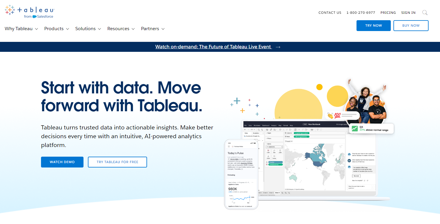
Tableau is a market leader for big data analytics pipelines. Enterprises use it to publish high-quality data visualizations. Tableau Desktop supports hundreds of data import options from CSV files to APIs to full integration with AWS, Spark, Hadoop, Microsoft SQL, and more.
The enterprise version supports live data feeds for BI dashboards, allowing data analysts to create compelling narratives with real-time data insights. Tableau Public is the free version for personal use—your creations are public and can only save to the cloud. You are also limited to pulling data from CSV, Excel, and other flat files.
- Features. Intuitive dashboards with drag-and-drop capabilities; support for live and in-memory data feeds; hundreds of data importing options, including 60 instant data connectors.
- Pro. Strikes that sweet spot of being user-friendly to beginners but robust enough for data scientists and developers; this is one of the most popular data visualization tools available and does everything you’d expect from a comprehensive data visualization tool.
- Con. The free trial version is pretty limited compared to other offerings on this list.
- Price. Paid plans start at $35 per user per month (billed annually).
Microsoft Power BI
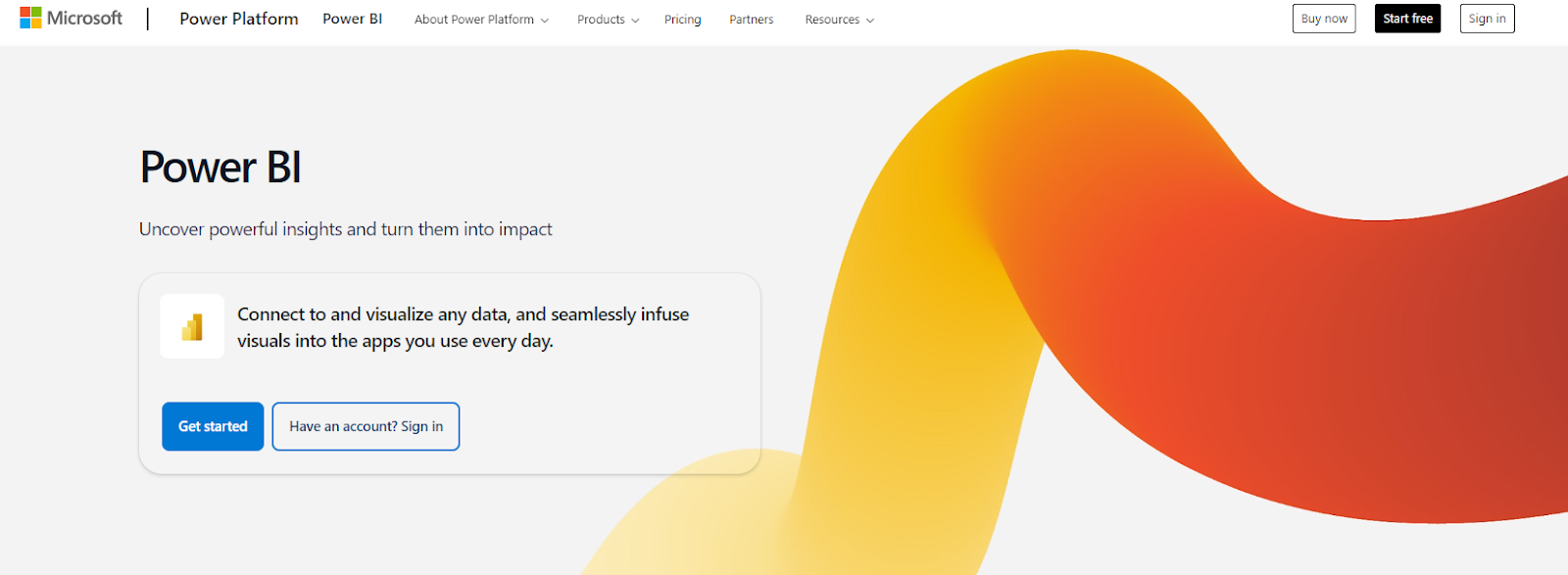
Microsoft Power BI is an industry leader in analytics and business intelligence platforms. Its data connectors make pulling data points from other apps a snap, and it integrates nicely with all the usual big data analytics sources (e.g., AWS, Spark, and Hadoop).
Power BI is a natural fit if your enterprise technology stack already uses Microsoft technologies. The premium subscription model also provides dedicated cloud computing and storage resources.
- Features. Power BI sports a familiar Microsoft UI, drag-and-drop functionality, hundreds of data connectors, and support for both in-memory and live data feeds.
- Pros. Power BI Desktop is very robust, giving you a single workspace to consolidate data sources, produce reports, create data visualizations, and run analyses and tests.
- Con. $4,995 per month is costly for those requiring on-premises storage and processing.
- Price. Power BI Desktop is free, Power BI Pro is $10 per user per month, and Power BI Premium is $20 per user per month or $4,995 per organization capacity per month.
FusionCharts

FusionCharts is a JavaScript-based data visualization package. You can purchase licenses with deals depending on the size of your development team. As a JavaScript package rather than a tool, you have maximum flexibility to build both public and private dashboards to handle big data processing.
One key differentiator is FusionCharts’ extensive library of live templates—just plug in your data and see it visualized instantly.
- Features. The developer’s license grants access to a suite including FusionCharts, FusionWidgets, PowerCharts, FusionMaps, and FusionTime. The package also provides 100+ interactive charts and 2,000+ interactive maps.
- Pros. FusionCharts has a flat learning curve, enabling you to create charts quickly. The extensive documentation and live examples also facilitate faster content creation.
- Cons. FusionCharts can be expensive for teams. Integrating FusionCharts’ API in a project also requires some coding knowledge.
- Price. FusionCharts is available in three versions: The Basic edition goes for $439 per year for one user, Pro for $1,899 per year for up to five users, and Enterprise for $3,399 per year for up to 10 users.
Looker Studio

Looker Studio is free, but those using it for enterprise will likely need to pay for a data connection to a service like Supermetrics. The platform is for business analysts who may know a little scripting with Python or JavaScript and want to generate reports and visuals for dashboards.
- Features. Provides a web interface for creating BI dashboards and reports. Easy sharing of reports via Google links and access to 800+ datasets from over 260 connectors.
- Pros. Seamless integration with Google products. Plenty of style options to match reports and visualizations to your brand. Looker Studio doesn’t have data caps, supporting unlimited tables and pages.
- Con. Users can only read Looker Studio reports online; there’s no way to export reports as CSV, PDF, or other file types.
- Price. Looker Studio is free, but Looker Studio Pro is $9 per user per project per month.
Flourish

Flourish is popular among journalists wanting to tell stories with data. Its intuitive UI makes it easy for non-coders to collect and present data in polished, mobile-friendly data visualizations.
The interface runs in the browser and allows you to adjust the width and styling of your data visual as you build it to see how it might look with different screen widths. Flourish also allows developers to create custom templates with their developer SDK.
- Features. An intuitive drag-and-drop UI that lets you build responsive, interactive data visualizations in your browser.
- Pro. Flourish probably has the best UI for non-coders looking to turn spreadsheets into dynamic data visualizations.
- Con. Flourish is clearly for social media sharing and website content; if you want a BI dashboard and reporting tool, you must supplement those technologies.
- Price. Flourish Public is free. Contact the company for pricing on Publisher and Enterprise products, with additional features and support.
D3.js
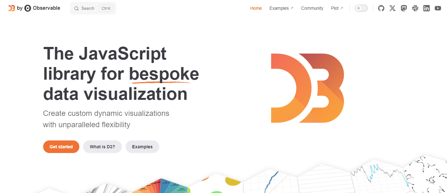
D3.js is a JavaScript library for producing data visualizations. If you know JavaScript, you can use it to bind arbitrary data directly to the Document Object Model (DOM). D3 is powerful, customizable, and extensible, and a number of popular charting apps use it (e.g., Plotly, NVD3, and Ember Charts, which even non-developers can use).
- Features. A powerful open-source JavaScript library for data visualization.
- Pro. Supports the creation of charts, graphs, and more via standard web technologies (e.g., JavaScript, HTML, SVG, CSS) so you don’t have to worry about relying on proprietary technologies.
- Con. Steep learning curve for anyone who’s not a web developer unless they use one of the tools built off of D3.js
- Price. D3.js is a free, open-source library.
Sisense

Sisense is an end-to-end data analytics platform with an enterprise interface that any BI analyst will recognize. It can be deployed on-premises or in the cloud and provides robust data visualizations for reports and dashboards.
- Features. A centralized data hub, data source connectors, and all the tools you need to perform big data analytics, visualization, dashboarding, and reporting.
- Pro. Sisense delivers enterprise-grade end-to-end BI dashboarding and reporting.
- Con. Sisense is a robust enterprise tool with taxing resource requirements and a hefty setup and configuration process.
- Price. Sisense has a free trial, but no longer reports its long-term pricing publicly; contact the company directly for a quote.
Highcharts

Highcharts is a JavaScript charting library designed to make it easy to embed interactive charts into websites and apps. Written in pure JavaScript, it’ll work across browsers from a single JavaScript file.
Highcharts is free for noncommercial use but has a pricing tier for developer licenses. From standard scatter plots to angular gauges, Highcharts is a popular choice for adding data visuals to your web apps.
- Features. Highcharts includes numerous chart types like line charts, tooltip labels, and axes options with an open dynamic API.
- Pro. Highcharts is written in pure JavaScript for maximum cross-platform compatibility.
- Con. Steep licensing prices must be factored into your budget when leveraging Highcharts for commercial apps.
- Price. Highcharts is free for personal use. You can also get Highcharts by purchasing an annual or perpetual license. When you buy an annual license, you get Highcharts Internal Edition for $168 per seat per year and SaaS for $332 per seat per year. For the perpetual license, the Highcharts Internal version costs $386 per seat and SaaS $761 per seat.
ChartBlocks
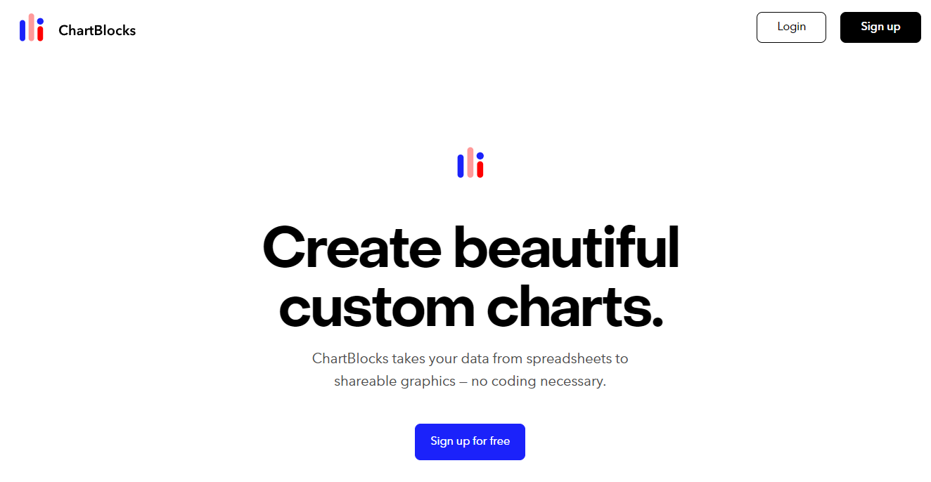
ChartBlocks is a user-friendly online chart builder that lets you build custom data visualizations without programming skills. The platform also makes it easy to share and embed charts on websites and across social media.
Built off of D3.js, ChartBlocks visualizations are responsive and rendered as SVG files that look great on high-resolution screens.
- Features. An intuitive drag-and-drop interface for building charts that can easily embed on websites and across social media. A powerful API that supports data imports from spreadsheets, databases, and live feeds.
- Pros. A nice combination of a non-coder-friendly interface, easy web sharing, affordable pricing options, and flexible API access to a wide range of data sources.
- Con. Appears to lack support for interactive mapping and unclear data limits.
- Price. ChartBlocks is free to sign up.
Dundas BI
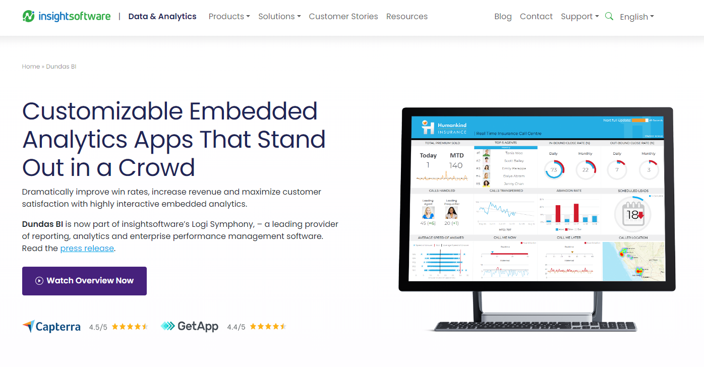
Dundas BI is a web-based tool that helps make sense of complex data by enabling you to add interactive dashboards and reporting capabilities to your applications. It’s fully customizable, meaning you can create, modify, and embed different data visualizations to match your software’s look and feel.
Plus, Dundas BI promotes data safety through multiple layers of authentication.
- Features. Whether you’re targeting the cloud, on-premises, or both, Dundas BI is flexible enough to be deployed on any platform you choose. It also consumes data from numerous sources, including Google Sheets, Microsoft Excel, MySQL database, and flat files. Dundas BI supports multitenant deployment, lowering costs by allowing you to host and manage multiple clients on a single server.
- Pros. Dundas BI supports white labeling, enabling you to develop visualizations that match your brand. Importing and exporting data from different sources or in different formats is also a huge advantage.
- Con. Dundas BI has many features, which can be overwhelming (especially if you’re a beginner or lack programming knowledge).
- Price. Dundas BI’s prices aren’t listed publicly, but you can get a custom quote by contacting the company directly.
Qlik Sense

Built on top of Qlik’s Associative Engine, Qlik Sense enables you to find connections and clearly understand information by turning raw data into appealing visualizations.
You can use Qlik Sense to perform statistical analyses and create flexible user interfaces, dynamic tables, and charts, among other functions. If you collect data from multiple sources, Qlik Sense allows you to merge the data into a new table for easier analysis.
- Features. Qlik Sense loads and stores data in memory. This speeds up the data analysis process by making it faster to query large datasets and create visualizations. It also supports custom connectors and scripts that allow analysts to fetch data from different sources, including APIs. Plus, Qlik Sense’s data visualization reports are shareable, which promotes collaboration.
- Pros. Qlik Sense has a user-friendly interface and a flat learning curve. The in-memory data storage technology facilitates faster queries and filtering. You also get to try out Qlik Sense’s business features and determine if they fit your needs before purchasing them.
- Con. Qlik Sense loads and temporarily stores data in memory but is limited by your computer’s RAM. Systems with less RAM may become incredibly slow when large datasets are involved.
- Price. Contact Qlik Sense for client-managed pricing.
Jupyter

Whether you specialize in data science, machine learning, or scientific computing, Jupyter provides a wide range of features to help you analyze, visualize, and get rich insights from complex information. The application is 100% open-source and free, so you can focus on your work without worrying about extra costs.
As a web-based application, Jupyter also allows you to create and share documents (“notebooks”) with your team members. It has a large community of users, including top companies like Google, Bloomberg, Microsoft, and Oracle.
- Features. Jupyter supports many programming languages, including R and Python. It also produces rich and interactive output, such as images, dynamic graphs, charts, and videos. Popular data analysis libraries like ggplot2, sci-kit-learn, and pandas are supported out of the box. Users can also share notebooks via email, GitHub, or the integrated viewer.
- Pros. Jupyter provides several powerful features for free, making it suitable for organizations of all sizes. It has a large community and many regular contributors who facilitate fast updates and bug fixes. You can also convert your data visualizations into standalone web applications and share them with others.
- Cons. Non-coders may have difficulty using Jupyter. Plus, it mainly works through the browser, adding an extra complexity layer.
- Price. Jupyter is available for free.
Zoho Analytics

Zoho Analytics is for businesses wanting to discover hidden insights, track key metrics, and predict the future. It’s quite flexible, allowing data analysts to import data from different files and apps on the cloud or on-premise.
The product also features automated tools for preparing data for analysis. As a result, you have an easier time cleaning, enriching, and transforming data. With artificial intelligence, Zoho Analytics helps you make more accurate predictions.
- Features. Zoho Analytics supports custom connectors, enabling you to access and import data from other popular third-party applications. Pre-built analytics also provide a quick way for you to visualize data. Integrated collaborative analytics allow users to share reports and dashboards and control how other people interact with the documents. In addition, users can use the Zoho Analytics mobile app to access their reports and dashboards.
- Pros. Zoho Analytics saves time by allowing easy data import from multiple sources and effortless creation of interactive reports. The integrated drag-and-drop interface ensures a user-friendly experience, eliminating the need for extensive technical knowledge. Additionally, pre-built visualization templates provide quick insights and enhance productivity in presenting data effectively.
- Con. Zoho Analytics can quickly get expensive, especially with many users and viewers.
- Price. Zoho Analytics is available in four packages with different pricing. With annual pricing, the Basic edition goes for $24 per month (two users), the Standard edition for $48 per month (five users), the Premium edition for $115 per month (15 users), and an enterprise edition for $455 per month (50 users). Each additional team member costs $6.40 per month and 25 viewers cost $80 per month.
Infogram
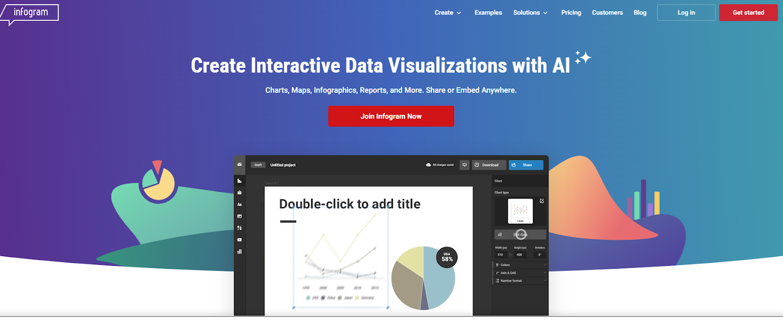
Infogram is an intuitive tool for creating beautiful visuals, including infographics, reports, maps, dashboards, and social media posts. With Infogram, you can add animations like bounce, fade, and zoom to reports, which increases interactivity and brings your content to life. You can also collaborate with team members in real time.
- Features. Infogram’s drag-and-drop editor enables you to add charts, text, tables, and other objects to your document easily. It also has hundreds of ready-to-use templates, including pie charts, bar charts, line graphs, and histograms, which you can incorporate into your project to save time. Infogram also supports collaboration, enabling you and your team to create, edit, share, and comment on documents.
- Pros. The integrated version control system allows you to track changes on any project. Infogram’s templates are responsive out of the box, ensuring content displays well on devices with different screen sizes.
- Con. Infogram is only accessible via the internet, which can be a problem when users are offline.
- Price. Infogram is available in five versions, billed monthly or annually. The Basic version is free. For an annual subscription, the Pro edition is $19 per month, Business is $67 per month, Team is $149 per month, and Enterprise is custom.
RAWGraphs

RAWGraphs helps you analyze and visualize data, making it easy for different audiences to understand. Although it’s open-source and free, it still packs in different types of visualizations for better productivity.
- Features. RAWGraphs has close to 30 types of charts for visualizing time series, hierarchies, quantities, and other trends in your data. You can also export your work and edit it in other software.
- Pros. RAWGraphs is open-source and receives community contributions, facilitating regular updates. The large chart library saves you time since you don’t have to create everything from scratch.
- Con. RAWGraphs supports limited customization since its developers chose to focus more on core visualization capabilities. For instance, you can’t change the font size or font family.
- Price. RAWGraphs is free.
Plotly
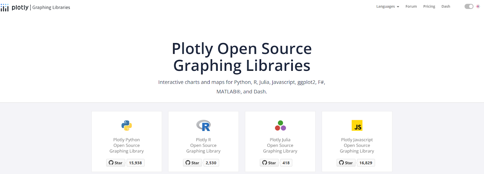
Plotly is a Python-based graphing library for building web-based visualizations. It offers over 40 chart types for scientific, financial, geographic, and statistical use cases. Once downloaded, you don’t need a stable internet connection to use Plotly. You can also add it to integrated development environments (IDE), allowing developers to work with data locally.
- Features. Plotly is an open-source library. It supports multiple programming languages, including Python, R, and JavaScript. Plotly’s extensive library of charts makes it easy to visualize data.
- Pros. Using Plotly’s wide selection of charts saves time since you don’t have to create visuals from scratch. Plotly also has a large community of active users who can help when you’re stuck.
- Con. You need some programming knowledge to use Plotly.
- Price. Plotly is available for free. Plotly also offers an enterprise plan that can be customized based on specific requirements and is available on request for a personalized quote.
Microsoft Excel

Microsoft Excel is among the most popular data entry, analysis, and visualization software options. You can use it for time and task management, project management, performance reporting, budgeting, and tracking progress.
Microsoft’s recent updates have allowed Excel to organize your data, learn patterns, and make predictions automatically, taking productivity to the next level. Microsoft Excel supports significant customization, including adding formulas, executable code, logical functions, and formatting options.
- Features. Microsoft Excel offers a wide selection of charts, graphs, clip art, and shapes to add to a document. You can store data in tables, which are easier to sort, filter, validate, and analyze. You can use Microsoft Excel to access more than 200 built-in formulas for data analysis. Plus, you can export your data in different formats, including CSV and PDF. Microsoft Excel also has an autosave feature that protects you from data loss.
- Pros. Microsoft Excel receives regular updates, meaning you’ll have access to top features. You don’t need programming knowledge to understand the basic features of Excel. The ability to arrange data in rows and columns is also a considerable advantage. In addition, Microsoft 365 offers a wide range of applications, including Word and PowerPoint, providing a comprehensive suite of tools for productivity and collaboration.
- Cons. It may take time for beginners to get a firm grip on Excel’s advanced features. Microsoft Excel can run all the formulas the user enters without checking if they are true or false, making it prone to human error.
- Price. The Microsoft 365 bundle includes the latest version of Microsoft Excel, available for home and business use. If you need the Business version, you can get the Basic edition for $6 per user per month, the Standard for $12.50 per user per month, and the Premium for $22.00 per user per month (billed annually). For the Home version, Microsoft 365 Family goes for $99.99 per year and the Personal edition for $69.99 per year (billed annually).
Datawrapper
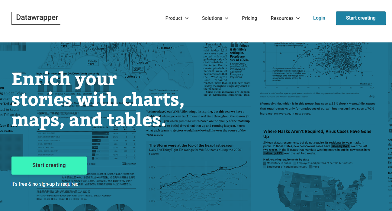
Whether you’re creating responsive tables, interactive visualizations, or maps, Datawrapper provides tools to help you tell your story. It has a free plan you can use to create, publish, and export visualizations, but you can only download the content in PNG format.
You don’t need any special knowledge to work with Datawrapper, and you can import data from CSV and XLS files or copy and paste it into the Datawrapper editor.
- Features. Datawrapper visualizations are responsive, enabling you to display them on different devices. Teams can also use shared folders for collaboration. Datawrapper’s visuals are dynamic, meaning they can respond to data changes. Datawrapper also supports white labeling, and users can create visuals with color and style that march the brand.
- Pros. You don’t need coding experience to work with Datawrapper; you can import and use a wide selection of charts and maps in your project; responsive content can adjust depending on the users’ device.
- Con. You must pay more to access extra features in the Custom and Enterprise editions.
- Price. Apart from the free version, Datawrapper has a Custom edition for $499 monthly for up to 10 users (billed annually) and an Enterprise edition for a custom quote.
What is data visualization?
Data visualization is the visual depiction of information through charts, graphs, maps, and other graphics. It is imagery dedicated exclusively to messaging or presenting information.
Data visualization tools can help you reveal the hidden stories within your data—whether it’s pulling website traffic data into a scatter plot to tell you how your marketing campaign is going or using a heatmap to highlight the areas of a city that are most prone to flood damage. Most tools allow you to customize charts, have powerful presets, or offer both capabilities.
Most tools allow you to customize charts, have powerful presets, or offer both capabilities, enabling you to create a unique data story that resonates with your audience.
What to look for in a data visualization tool
With so many data visualization tools available, deciding which is right for your needs can be daunting. We cover some criteria to help you decide.
- Ease of use. Is the user interface (UI) intuitive enough to create the necessary data visualizations? Do you need a drag-and-drop interface for non-coders or a lightweight library for developers?
- Interactivity. Does the target audience for your data visualizations need to filter, zoom, and otherwise interact with your graphics?
- Dashboard capabilities. Is your goal to create a business intelligence (BI) dashboard that can update visuals from live data feeds?
- Customizability. From data presets to chart types to the degree of software integration, how much control do you need over the design and implementation of your data visualizations?
- Integrations. From Amazon Web Services (AWS) to Salesforce to social media, does the data visualization tool have a data connector or API for the app you wish to pull data from?
Get help with data visualization on Upwork
Data visualization tools are a diverse bunch. We’ve included a representative sample of the best data visualization tools available. Some tools are better for developers, while others are better for BI analysts.
Choose the tool that best suits your needs. Regardless of which tool you use, the art of telling a compelling story through data visualizations is a skill that must be honed.
If you’re a business and want to take advantage of data visualization, check out the data visualization professionals for hire on Upwork to find independent talent for your data storytelling goals.
If you’re a data visualization freelancer searching for new clients, browse the data visualization jobs on Upwork to find your next client.
Upwork does not control, operate, or sponsor the other tools or services discussed in this article, which are only provided as potential options. Each reader and company should take the time to adequately analyze and determine the tools or services that would best fit their specific needs and situation.

.avif)

Author Spotlight

Upwork is the world’s largest human and AI-powered work marketplace that connects businesses with independent talent from across the globe. We serve everyone from one-person startups to large organizations with a powerful, trust-driven platform that enables companies and talent to work together in new ways that unlock their potential.