Building an Automated Canary Analysis tool - part 2
%20(1).png)
The first Gloster version
In part 1 I provided some context about Automated Canary Analysis (ACA). I defined the problem as "how can I tell if my canary is performing as good as my existing (baseline) system, so I can proceed with a full deployment? and can I do it in an automated way?" Without further ado let's dive into the story of the first version of Gloster, the tool that organically grew out of my effort to answer this question.
Research and initial problem definition
At the time (early 2017), there was no open source ACA software available, but almost everybody that was seriously engaged in deploying microservices at scale claimed to use canary deployments and some form of canary analysis. The Upwork Platform team was already providing mature deployment orchestration tools that supported automated Blue/Green deployment, including the option to do progressive traffic increase from 0% to 100% for the Green stack while testing a small set of golden metrics against preset thresholds. But this was a poor replacement for a full blown ACA system, so I started working on the idea of introducing ACA into our toolset. While researching what the masters were doing at the time, I was really inspired by the following:
- "Canary Analyze All The Things: How We Learned to Keep Calm and Release Often" by Netflix's Roy Rapoport - slides on Slideshare, QCon presentation page, Roy's interview on canary analysis. This mid-2014 presentation emphasizes the importance of Canary Analysis and allows a quick glimpse into how Netflix was using telemetry to increase release confidence. The presentation touches many interesting aspects but also leaves so many details to the imagination of the reader/watcher. Such a teaser!
- "Deploying the Netflix API", a Netflix blog post by Ben Schmaus. An older blog post (2013) that briefly mentions how the canary analysis is an important part of the deployment at Netflix; it also sets the context of an early automated process for handling the complexity and the large scale (hundreds of metrics to consider).
- "Monitoring the Pulse of LinkedIn", a LinkedIn Engineering blog post by Jimmy Zhang. This 2015 post also emphasizes the importance of Canary Analysis (compares it to a real life EKG test) and elaborates further on the LinkedIn approach and its evolution. The post is dense with concepts, without getting into too much detail, and also promotes some very important principles related to releasing with confidence and using telemetry and log information to reason about the safety of a new release.
Being inspired by these and a few other publications, I focused on the following core questions that needed an answer before attempting to design and implement an ACA tool:
- How should I use our telemetry to reason about the health of the canary? Can I solve this deterministically or training an ML model is the only way to approach this efficiently?
- How do I reduce the dimensionality? Our microservices generate over a thousand metrics (typically between 800 to 1,200). Clearly not all of them are important when trying to understand whether the canary behavior is deviating in a negative way from the expected norms.
- How do I normalize the telemetry values in order to compare the canary to the baseline; since the former receives a much smaller chunk of production traffic than what the latter is handling, there is instinctively some normalization required. More on this problem later.
There were of course engineering complexities and integration considerations for introducing an ACA toolset in our release pipeline and deployment workflow, but the hard part was answering the three questions above. As always, finding the right algorithm(s) is the hard part and you always have to start small and improve incrementally if you want to efficiently plot your way through the multi-dimensional complexity.
A first solution
Starting small meant avoiding reinventing the wheel, so finding an answer to question #1 was based on the Netflix posts and presentations mentioned above. Calculating a canary analysis score and comparing it to a threshold value for determining success or failure is a typical approach in anomaly detection and this was a good starting point. I decided to start experimenting with a simple deterministic approach for the scoring algorithm that calculates a score for each metric and then combines the scores of all metrics into the aggregate as the presentation suggested. The initial approach required the definition of an upper and lower deviation threshold (defined as percentages) for each metric used in the analysis. So, if the metric for the new release under test is within the expected deviation, this metric gets a score of 1 (perfect success), else it gets a score of 0 (perfect failure); in this early Gloster version no score existed in between (partial match). The overall canary analysis score is calculated as the average of all the scores of the individual metrics participating in the analysis, yielding a score between 0..1 (or 0% and 100%). Easy to implement and with very low computational complexity. In an effort to provide more insight on which high level the analysis failed, the approach adopted the definition of metrics groups as the Netflix literature suggested; metrics were grouped under System, Server, and Requests (we later introduced Dependencies too), so that the service owner can easily understand the type of deviation observed (e.g. system level metrics were off in the new release).
Question #2 screamed for some automation based on training a model or pinpointing statistical characteristics that one can capture through statistical analysis. However, at the time, while tackling multiple dimensions of the problem, the decision was to start simple and require human intervention: expect the service owner to define the set of metrics that matter (i.e. which metrics describe the behavior we care to benchmark) as well as how much they matter (i.e. assign a weight) in a static way. I secretly hoped that this would be enough, since it was implied in the literature that this is the way the experienced Canary Analysis masters do it :) Second question answered! at least for a first version.
The answer to question #3 was not straightforward and could not be simplified. The problem is that we need to compare the behavior (modeled by our telemetry) of the new release deployed as a canary against the existing service version. The typical canary deployment configuration looks like that:

Parameter C starts with a value of 1, and gradually increases to a much higher value, but it is almost never 100 (usually never exceeds 50%). Before increasing C to the next step, we need to make sure that the new release (deployed on the canary) does not exhibit any anomalous behavior and it is safe to proceed to a higher percentage of production traffic. This gradual, calculated traffic increase aims to minimize the risk of impacting the service users, and we only increase the exposure to the new release when we achieve higher confidence that for the given percentage the behavior is within the expected norms. However, this approach complicates the canary analysis since:
- The canary instance is freshly provisioned, while the existing production instances may have been running for many hours or even days, thus we are potentially comparing steady state against system that is still "booting up"
- Most importantly, we are trying to compare the behaviors of two systems that receive grossly disproportional traffic, and this can lead to comparing oranges to apples for metrics that depend on the traffic received. Clearly, some normalization is required. The Netflix presentation suggests solving this problem by comparing rates and not absolute values. However, this normalization is meaningful to metrics that do depend on traffic, and the problem here is that this is difficult to automate since there is no easy way to teach a machine to reason about which metric should be normalized, unless you ask a human to tag the metrics.
After heated brainstorming and some experiments, we decided to adopt the following modified canary deployment pattern:
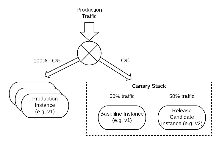
Instead of provisioning a canary instance (or cluster) that receives a low and increasing percentage of production traffic, we provision a canary stack (or cluster of stacks) with two instances: (a) the baseline, running a service with the existing production version, and (b) the release candidate, running a service with the new version we intend to test. We follow the same strategy on how we divert a small and progressively increasing percentage of production traffic to the canary stack (as we did with the canary instance), and internally this traffic is divided equally between the baseline and the release candidate. We compare the release candidate to the baseline inside the canary stack and not to the pre-existing production instances. The benefit of this approach is that both instances have the same age (are provisioned at the same time and will reach steady state at about the same time) and most importantly, they are receiving statistically equivalent traffic; thus there is no need to introduce any kind of normalization. There is a caveat though, this approach is problematic for services that receive very low production traffic since splitting a small percentage of low traffic in half results in very low request rates and we eventually lose the "statistically equivalent" quality. Solving this problem with traffic mirroring is a topic for another post :)
Gloster v1.0
Having an initial, simplified answer to all three questions, engineering a first version of Gloster was almost straight forward. The high level design included four components:
- Analyzer: the stateless component that executes the scoring algorithm, given as input all the required telemetry and reasoning parameters.
- Maestro: the ACA orchestrator that handles the workflow, understands case specific configuration parameters, has state, controls scheduling and invokes the Analyzer.
- Configuration: the component that handles configuration management, per service customization, etc.
- UI: the tool UI that facilitated configuration and provides visibility to the ACA progress (in addition to the API that is mostly intended for integration with the rest of our deployment pipeline).
This was a first approach that evolved, as the algorithm evolved and as different problems emerged. The design assumed integration with our CICD orchestrator (Jenkins) and our home-grown deployment workflow orchestration tool. I will provide more detail in a separate post.
It is interesting to note that based on the initial decision to approach the selection of relevant metrics in a manual fashion, Gloster v1.0 expected a user defined configuration in the following form (snippet from an actual example):
--CODE language-js language-markup line-numbers--
[
{
"groupName": "system",
"weight": 1.0,
"metrics": [
{
"metricName": "summary.cpu.util",
"weight": 1.0,
"sensorType": "Atlas",
"duration": "5m",
"stackAggregator": "avg",
"statAggregator": "avg",
"highDeviation": 0.35,
"lowDeviation": 1
},
{
"metricName": "mem.util.used",
"weight": 1.0,
"sensorType": "Atlas",
"duration": "5m",
"stackAggregator": "max",
"statAggregator": "max",
"highDeviation": 0.35,
"lowDeviation": 1
},
{
"metricName": "kernel.all.load._5_minute",
"weight": 1.0,
"sensorType": "Atlas",
"duration": "5m",
"stackAggregator": "avg",
"statAggregator": "avg",
"highDeviation": 0.35,
"lowDeviation": 1
}
]
},
{
"groupName": "server",
"weight": 1.0,
"metrics": [
{
"metricName": "jvm.memory.heap.used.value",
"serviceName": "ServiceA",
"weight": 5.0,
"sensorType": "Atlas",
"duration": "5m",
"stackAggregator": "sum",
"statAggregator": "avg",
"highDeviation": 0.350,
"lowDeviation": 0.350
} ,
{
"metricName": "http.server.requestDuration",
"serviceName": "ServiceA",
"weight": 1.0,
"sensorType": "Atlas",
"duration": "5m",
"stackAggregator": "sum",
"statAggregator": "avg",
"highDeviation": 0.350,
"lowDeviation": 0.350
}
]
},
...
You will notice the grouping into the System, Service, etc groups, as well as the high and low deviation thresholds. What is important to emphasize here, is that we relied on the service owner expertise to identify which metrics (out of the ~1,000 metrics) are relevant and should be included in this configuration, how important they are (define a weight for the calculation of the total score as a weighted average), and what are the acceptable baseline deviation values. Note: Your gut feeling is correct, this requires some serious effort and potentially a long series of trial and error experiments to fine tune the weights and the deviation tolerance parameters.
In any case, the purpose of this first version was to prove that the approach made sense and that the algorithm can actually detect anomalies, without generating a high number of false negatives.
The following screenshot shows the UI of Gloster v1.0 when it was released to actual users for validation/evaluation.

The (volunteering) users were shown a very engaging demo running ACA for a test service that was emulating on demand anomalies (via a REST API) that showed how Gloster detects anomalies without reporting false negatives when the test service is not configured to inject errors and latency. Creating the Gloster configuration for the test service was a long and cumbersome process, but it allowed the creation of a template with some basic metrics common to all of our microservices. The users were then handed instructions and the default template, and they were asked to configure Gloster for their services and perform tests in order to assess the ACA success. This involved A|A tests (compare two instances with the same version in production) or A|B tests (compare the new deployment to the previous one by keeping the Blue and Green stacks at 50% for an hour during B/G).
Results and lessons learnt from v1.0
It become very clear that asking an engineer to put any kind of effort worth more than 15 minutes of configuration in order to test drive any kind of tool, however exciting, will just not happen. I know I wouldn't do what I was asking our engineers to do given their workload, but I was too passionate with the experiment to see it.
But this experiment, was not a waste. One engineer actually put the effort and customized his service-specific configuration by hand and ran a ton of experiments. Gloster was using the telemetry from actual production services and the results were rewarding. The scoring algorithm was able to reason correctly about hiccups and errors and it did not yield any significant percentage of false negatives. However, the manual configuration approach was brittle. Investing enough time into fine tuning the configuration provided a solid anomaly detection system, but any significant change in the internals of the service could require fine-tuning the configuration again. It was obvious that this human-based configuration was not viable.
In addition to this realization, there were some other interesting lessons learnt related to the selection of the relevant metrics:
- Some metrics that almost always have a value of 0 (e.g. specific error rates), should not be ignored since when they get a non zero value they will indicate an anomaly. However, they should not be allowed to dilute the aggregated score when their value is 0.
- A lot of metrics are correlated, so it is difficult to define the appropriate weights manually, without taking into account these correlations.
- Some golden metrics are so important that should probably be used in a "drop dead" approach: if a golden metric (e.g. Availability or Latency SLOs) deviate from a known absolute value then the analysis should fail immediately without the need to consider other metrics.
- Some categories of metrics are clearly irrelevant to the behavior of a service and can be ignored and not included in the configuration. This process can be automated and it is straightforward to define the "exclude" rules at the Gloster system level.
Redefining the problem
After evaluating the first version of Gloster through countless experiments and by reviewing the user feedback, the initial problem definition was augmented with the following additional goals:
- Invent an automated way to identify the set of relevant metrics for any given service. This has to be a dynamic process that adapts to the evolution of the service.
- Invent an automated way to identify the tolerated deviation for the release candidate, without requiring manual definition.
- Allow users to override the automated model by boosting the significance of specific metrics or even excluding other metrics from the automated metric selection.
- Allow the definition of golden metrics that are tested against absolute threshold values (mostly SLOs) that will short circuit the anomaly detection scoring algorithm and force the analysis process to fail.
My next post is going to be about the construction of the algorithm that attempts to address this refined problem definition. It was an interesting journey with many dead ends and countless experiments that forced Gloster to evolve into a truly automated canary analysis system.


.png)
%20(1).png)
%20(1).png)
.png)
.png)
%20(1).jpg)