Building an Automated Canary Analysis tool - part 3
%20(1).png)
Gloster v2: Building a truly automated canary analysis tool
In part 2 I outlined how Gloster v1 was designed, why it failed and what were the lessons learnt. The experience lead to refining the problem definition by focusing on two main sub-problems:
- Design a constantly adapting approach for identifying the metrics that are relevant to the behavior of the given service, in an automated way.
- Invent an automated approach to specify the tolerated deviation for all metrics of the release candidate, thus deprecating the manual algorithm configuration.
The first version failed because the model used in the analysis required a lot of manual effort (trial and error) and it was proven too brittle, since significant changes to the service codebase required manual recalibration of the weights and thresholds.
Introducing Historical Data
The first idea that led to the automated approach was to use historical data for the anomaly detection reasoning. Instead of expecting the service owner to provide the important metrics by using weights, and to define the acceptable deviation of each metric value by setting upper and/or lower thresholds, we decided to rely on historical trend data for sensing anomalies.
The concept is to monitor multiple, different service instances in production, over long periods of time (for taking into account seasonal behaviors) and capture acceptable deviations for all the metrics of a service. What we are trying to achieve is to establish a baseline on how our telemetry fluctuates for identical systems, i.e. identically sized instances running the same software release and handling approximately the same production traffic. We can then use this information when performing a canary analysis for (a) identifying the most relevant metrics and for (b) guiding the system comparison algorithm. More details on the approach are explained below.
Introducing a Distance Function
The second improvement focused on the comparison algorithm. We removed the threshold checks on the absolute values of the metrics and decided to introduce a distance function for comparing time series. The concept here is that instead of comparing the metrics of the release candidate service instance to the metrics of the baseline instance by using maximum allowed percentage deviation values, we calculate instead a distance between the two time series and then check whether the result is aligned with the historical behavior recently observed in Production.
There are many distance function options for comparing time series, with the simplest one being a Euclidean approach. After some research we chose to go with Dynamic Time Warping (check out this interesting article for more details applying time warping on time series) which measures the similarity between two temporal sequences that may vary in speed.
The Approach - Preparation
Based on these ideas, we introduced a background process that executes the ACA preparation phase, during which we capture historical information that will be used during the analysis. This process implements the following logic:
- Every N minutes (we usually set it to 5 or 10 minutes), we select two random production instances of the service. We pick instances that receive approximately the same traffic, so that their behavior is similar. The algorithm attempts to find instances that have been running for approximately the same time, so that we compare systems that have reached about the same level of steady state.
- We then retrieve all the telemetry values for each instance and calculate the distances and and then store the results in our historical "similarities" database. The distance is calculated on the metric time series for the latest sliding window (now - N minutes).
So, given a distance function D(m1, m2) that provides an estimate of the deviation (or similarity) between a time series m1 and time series m2, the output of this historical data capturing mechanism for a service with M metrics, will generate M time series, each containing values of the following format:
[D(metric_i_ts(random_instance, t0), metric_i_ts(other_random_instance, t0)), t0], [D(metric_i_ts(random_instance, t1), metric_i_ts(other_random_instance, t1)), t1], ... [D(metric_i_ts(random_instance, tn), metric_i_ts(other_random_instance, tn)), tn]
where t0 is the oldest data gathering time and tn the most recent time, D() the distance function and metric_i_ts(instance, tx) is a time series with the values of metric i, for the given 'instance' and for the time period 'start: tx - N minutes, end: tx). As explained above, we pick random pairs where 'random_instance' != 'other_random_instance' and we try comparing all instances in the service cluster over time, since we do not want to be biased by always picking the same pair of instances.
Finding the Most Relevant Metrics
Our services typically generate 500 to 1,200 metrics. We need to minimize the dimensionality during the canary analysis for the following reasons:
- We compare each metric between the Release Candidate (RC) and the Baseline (BL) systems generating a metric-specific score and then calculate the aggregate score as a weighted average. Having irrelevant metrics in the mix will smooth out the aggregate score, and for a large number of them we may completely average out any anomaly detected by the comparison of the handful of relevant metrics.
- Reducing the volume to 20% of the total metrics, including only the most relevant metrics, will greatly improve the accuracy and the performance of the approach, bringing down the processing required, the load on our telemetry servers and the cost of running ACA on our 400 microservices being deployed multiple times in a day.
As a first measure against using irrelevant metrics, we added static filters to Gloster for removing some truly irrelevant metrics, like static metrics related to configuration parameters or metrics that are highly correlated to other metrics that we want to keep in the mix. This mechanism is simple and efficiently weeds out some metrics that are common among all microservices and clearly will not contribute to the analysis. But this covers less than 1% of the filtering we need to do.
The lesson we learnt form the initial weight-based approach was that as each microsystem or its environment evolve, weights need recalibration and some metrics become irrelevant while others start having an impact when trying to detect anomalies. Based on this observation, it was clear that we needed an algorithm that dynamically adapts to the evolution of our services. And this is where the historical information comes into play. The hypothesis is that if we consider the historical distances of the metric time series between the identical service instances running in Production, the metrics that are relevant to normal behavior will be the ones that exhibit the smallest deviation / higher similarity (smallest distance values). A way to model that, is to calculate the mean value of the metric historical distances time series we capture (e.g. for the last week or month) and select as relevant the metrics with the smallest mean value, i.e. the metrics that are pretty stable across all instances on the average. We can further enhance the selection by also taking into account the distance variance (standard deviation), i.e. we care about the metrics with a deviation across instances that does not spike much.
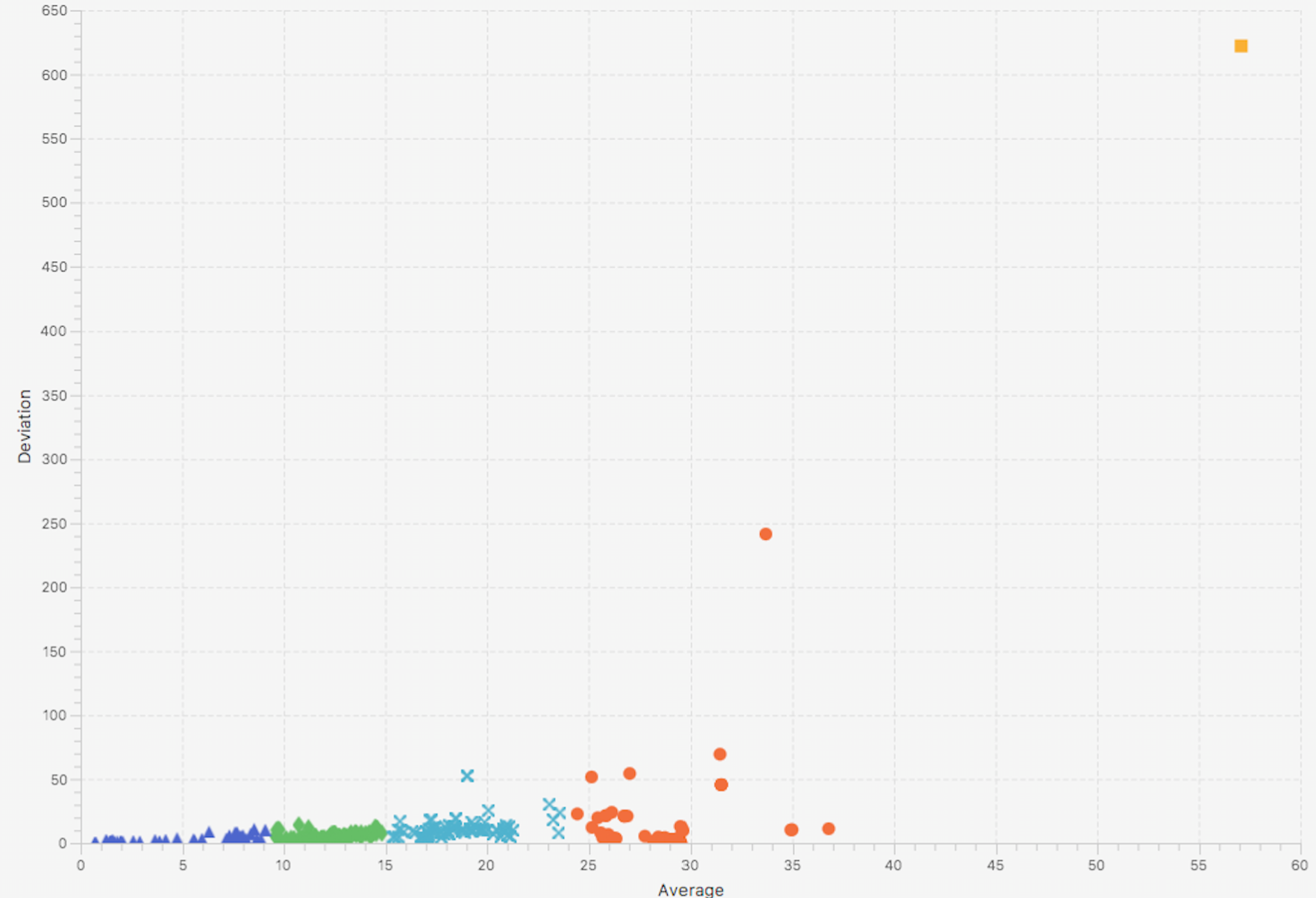
Clustering can help to help implement this selection approach, and after some experimentation we decided to use Hierarchical Clustering. The algorithm requires as an input parameter the number of clusters required and the selection of this parameter cannot be automated in a straightforward way. Very low values will generate very large clusters, while very high numbers will result in very small cluster. Further experimentation revealed that for our microservices a value between 5 and 10 is ideal and the difference in the result is not significant as long as we remain within these boundaries. The diagrams below show two examples for 5 and 10 clusters. Note that we pick the cluster closer to (0, 0) as the most relevant one for our analysis.
Hierarchical clustering result with input=5 (number of target clusters)
Hierarchical clustering result with input=10 (number of target clusters)
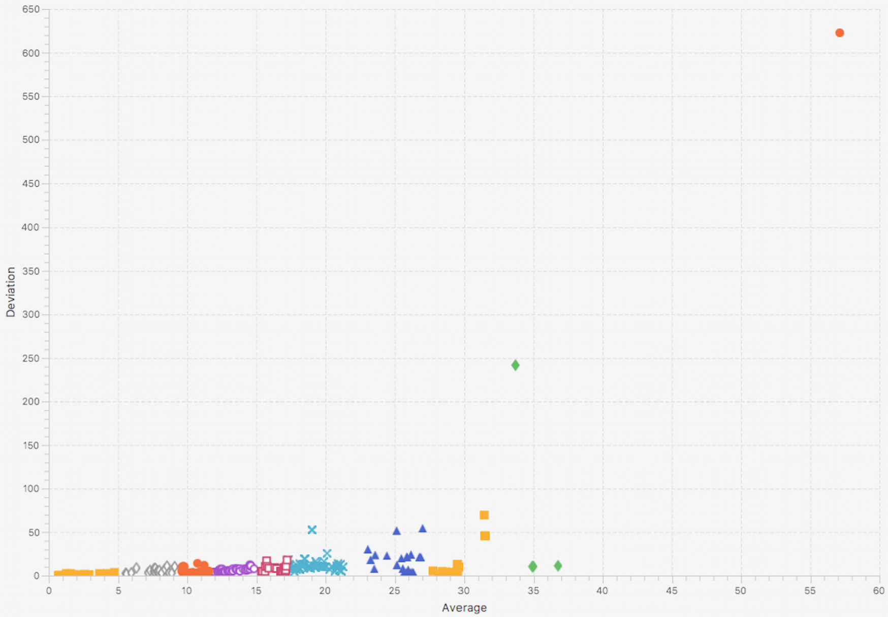
As it is visible in the above diagrams, in the vast majority of the metrics we do not observe high variance, and these cases already have high mean values, so the clustering can be performed on a single dimension (mean, not variance) to practically get the same results.
We validated that the results of this selection approach are actually the most relevant variables by both reasoning about the physical representation of the metrics as well as running ACA experiments with the first cluster (nearest to (0, 0)) and comparing the score results to the full set of metrics or more than one clusters (always the ones closer to (0, 0)). The increase in accuracy was a real game changer though: picking the first cluster or the first 2-3 clusters removed all the noise of the irrelevant metrics, and adding more than one cluster in most cases decreased accuracy.
Running the Canary Analysis - Workflow
Based on the historical data and the distance function we refactored Gloster to execute each ACA process according to the following workflow:
- Configuration step: Before the analysis starts, Gloster will retrieve the historical distance time series for all metrics for the given service. It will then execute the selection of metrics via clustering. Since it takes into account the latest historical data, it will adapt to the evolution of the service. The output of this step is a set of metrics to be used during the analysis.
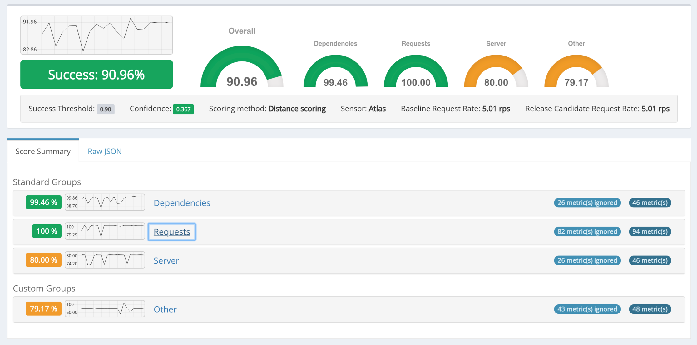
- Analysis step: Gloster will start the analysis by periodically retrieving the set of metrics identified by the Configuration step for both the RC and BL instances and it will execute scoring per metric and then aggregate all score to the Aggregate Score. Note that the analysis period should match the preparation period (i.e. the period we use for gathering historical distances). Gloster will generate an Aggregate Score and a Confidence value on each analysis cycle that can be used by the CICD Orchestrator to decide on how to proceed with the ACA process (complete the process, continue observing, or increase traffic). The Confidence value models the certainty that the scoring process has seen enough data and has stabilized so the observer (CICD Orchestrator) can use the Aggregate Score to reason about the ACA results.
Scoring Algorithm
During analysis, the score for each metric i is calculated as:
score = 1 (success), if D(metric_i_ts(RC), metric_i_ts(BL)) < historical_Distance_mean + historical_Distance_variance
score = 0.9 (borderline success), ... 1, if historical_Distance_mean + historical_Distance_variance <= D(metric_i_ts(RC), metric_i_ts(BL)) <= historical_Distance_Max
score = 0 (fail), if D(metric_i_ts(RC), metric_i_ts(BL)) > historical_Distance_Max
So, the score for each metric will denote an absolute failure if the distance between RC/BL is more larger than the maximum historical value. It will denote absolute success if the distance is lower than the (average + variance) of the historical value. And it will denote a partial success if the distance is higher than (average + variance) but lower or equal to the max historical value.
We use the same distance function (time warp) for both the historical process and the analysis, and we also align the two periods so that we compare distance values calculated with the same parameters. For example, we gather historical every 5 minutes and we execute the analysis every 5 minutes.
Gloster calculates the score for all the relevant metrics and then it will generate the aggregate score by calculating the average for all metrics. Since this happens on every analysis cycle, Gloster generates and stores in its database a new data point for the aggregate score time series every N minutes.
Normalizing Data
The distance function results depend on the value of the time series. Typically the historical distances are calculated on much higher values since we compare production instances that receive higher traffic percentages than what the canary stack is receiving. Since we compare the historical distances (production nodes) to the distances between RC/BL metrics (typically 1% to 25% of the production traffic) we frequently ended up comparing number in different orders of magnitude. That is why we need to normalize our time series and bring them to a common, standardized range (e.g. 0..1) before we calculate the distances; the approach is explained in a concise way in this article: "How to Normalize and Standardize Time Series Data in Python". For example, consider an http.rate metric which is affected by traffic received:
(a) the production instances during historical data capturing phase may get values like that (over a 5 minute period): http.rate(instance1) = [5, 10, 5, 10, 5], http.rate(instance2) = [10, 5, 10, 5, 10], and we normalize them to [0.5, 1, 0.5 , 1, 0.5] and [1, 0.5, 1, 0.5, 1], and then we calculate the distance.
(b) because of the 1% traffic, for the canary stack instances, we get a time series like this: [0.05, 0.1, 0.05, 0.1, 0.05] and after normalizing we get values in the same range, e.g. [0.5, 1, 0.5, 1, 0.5]. As the traffic percentage increases, the rate time series will potentially get higher values, but as we normalize we are getting back to the standardized values so the calculated distances end up in the same range.
This normalization allows us to always be able to compare canary data (regardless of the percentage of traffic) to the historical data.
Improving Accuracy: Sparse Data
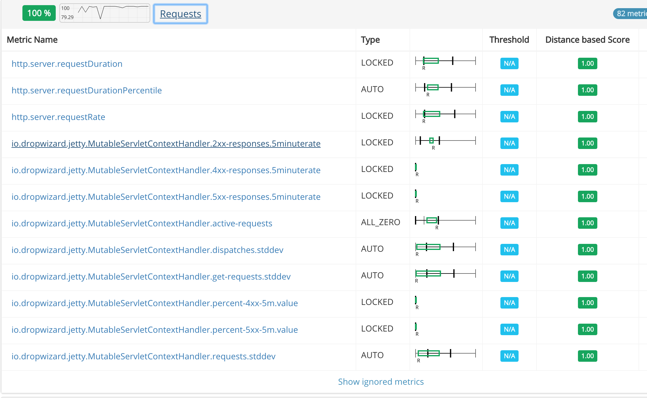
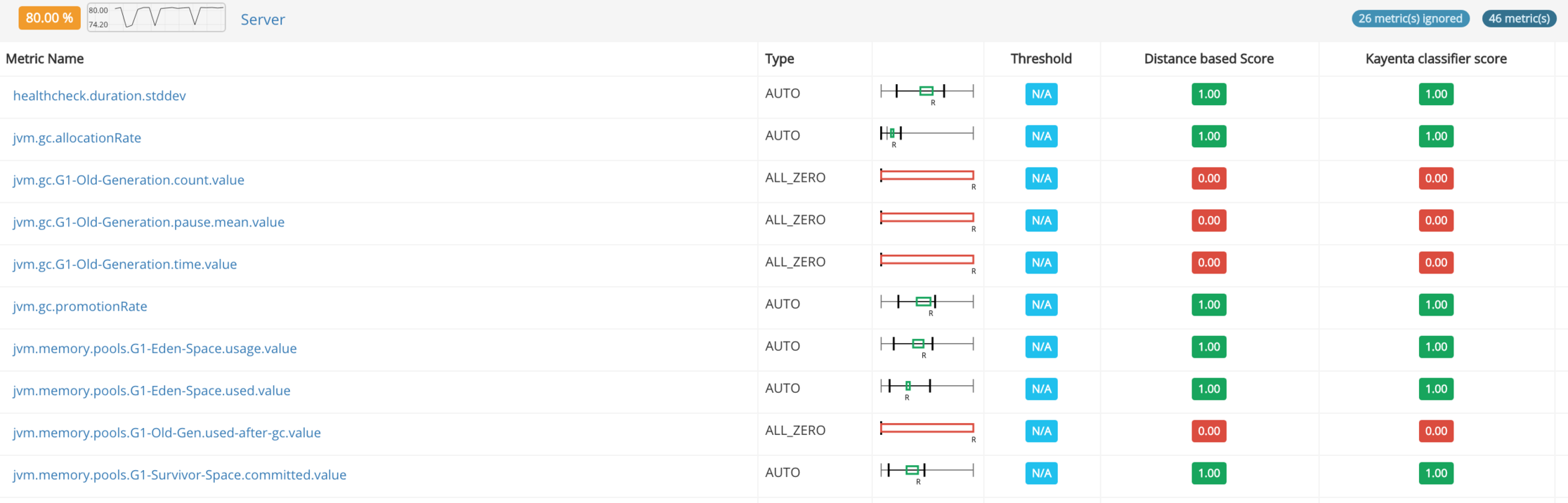
Typically, the telemetry of a microservice (and potentially any system) contains metrics that are mostly without values (or zeroes). These are metrics that model rarely exhibited behaviors, like for example the rate of a specific error state, and in the context of the canary analysis they should be taken into account. The interesting fact about the approached described above, is that the clustering algorithm Gloster uses will place all these metrics in the first cluster, so they will be automatically included in the most relevant metrics set. The problem, however, is that when these metrics make up a significant percentage of the metrics in the set (we saw cases where they summed up to 60% of the set), so when included in the scoring algorithm they will smooth out anomalies. Since we cannot ignore them since they are signal for anomalies, Gloster will track them and keep them in the relevant metrics set, but it will not include their individual scores in the calculation of the Aggregate Score. This optimization increases the overall accuracy and sensitivity.
Adding a Deterministic Dimension
The approach explained above automates both the relevant metrics selection and the abnormal deviation detection by using a historical baseline. It is based on statistic analysis and it is dynamic. We noticed, however, that we have a small number of "golden metrics" that are always relevant and we want them included in the relevant metrics set. In some cases, for a handful of these golden metrics (e.g. Availability and Latency SLOs) there is a very clear definition of what a failure is by just observing their absolute values and comparing them to static thresholds. We extended the ACA anomaly detection algorithm to include a parallel deterministic branch and allowed the injection of specific golden metrics in the relevant metrics set. The approach is outlined in the diagram below.
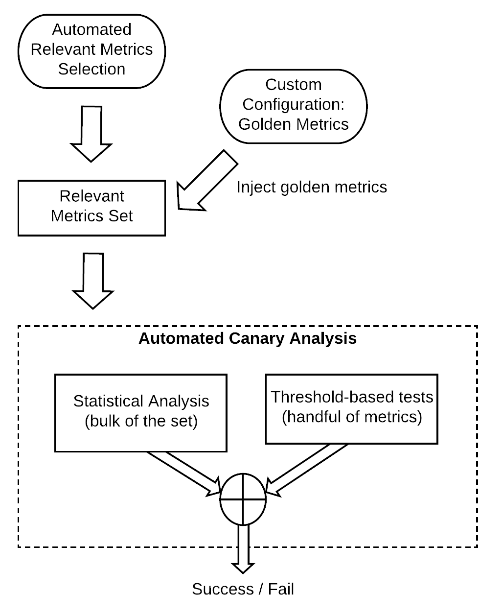
Gloster injects by default some SLO-related golden metrics and it can automatically import the metrics and their thresholds from our monitoring and alerting infrastructure has been configured to track for any given service. When threshold-based tests are injected in the ACA process, they act as "flow breakers" and they will fail the analysis and set the Aggregate Score to 0, bypassing the statistics analysis flow (although individual metrics scores are available for review by the service owner).
User Controlled Configuration
Although Gloster v2 automates almost everything, it still allows some optional customization. As explained in the previous paragraph, the service owner can force include and/or exclude metrics to the output of the automated metric selection, allowing for more detailed fine tuning of the automation. The user may also define the parameters of the clustering algorithm and may define thresholds for specific "golden" metrics (upper and/or lower bounds). A typical approach used is to ask Gloster to import the alerting configuration and then remove/modify the alert thresholds, that are transformed to pass/fail tests in the context of the canary analysis.
There are other customization options that Gloster supports, including fine tuning of the automated algorithm (type of clustering, whether one or two dimensions are used in the clustering, advanced configuration of the scoring algorithm, etc.) and the type of telemetry server used (Atlas, Prometheus).
Confidence Value
Adding a confidence value to the process is important for automation since the CICD Orchestrator needs some indication that the analysis has seen enough data to be confident that it can use the score to decide about the final outcome of the ACA. We experimented with various approaches but eventually we achieved very accurate results by observing the Aggregate Score time series and testing whether the plot has stabilized; this is a simple t Test on the two halves of the time series with a 0.05 threshold and we have empirically verified that this is a good model of the steady state status of ACA process. For longer period experiments (spanning more than an hour) we added a further optimization by using a sliding window, i.e. feeding only the last K data points of the score time series to the t Test, thus ignoring the older data points that may still exhibit some fluctuation.
Finding the Appropriate Score Threshold
By the definition of the scoring function, the score success threshold is 0.9 (or 90%). This was also an improvement towards automation of the process since we did not want to require the user setting a success threshold per service. However, by observing the data from countless experiments, we noticed that the resulting score average, max and min values vary significantly depending on the service monitored. In an effort to improve accuracy and make Gloster more adaptive, we introduced the following optimization:
- Add a canary analysis scoring process on every historical data capturing cycle, that captures historical scoring data on identical systems. This means that the distances will be calculated for all the metrics of the service and stored in the database, and then the ACA process will kick in, using older historical data to select the relevant metrics and then calculate a current score by comparing the two identical services instances used for the historical distances. The hypothesis here is that since we are scoring identical systems, so the resulting score value should denote a success. We store these historical "success" score data points in the database.
- When an ACA process is initiated, Gloster will retrieve the historical success score timeseries and try to recalibrate the successful score threshold. Note that we need enough historical data, so the threshold will default to 0.9 if not enough data are found (usually at least a week of data). Otherwise, Gloster will calibrate the threshold for the specific service, so we may have services with a stricter threshold (e.g. 0.94) or a more relaxed value (e.g. 0.79). There is a corner case, though, when an anomaly occurs at the time of the historical data capturing (e.g. faulty instance, some application incident or a network partition) in which case the score may be too low, as expected since the hypothesis that we compare normal behavior does not stand anymore. To protect against these rare cases, Gloster has a minimum acceptable score threshold (usually set to 0.70) and any historical scores below that will be tagged as outliers and they will not be used in the re-calibration.
High-level Gloster Architecture
Gloster consists of four microservices as outlined in the high level diagram below:
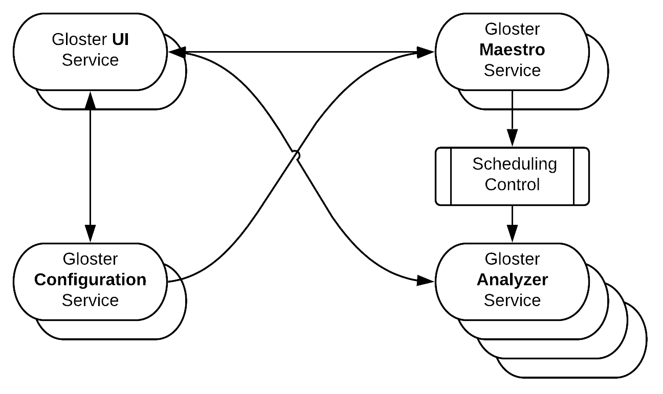
Gloster Maestro is responsible for the overall orchestration of all workflows. It listens to Deployment Workflow events (e.g. new canary stack created with ID, canary stack with ID deprovisioned, traffic increase to canary stack with ID, etc) and decides on starting or deleting an ACA process. It also accepts requests from the end user (via the Gloster UI) for starting non-automated analysis experiments (comparison of ad hoc instances). Maestro fully controls and coordinates the scheduling of recurring jobs, i.e. historical data capturing for tracked services, and ACA or manual analysis processes. It will attempt to spread scheduling over the available time window in order to improve resource utilization and avoid bottlenecks. It also handles the analysis configuration phase, being responsible to execute the clustering step and the score success threshold recalibration; it then triggers the analysis by passing the fully processed and finalized configuration to the Gloster Analyzer. It offers an API to the Gloster UI and a query API to the CICD orchestrator for checking on the process of the analysis processes.
Gloster Configuration is responsible for handling all the configuration parameters of a given service. It supports versioning and activation/deactivation of different profiles, handles the configuration datastore, performs validation and offers an API to the Gloster UI. Gloster Configuration should be used at least once for adding the specific service to the list of services tracked by Gloster.
Gloster UI is the front end interface to the user. It is mainly used for managing the configuration parameters (access to Gloster Configuration), browsing analysis results details or historical data insights (access to Gloster DB via the Gloster Analyzer API), and stopping ACA/manual analysis jobs or starting manual analysis jobs (access to Gloster Maestro). It sends to the browser a single page application that offers the GUI for all interactions with the user.
Gloster Analyzer is the tireless worker that periodically executes all historical capturing jobs and ACA/manual analysis processes. It interfaces with the telemetry infrastructure for retrieving the metrics required per each process, and stores all results to the Gloster database. It offers an API to the Gloster UI for accessing stored results. The Gloster Analyzer typically scales horizontally to higher number of instances than any of the other services for obvious reason (almost linearly to the number of services tracked and analyzed).
The following screenshots show examples of the analysis insights UI.
Integration with Other Systems - ACA Flow
The ACA process was designed as part of our automated CICD pipeline, even though Gloster can be used independently for running ad hoc anomaly detection analysis jobs by monitoring. The process is initiated by the CICD pipeline (we rely on Jenkins/Blue Ocean for orchestrating the CICD flow) which triggers the Canary Stack deployment. The pipeline will monitor the Canary Stack readiness and if no failure or timeout occurs, it will increase the percentage of production traffic flowing to the Canary from 0% to the first step (usually 1%). Gloster listens to deployment workflow events and it will automatically start the analysis (ACA) when it sees an new Canary Stack receiving traffic. The pipeline will poll Gloster after a warm up period and it will wait for a minimum number of data points with a high Confidence value for deciding on the Aggregated Score returned by Gloster. These are the possible outcomes:
- high confidence and successful ACA score => proceed to the next traffic percentage. If this was the last step of the ACA process => mark the ACA process as complete and successful, send the request for deleting the Canary Stack ad proceed with the pipeline logic (usually blue green deployment of the new version).
- high confidence and failed ACA score => mark the ACA process as complete and failed, send the request for deleting the Canary Stack ad proceed with the pipeline logic (most probably fail the pipeline).
- low confidence => wait until a confidence is high or a timeout is reached, in which case => mark the ACA process as complete and inconclusive, send the request for deleting the Canary Stack ad proceed with the pipeline logic (depending on the configuration).
- timeout on the Gloster poll => mark the ACA process as complete and inconclusive. Depending on the pipeline configuration the pipeline may ignore Gloster and continue or it may stop. Generally we want to avoid blocking deployment when Gloster fails, at least for non critical services.
Gloster will consume an event about a Canary Stack not receiving traffic anymore and it will stop the analysis. Also, as mentioned previously, Gloster interfaces with our telemetry infrastructure for retrieving the required metrics.
Using Gloster for Post-Deployment Anomaly Detection
The anomaly detection algorithm has proven quite powerful, so we added one more feature that extends the usage of Gloster beyond canary analysis. Gloster can easily be configured to consume blue-green-completion events and it will automatically start an analysis job comparing the new release (just deployed) to the time shifted telemetry of the previous version. Most of the existing ACA configuration is re-used and the user only has to enable the capability and potentially change the defaults about the time-shift value (by default -2 hours) and the duration (by default 2 hours). Gloster will send Slack notifications to the team if the aggregate score is below a threshold. The user can override the default threshold for fine tuning sensitivity for the time shifted analysis and the confidence calculated in ACA is ignored in this type of anomaly detection. The caveat in this case is that the two versions compared do not necessarily handle the same amount of traffic, so this score and the Slack alert are indications without high confidence that an anomaly occurs. However, we have noticed that the score will drop significantly if an actual anomaly is caused by the new release, but some false alarms may be generated unless a lower threshold is configured for this analysis.
Gloster and Kayenta
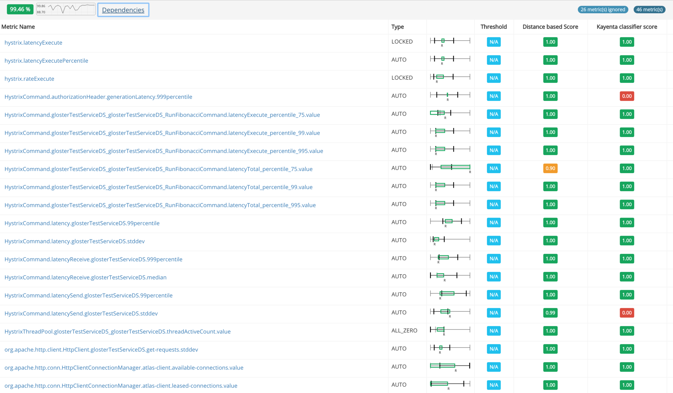
A few months after completing Gloster v2 I came across Kayenta, a very promising open source ACA tool that as an added benefit operates as a Spinnaker plugin. Browsing through the code and the related blog posts I saw some interesting ideas and common approaches. The first instinct, and an opportunity when great open source code is released, was to compare the two systems and potentially scrap and replace Gloster, or replace the reasoning logic in Gloster with something better. Since we do not currently use Spinnaker and there was huge effort involved into introducing Spinnaker just for testing Kayenta, I decided to try to plugin the Kayenta classifier into Gloster as a separate reasoning engine (Gloster was designed with this in mind). Bear in mind that this is a gross simplification, since Kayenta and Gloster clean up and prepare data in different ways, so feeding the data prepared for Gloster by Gloster will not necessarily yield the optimal results with the Kayenta classifier. In any case, our experiments showed pretty similar results, with Kayenta being a little more sensitive in some cases resulting to false alarms (lower scores). Again, I am making no claim on any of the two approaches being better, but what is interesting is that plugging a different engine into Gloster (with the risk of being a little "out of context") validated the results we are getting with Gloster's native approach.
The following screenshots show two representative examples.
Outlook
Gloster introduced an extra, automated layer of release confidence into our CICD pipeline. Version 2 was really successful in making it straightforward for service owners to adopt canary analysis. We continue evolving Gloster for achieving better accuracy, extending support for other types of anomaly signals (e.g. better logging support) and improving performance and scalability (e.g. datastore sharding). Creating and open sourcing a Gloster Spinnaker plugin is also something we are looking into.


.png)
%20(1).png)
%20(1).png)
.png)
.png)
%20(1).jpg)