Thank you! Your submission has been received!
Oops! Something went wrong while submitting the form.


Color is a big part of Upworks identity. It is a driving force for our brands recognition and we use a limited palette to reinforce this recognition.
Black and white is the base of our brand and we use Upwork Glimmers to bring a new dimension of color to life.
Our marketing color palette continues to build equity in our green. A new dimension of futuristic vibrancy comes from our ‘Primary Glimmer’. We have a tight and restricted color palette, which we will use with intention.
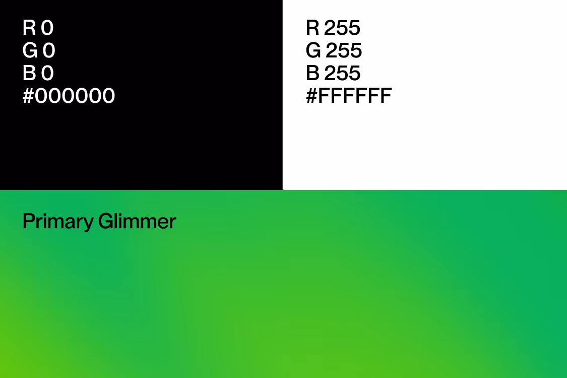
Primary
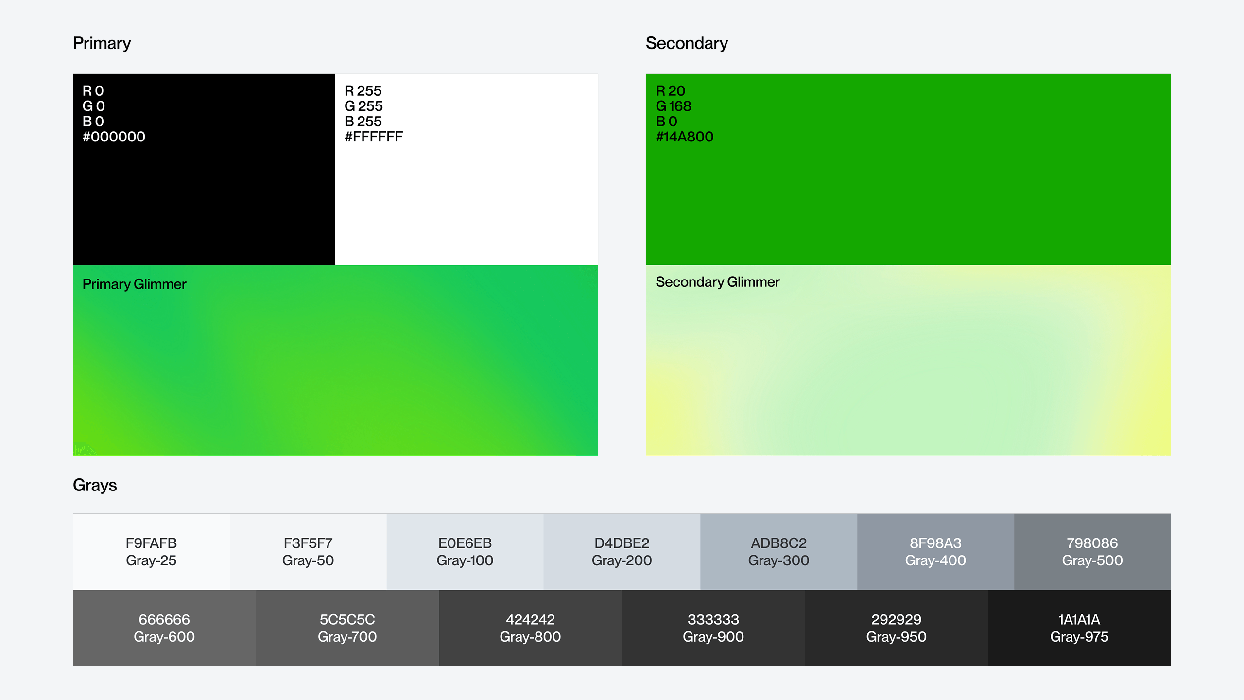
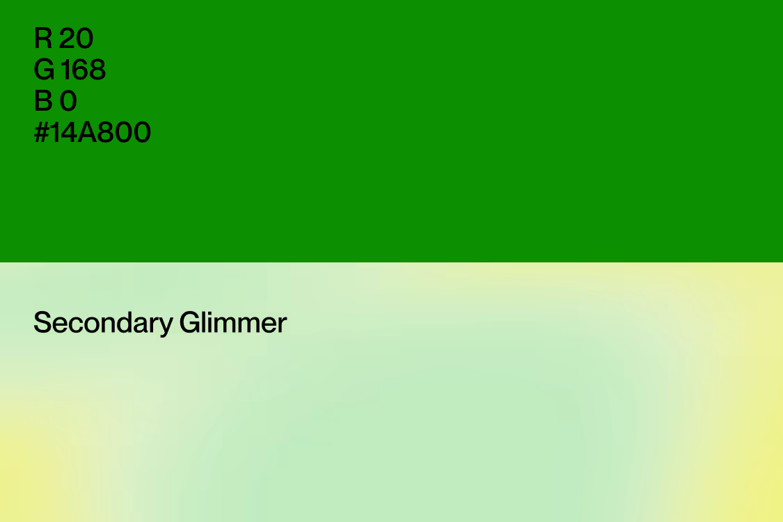
Secondary
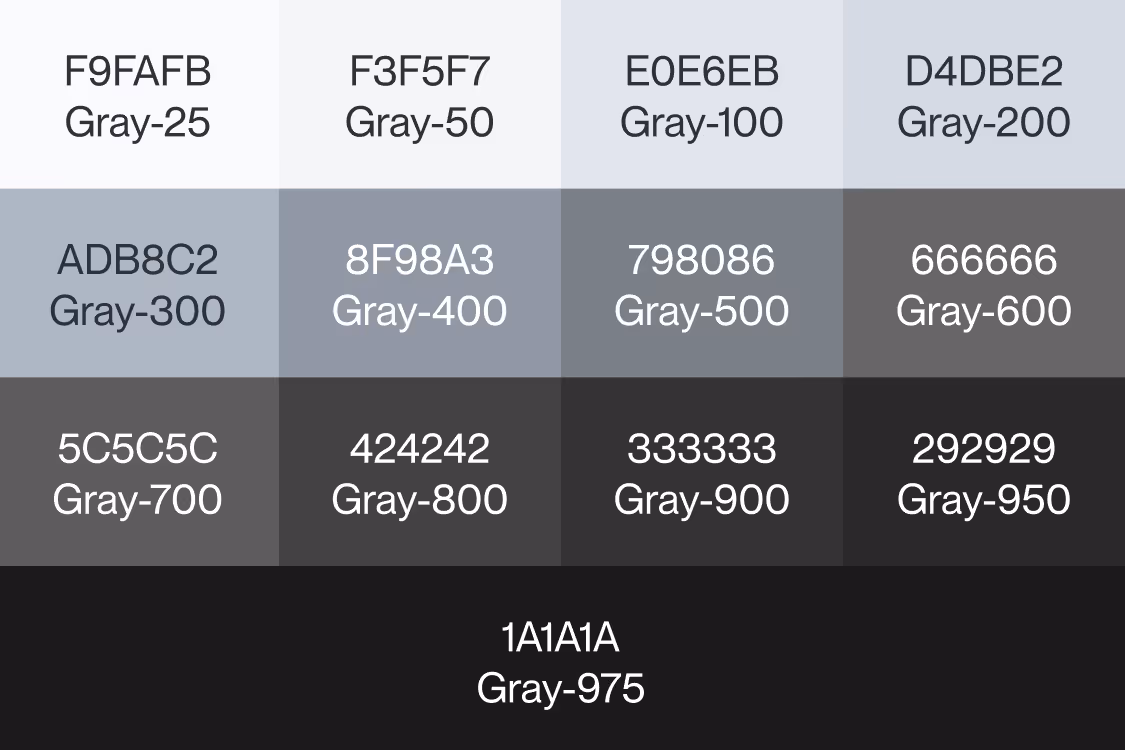
Grays
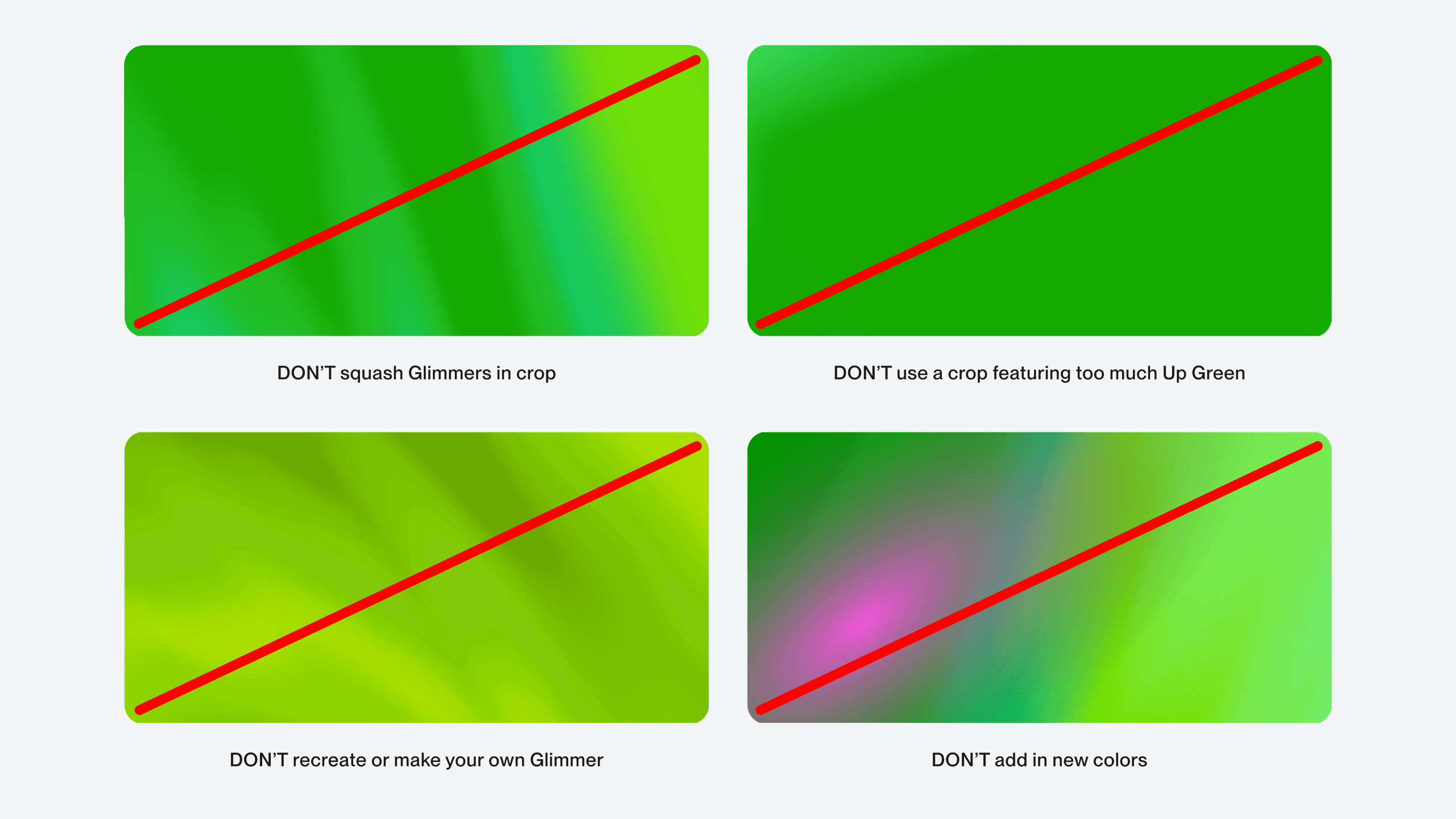
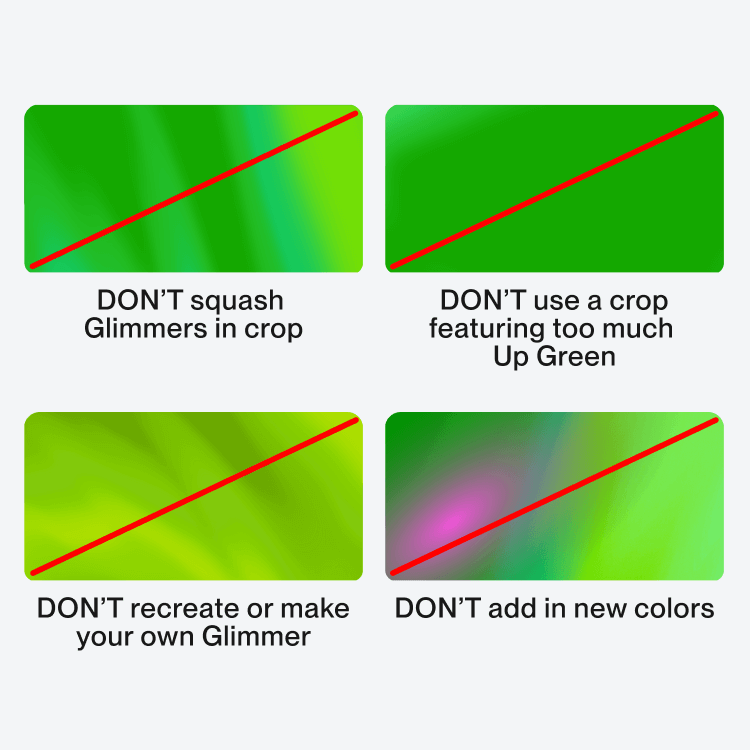
Here are some things you should never do with the Upwork color palette.
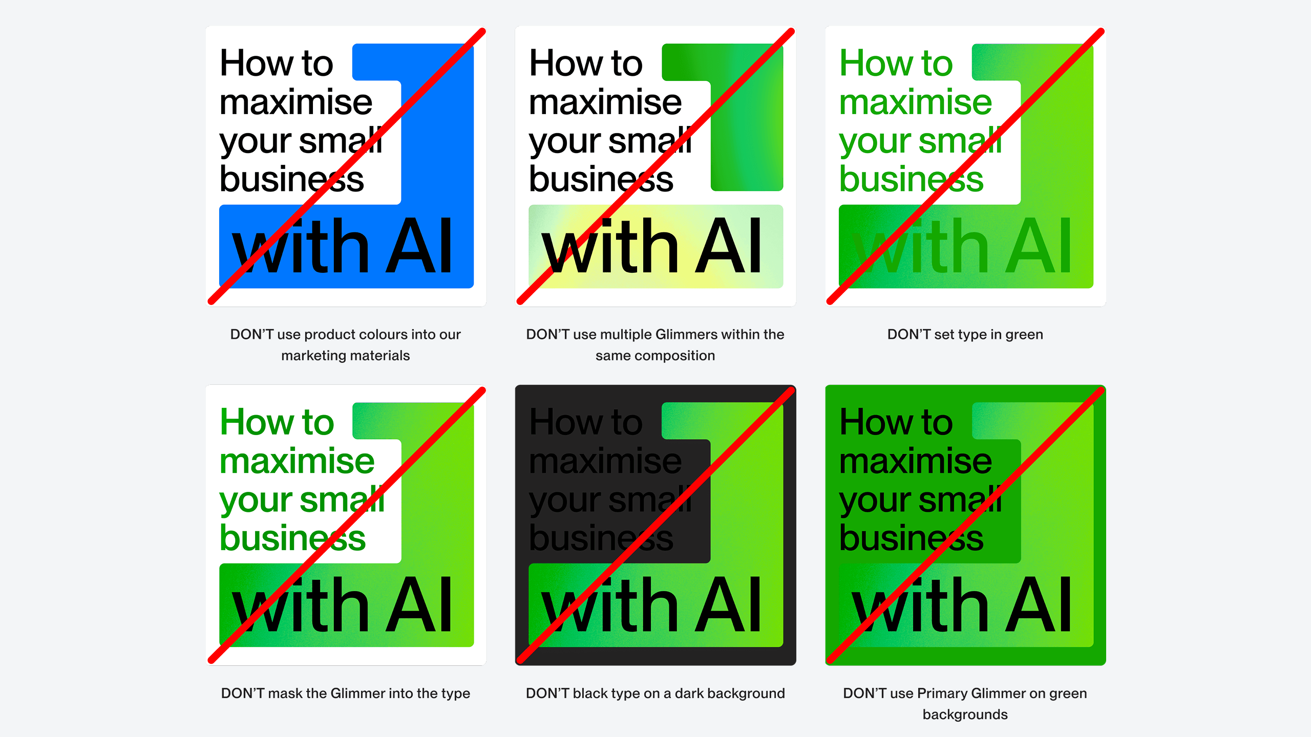
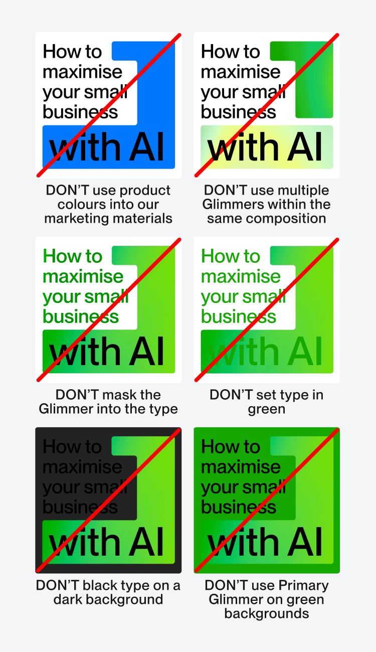
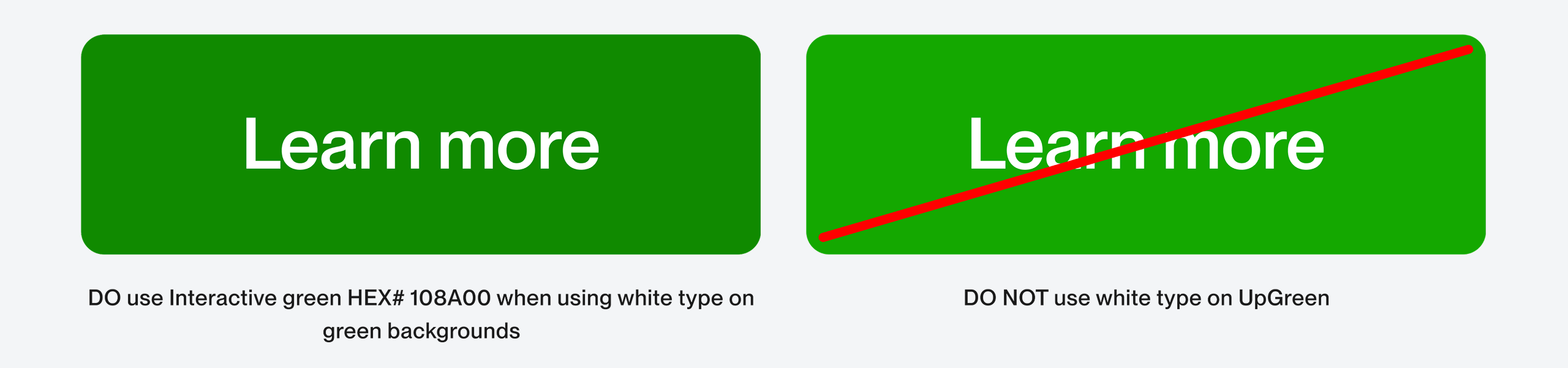
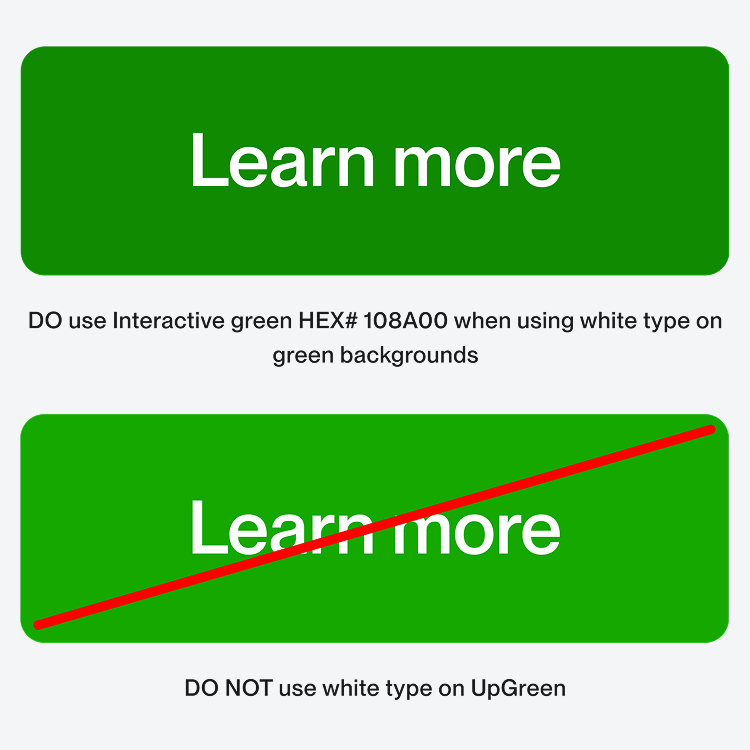
White type on Up Green does not meet accessibility standards. When using buttons with white type our ‘Interactive Green’ should be used instead.
Glimmers are a core part of our brand identity, they give our green and, in turn, brand life.
The old ways of working are flat and dull, our Glimmer adapts and flows bringing energy, movement and depth.
Glimmers should never be re-created. Only the original files should be used.
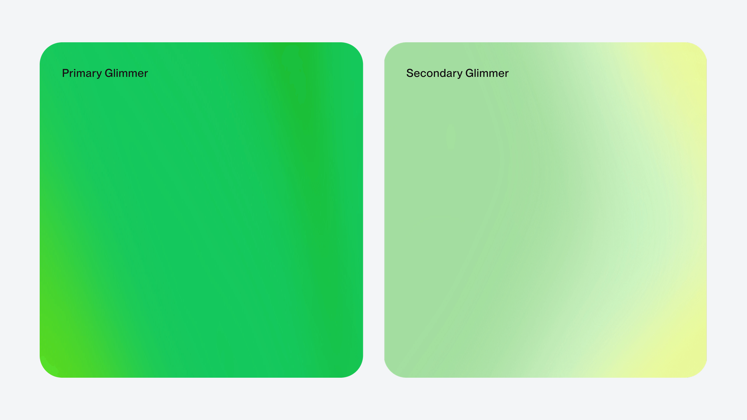

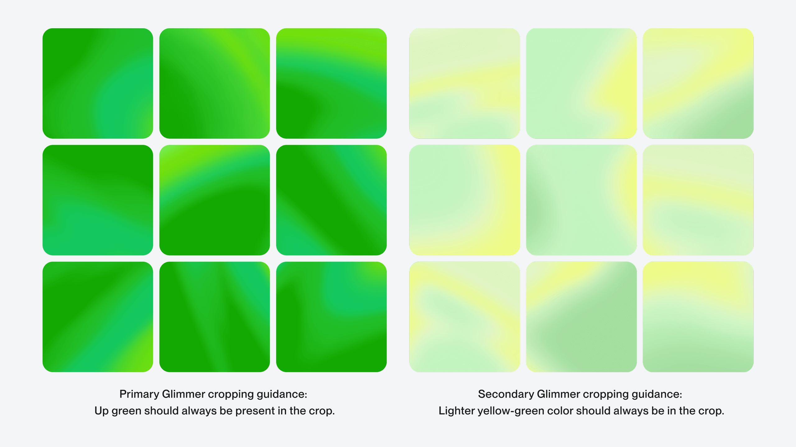
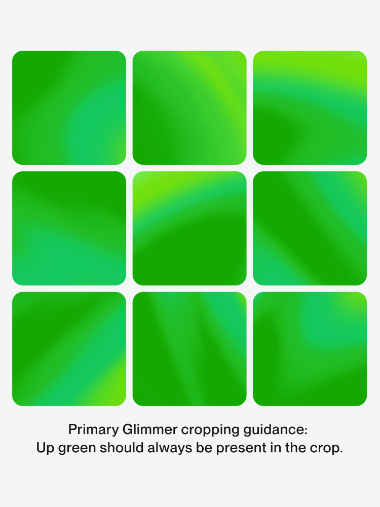
The Primary Glimmer is a part of our primary color palette. It is made predominantly using Up Green, along with a wider gamut of lighter and darker greens to allow for color movement and variation. For example: as backgrounds in text only applications and layouts using illustration.
Wherever we use our Primary Glimmer, Up Green should be present in the crop.

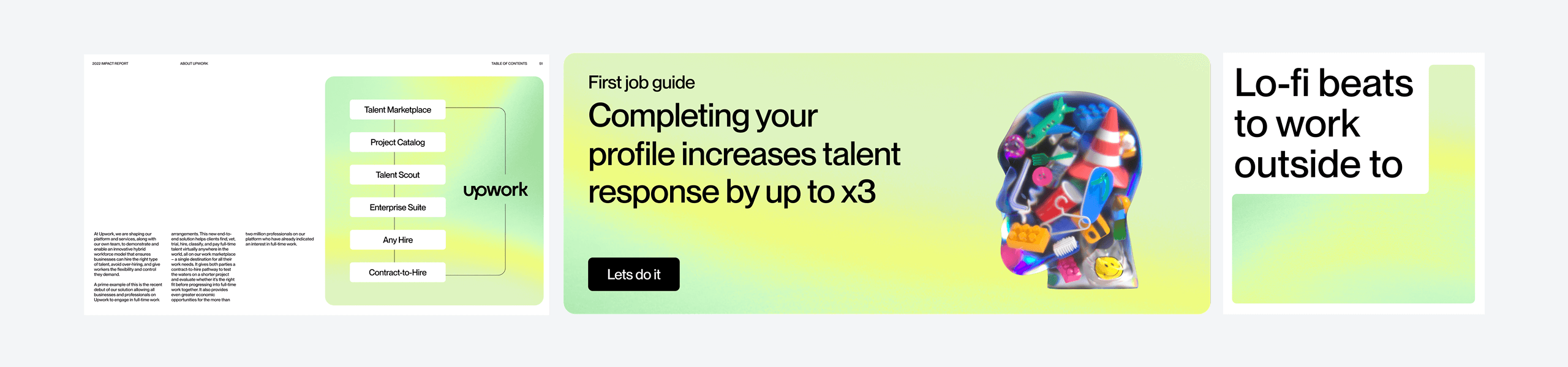
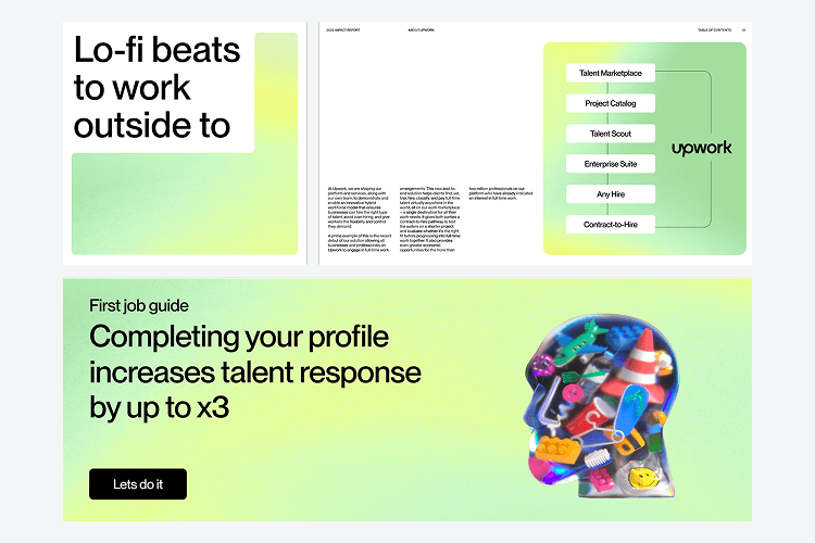
Examples of how the Primary Glimmer can be used. Illustrations are WIP and for illustrative purposes only.


In some circumstances our Primary Glimmer will not be appropriate to use or be feasible. Examples of this are in graphs. In these circumstances our flat Up Green should be used. We should limit this use as much as possible.

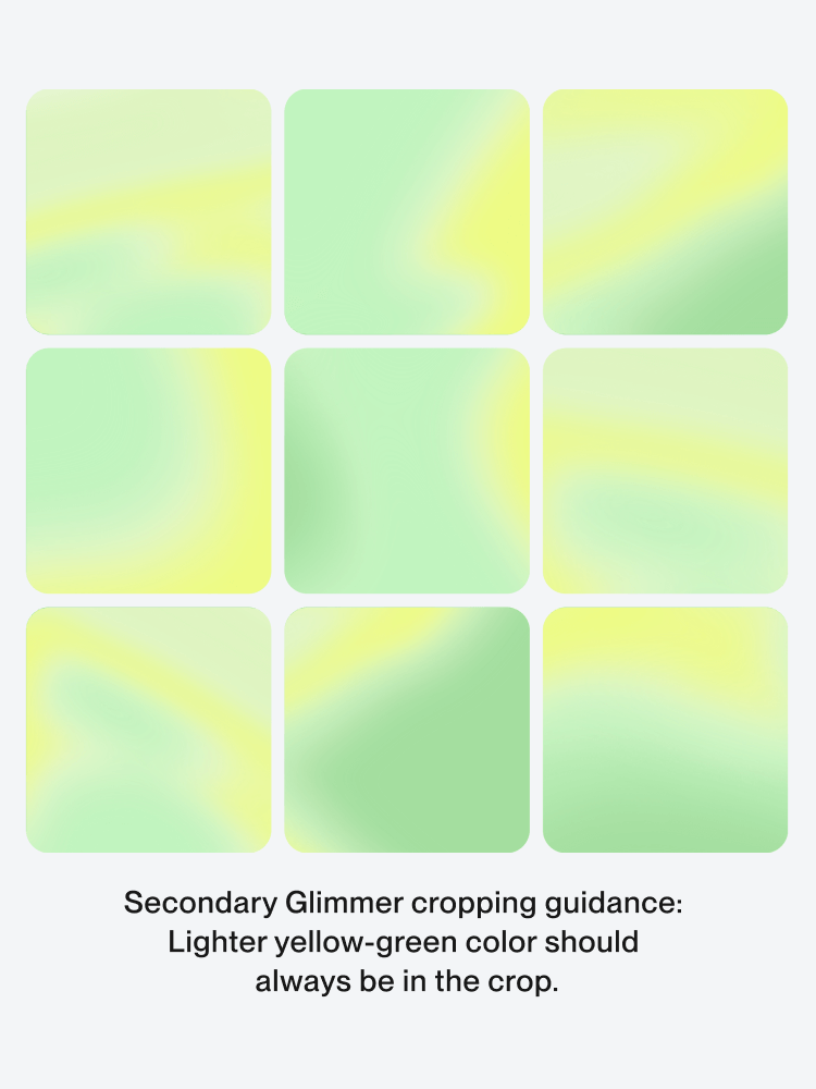
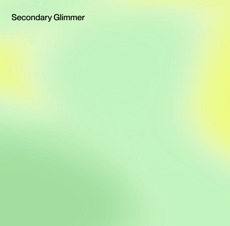
The secondary Glimmer is part of our secondary color palette and should be used accordingly.
Made from lighter complimentary greens and yellows it follows the same thinking as our Primary Glimmer, but with less visual impact.
It should be used for backgrounds and to add some visual rhythm to our brand, ensuring our Primary Glimmer doesn’t get tired and over used.
.avif)

The secondary Glimmer is part of our secondary color palette and should be used accordingly.
Made from lighter complimentary greens and yellows it follows the same thinking as our Primary Glimmer, but with less visual impact.
It should be used for backgrounds and to add some visual rhythm to our brand, ensuring our Primary Glimmer doesn’t get tired and over used.
Our Glimmers are cropped from a much larger ‘Master Glimmer’. We provided some recommended crops and guidance and here we can see an example of how this is used.
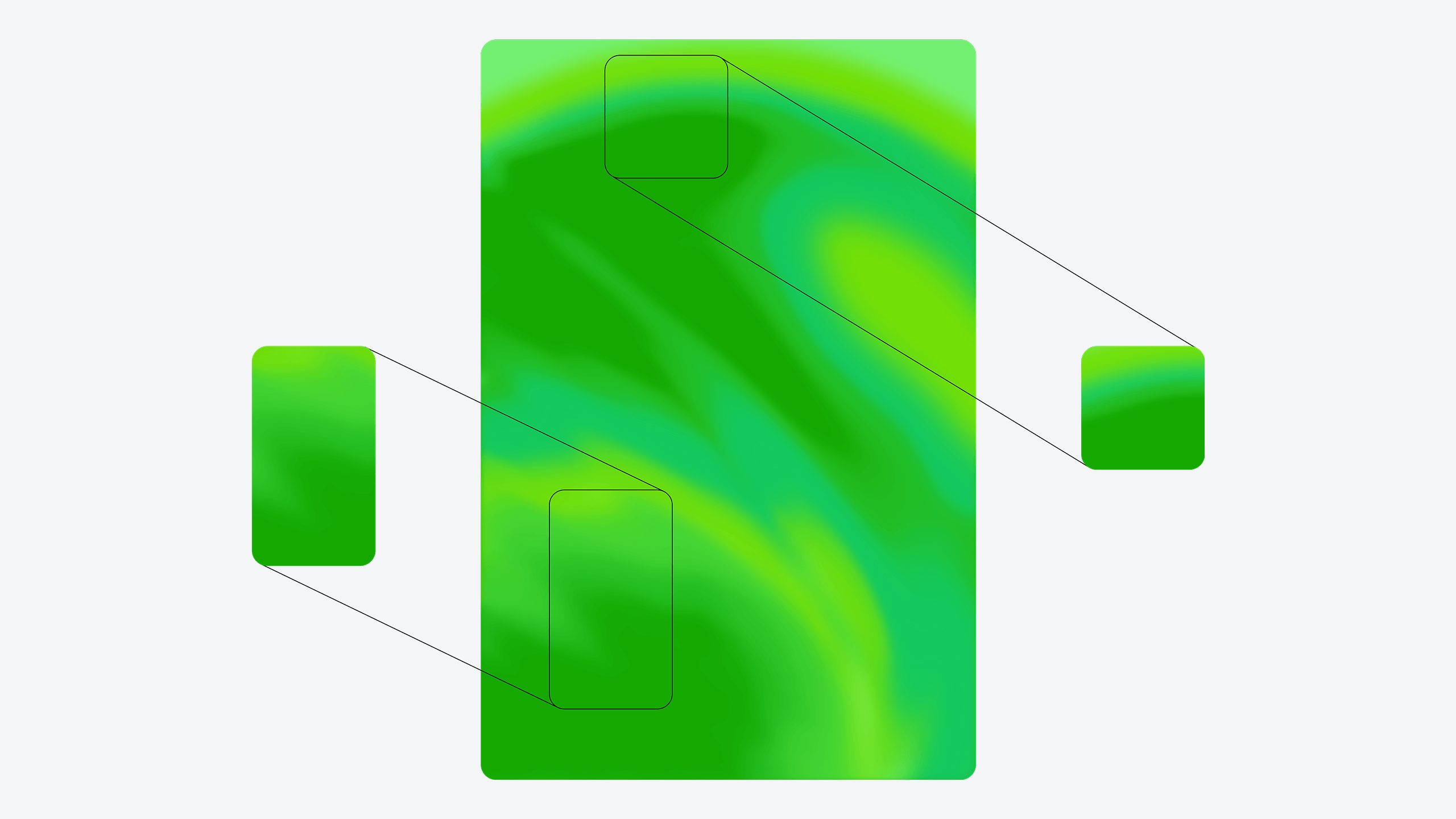
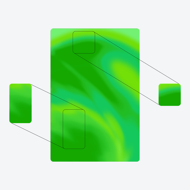
Recommended crops for both the primary and Secondary Glimmer.