Thank you! Your submission has been received!
Oops! Something went wrong while submitting the form.
.webp)
.png)
The Upwork logo is often the first point of contact with our brand. Accordingly, it needs to be treated with respect. While the design has remained unchanged, there have been some updates to its usage that are outlined below.
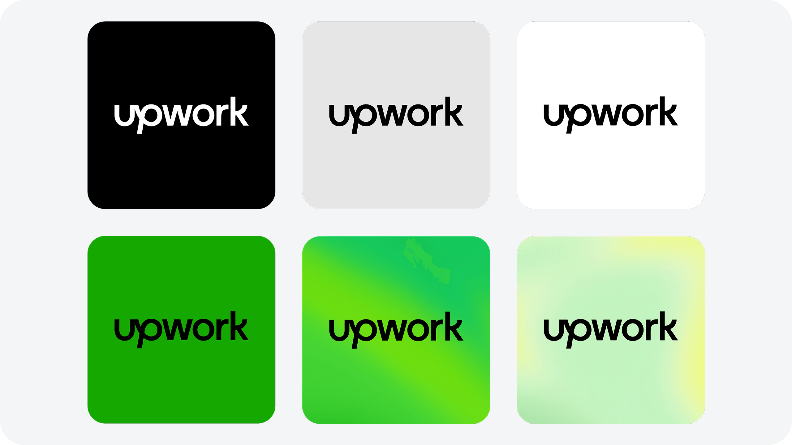
Logo assetsThe Upwork logo has been designed to be clean and approachable, representing the connection we foster between clients and talent, while conveying an upward sense of movement. Our logo is used in either black or white. It should be used in black whenever possible except on black backgrounds.
%20(1).png)
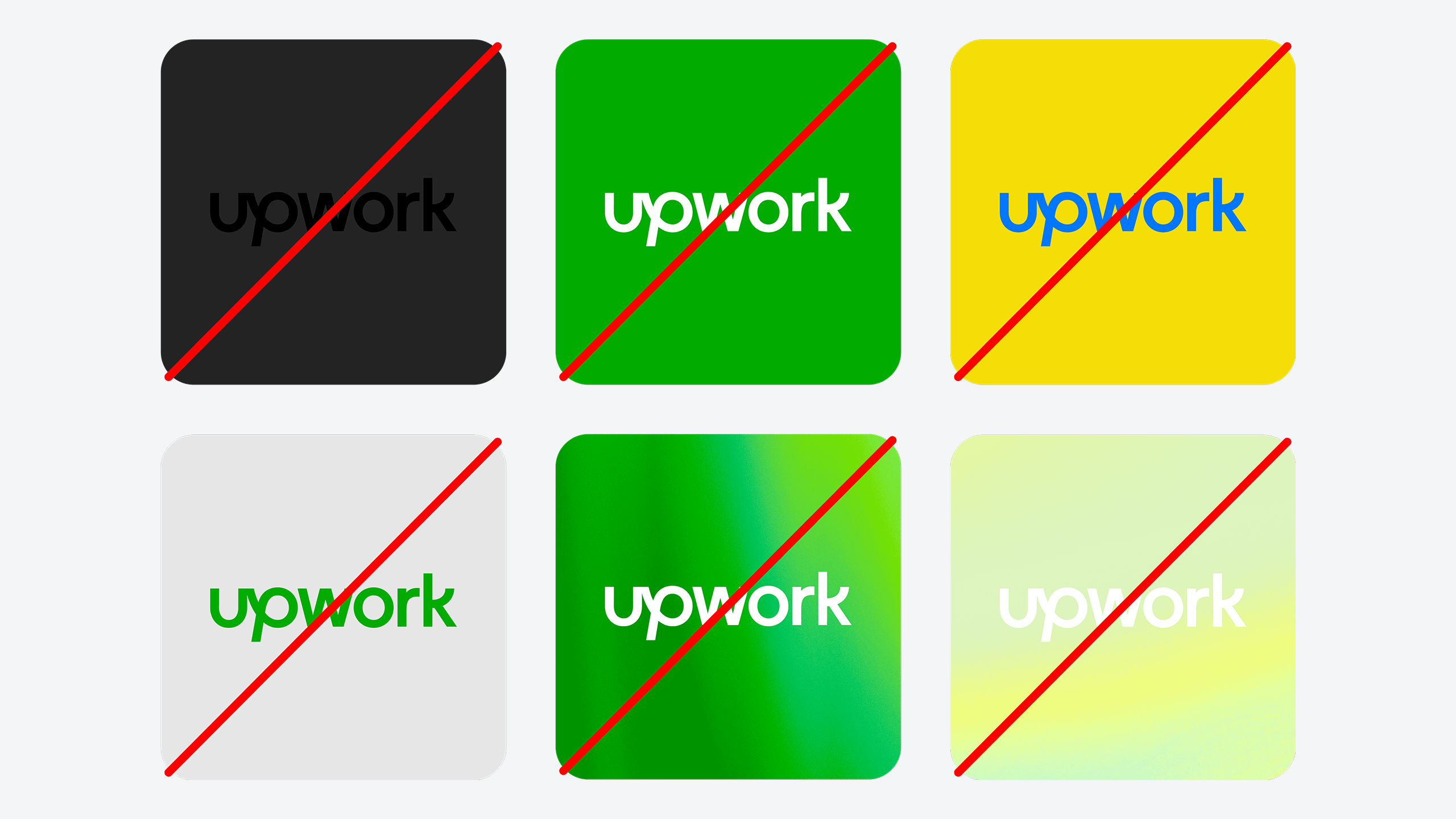
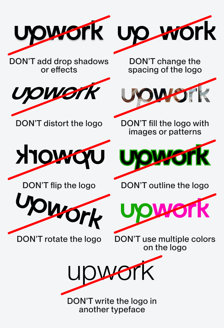
❌ Don’t use a background color with Up Black that provides too little contrast. The white logo should be used in these cases.
❌ Don’t use the white logo on Up green backgrounds. This doesn’t pass our accessibility needs and should be set in black instead.
❌ Don’t use the logo in Up Green. Our logo should be used in black wherever possible.
❌ Don’t introduce new colors for the word mark or backgrounds.
❌ Don’t use the white logo on our Primary Glimmer.
❌ Don’t use the white logo on our Secondary Glimmer.
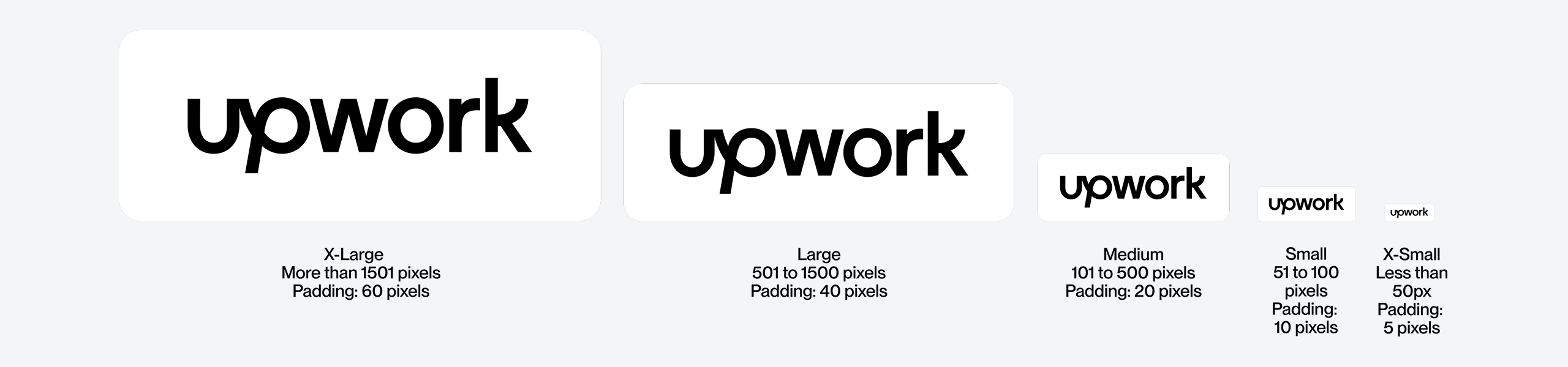
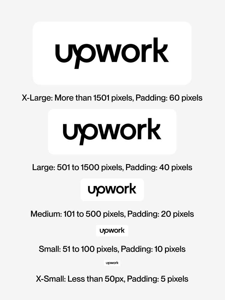
A certain amount of space is needed around the logo to prevent it from becoming cluttered by surrounding artwork, images, or the edge of a page. On screen, clear space has been provided for our logo at 4 different sizes. Use each logo with the corresponding art board size (see the Grid section for a more detailed breakdown on setting up art boards with logos).
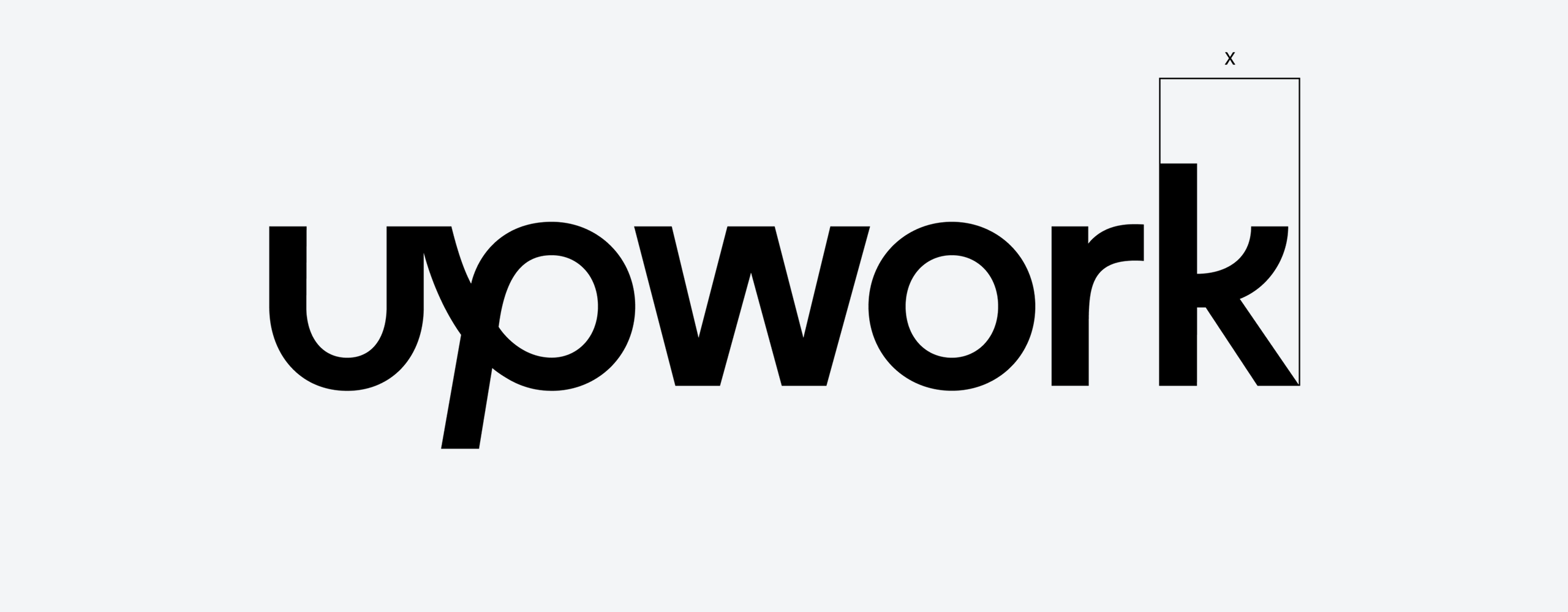
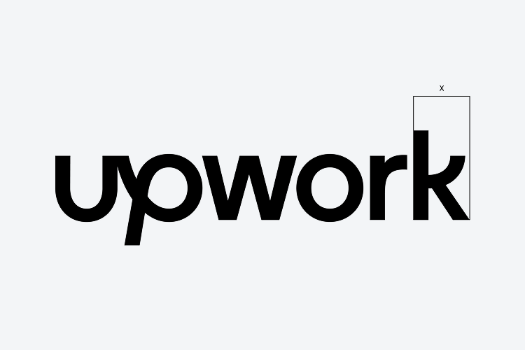
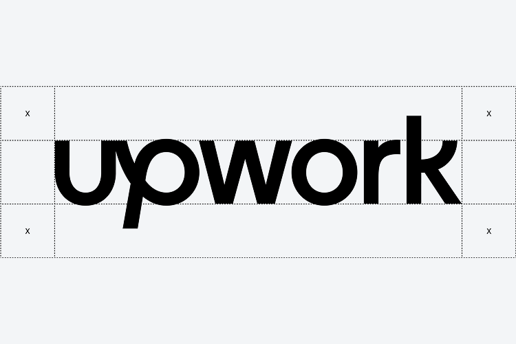
A certain amount of space is needed around the logo to prevent it from becoming cluttered by surrounding artwork, images, or the edge of a page. In print, or if a pixel grid isn’t present, clearspace is defined by the width of the ‘k’, as illustrated on the right.

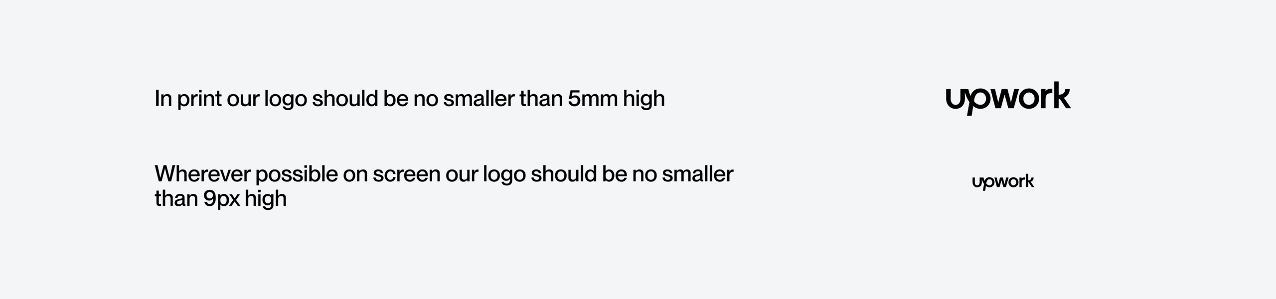
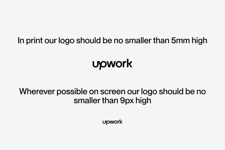
Our wordmark was designed and tested to work at various sizes. On screen the logo should be no smaller than 18px tall and in print no smaller than 5mm tall.
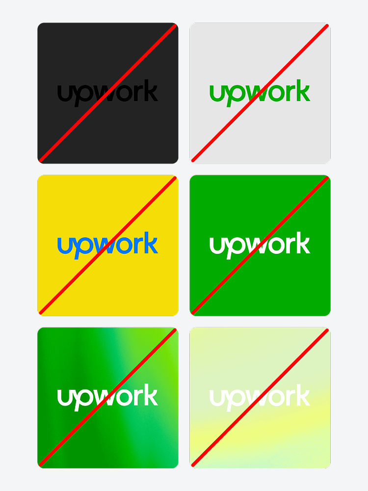
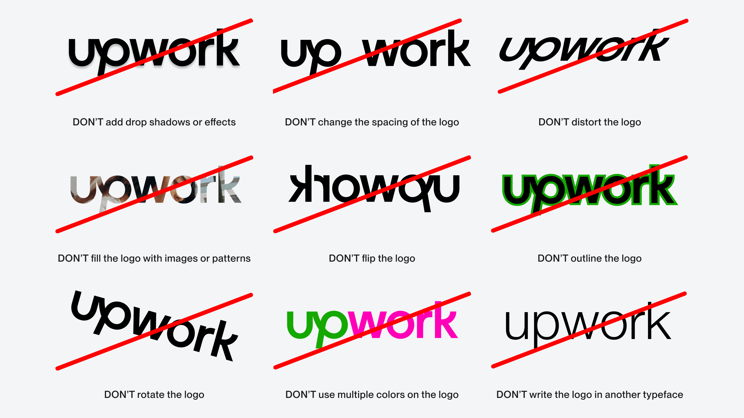
Here are some things you should never do with the Upwork logo.
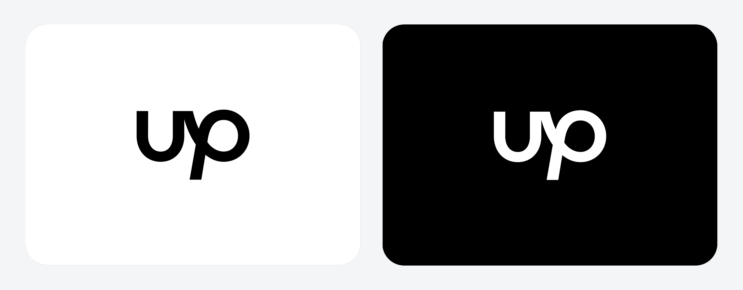
In certain instances when we have limited space, such as social media avatars or our app icon, we can use the short version of our logo in black or white.
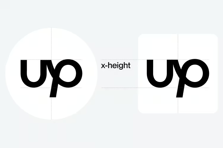
When using the Up symbol as our app icon, make sure it is optically centered, using the x-height of the “u” as a guide for its placement.
.avif)
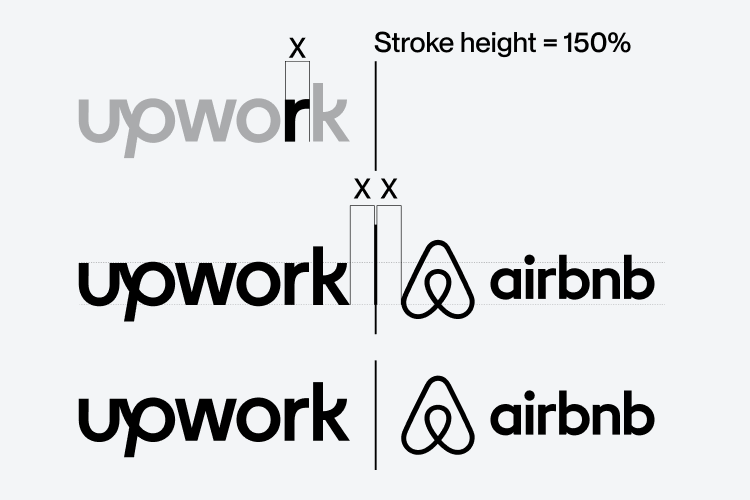
The Upwork logo can be locked up to the left of partner brands and collaborators with a vertical stroke between them. Logos must be optically sized and centered for balance. A space equivalent to the width of the “r” must be given before and after the vertical stroke.
.avif)