Thank you! Your submission has been received!
Oops! Something went wrong while submitting the form.


Our underlying grid structure gives us space to play and experiment within a framework. Inspired by the flexibility of remote work, it gives us the ability to generate a wide array of compositions while still retaining a consistent look and feel.
Titled the ‘Flexible working blocks’, it brings a new dimension to our layouts, acting as a tool to build dynamic morphing shapes and place graphic elements across our designs.
Note: this grid is to be used in marketing and for brand purposes only.
Our flexible working grid takes on many shapes and sizes. It is adaptable to any and all formats and ranges of expressions.
Many of the assets that make up our flexible working blocks are available in the Figma file provided. This section will review how to use these assets and how to build others.
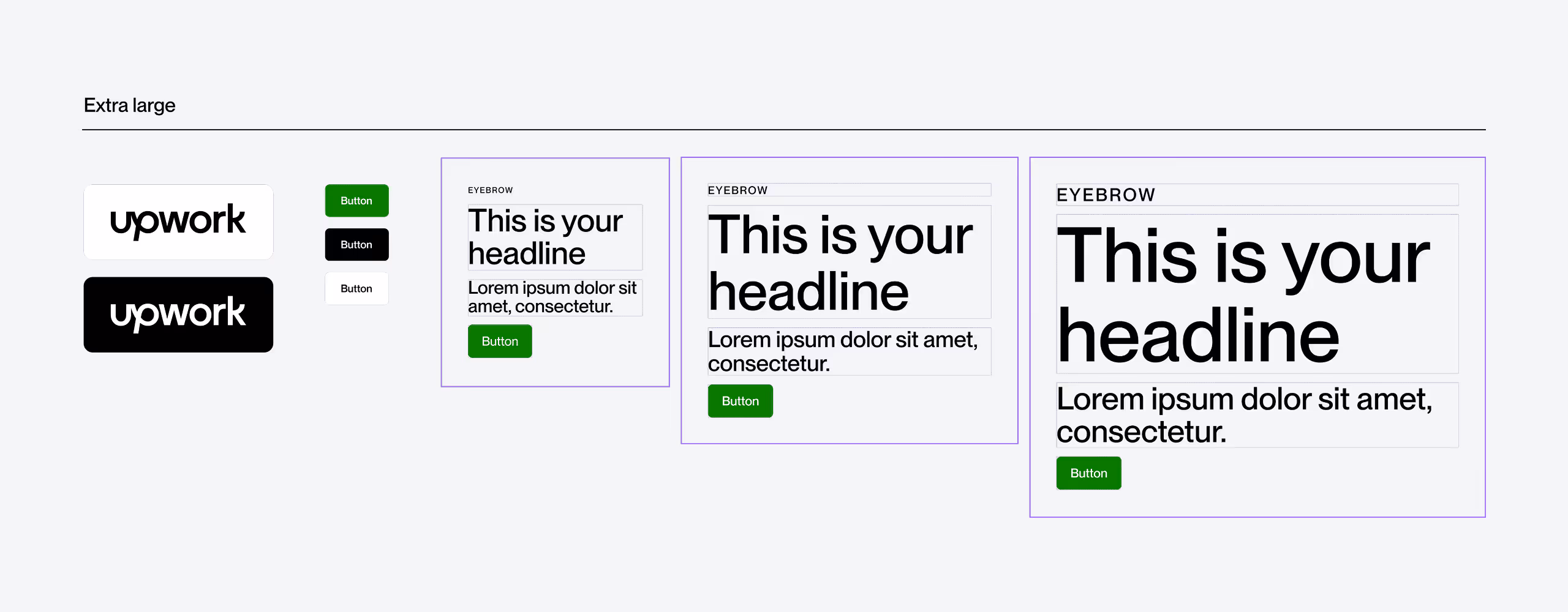
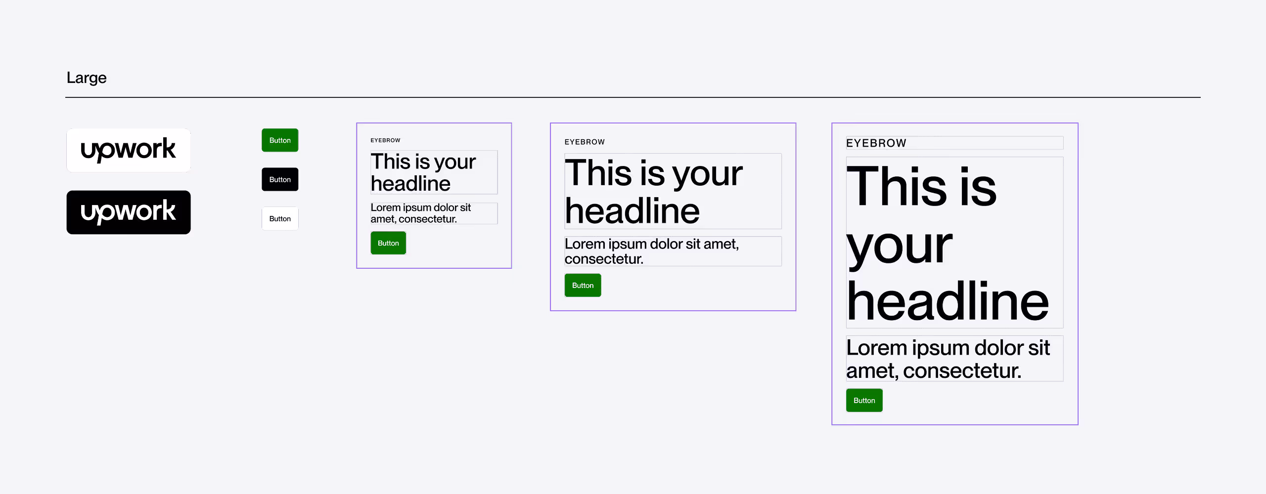
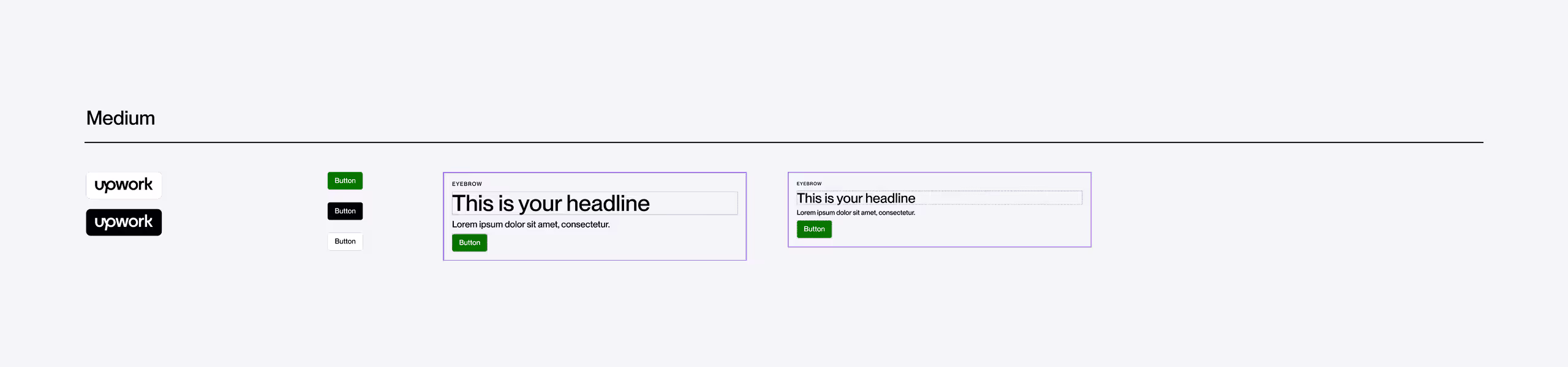
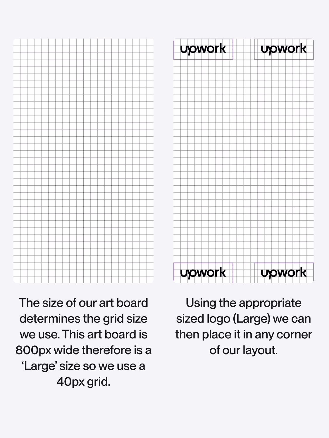
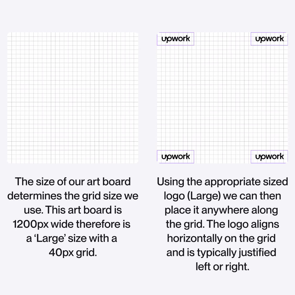
Our layouts and grids are determined by the width of the canvas. Each size and break point has a corresponding grid/margin, corner radius, button radius and logo that should be used. This not only ensures consistency but also a seamless process for creating layouts within Figma.
This chart offers all the sizes and breakpoints that you should need for your layouts.
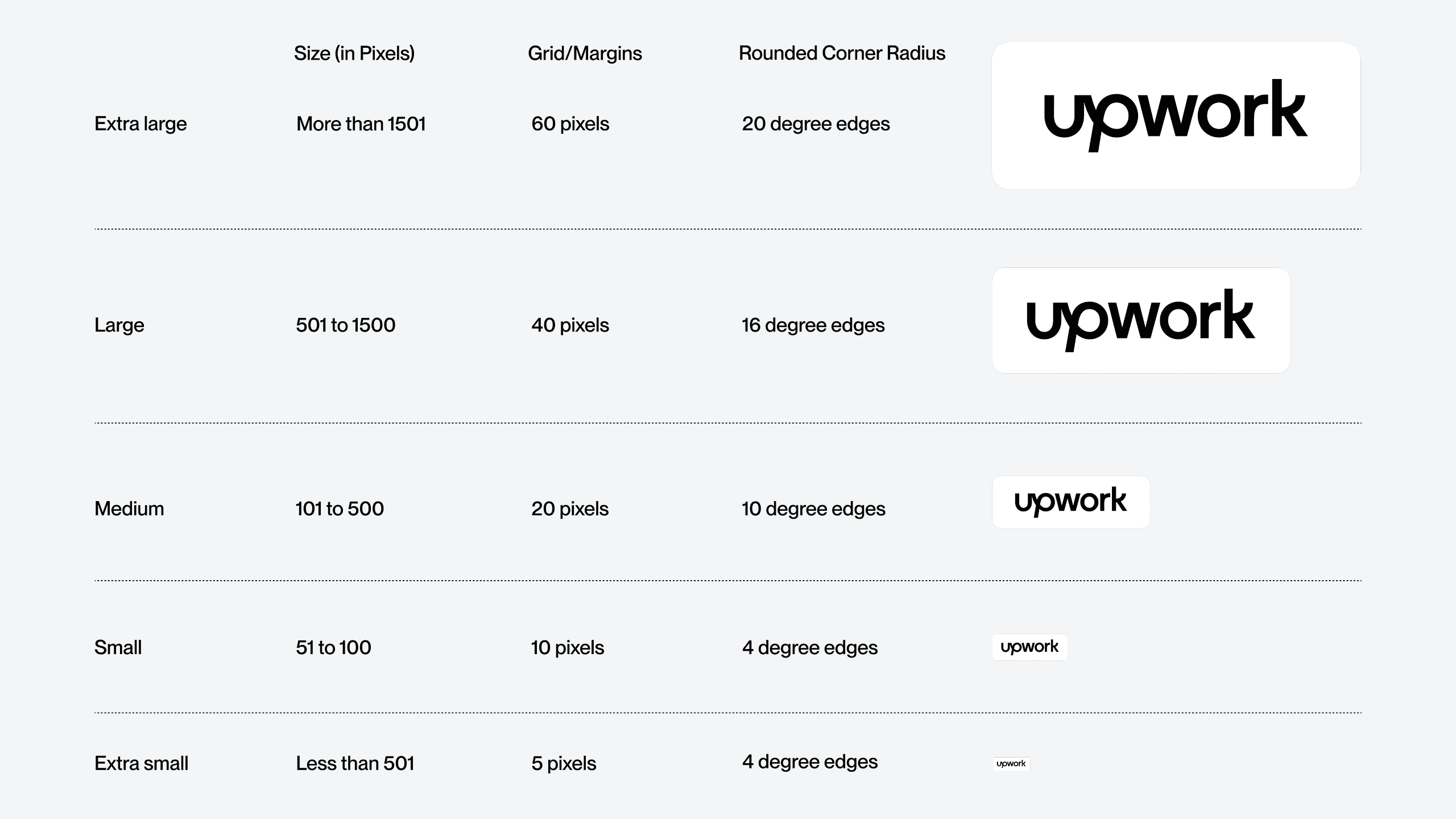
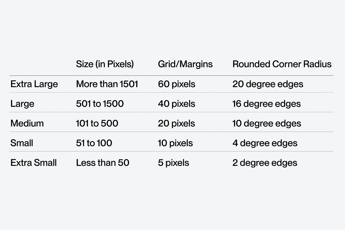
For each of these breakpoints a logo, button and basic type layouts have been set up in our Figma. This has the appropriate spacing to allow you to create consistent layouts and compositions.
NOTE: components shown at scale, for illustrative purposes only.
For each of these breakpoints a logo, button and basic type layouts have been set up in our Figma. This has the appropriate spacing to allow you to create consistent layouts and compositions.
To view components click on the link below:
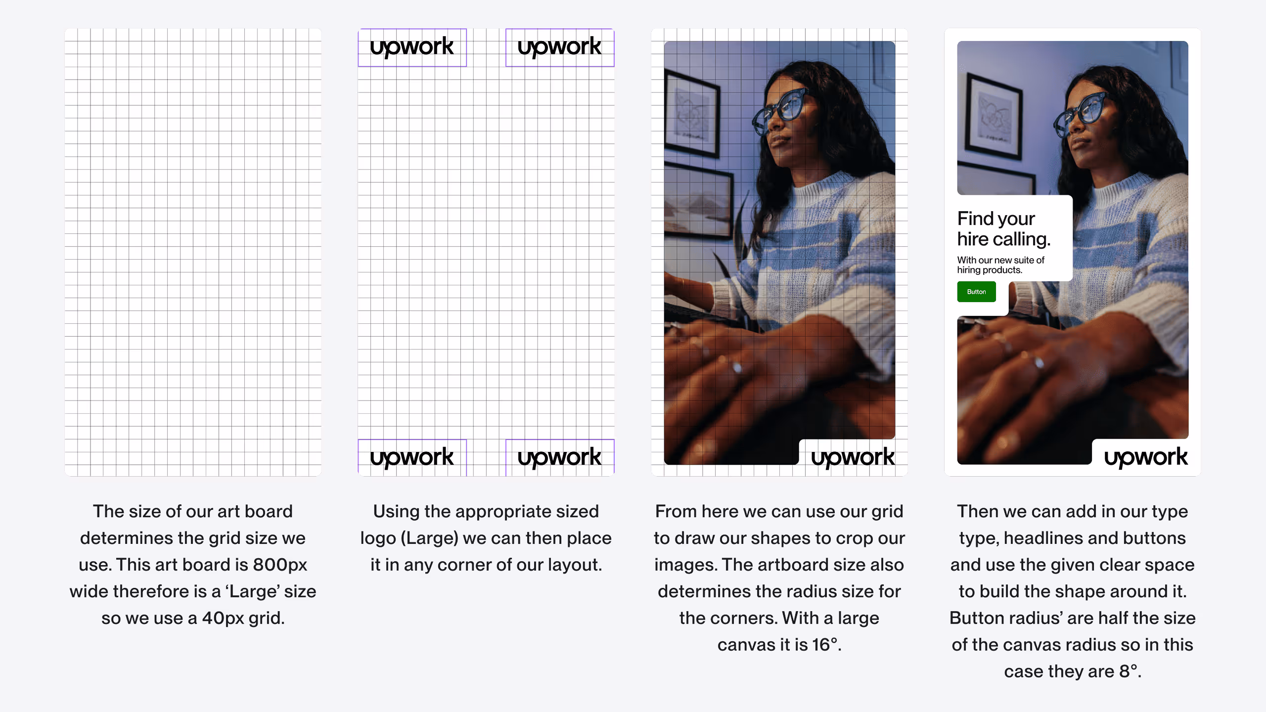
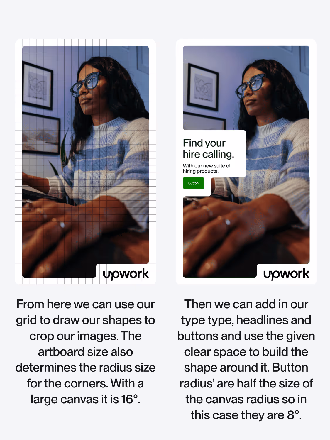
Once we have the size of the art board we can grab the corresponding assets and use them to build out layout. The example shows the process for an 800px wide frame but the process is the same regardless of the size.
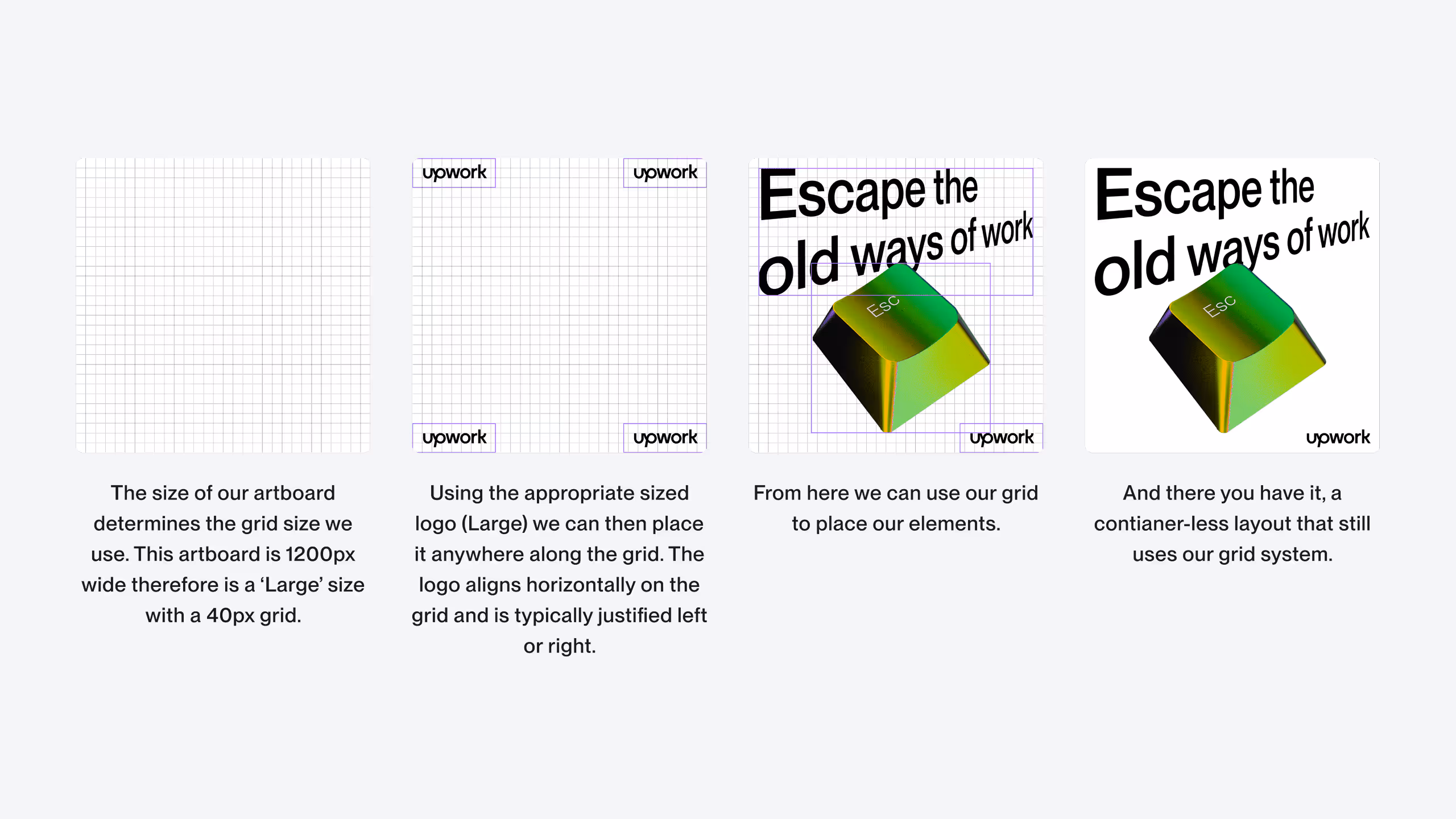
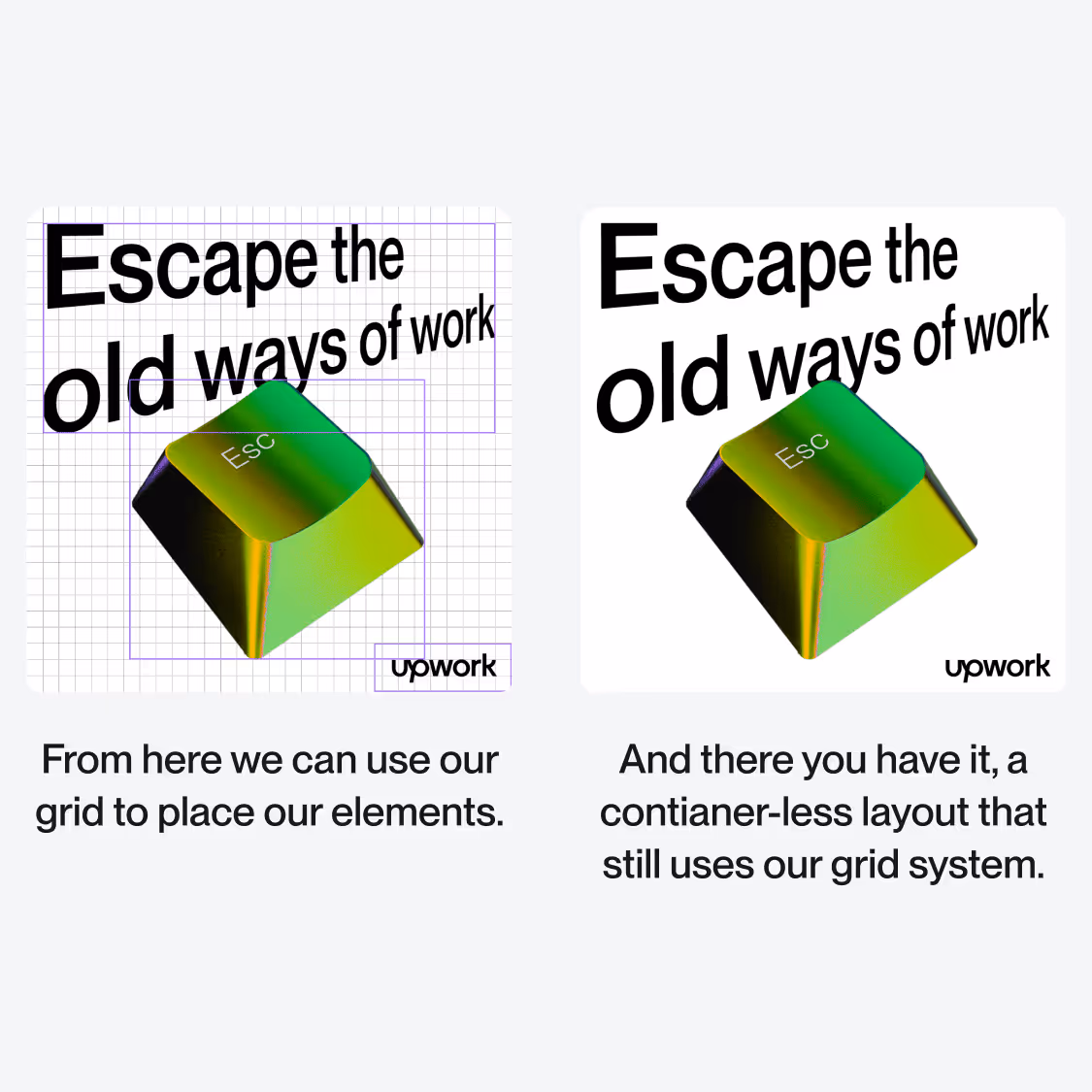
When making a layout that does not use a container shape, we can still use our grid for the composition. Even when elements overlap, aligning them to the grid and using the logos margin will give us a consistent framework.
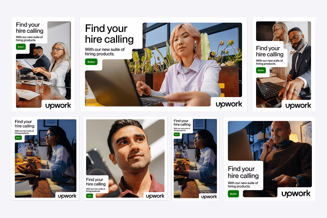
With this system we can create an endless amount of layouts, tones, expressions and compositions. Following these simple rules and using these tools keeps everything feeling on brand yet adaptive and ever changing.

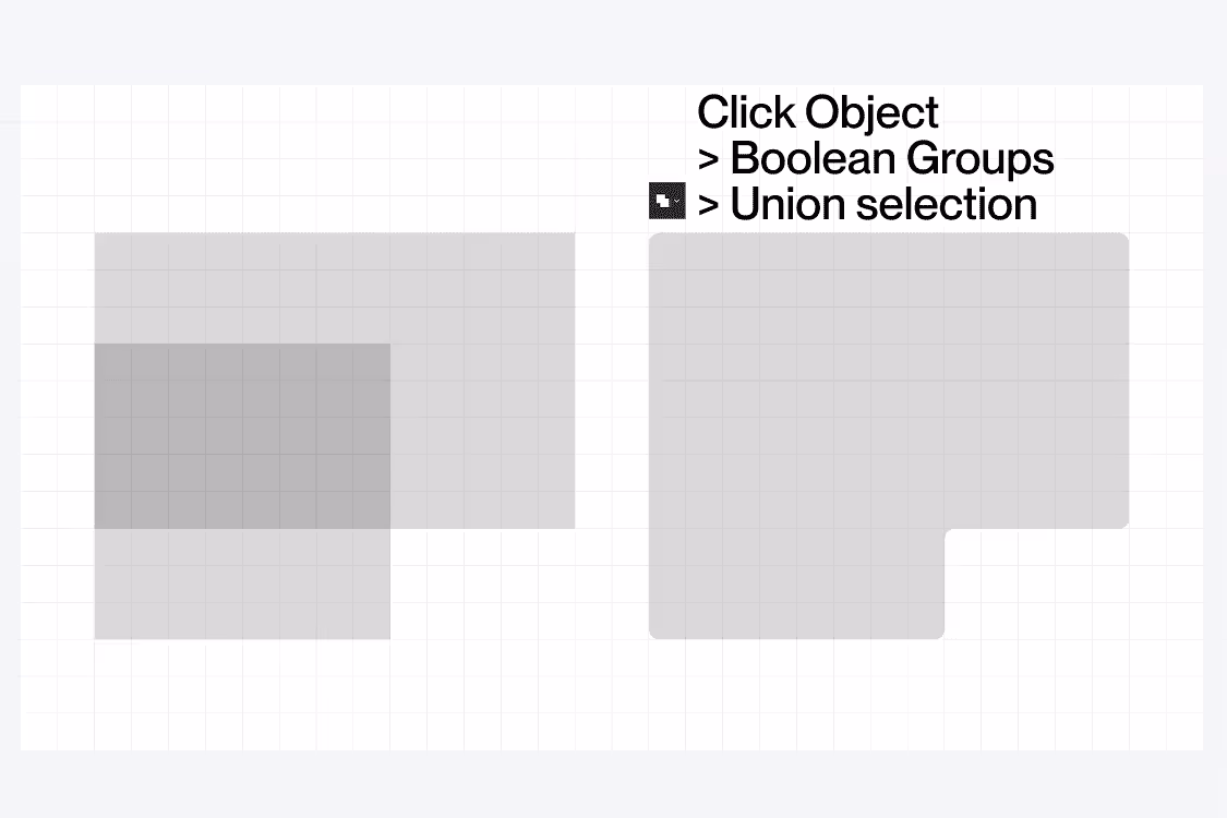
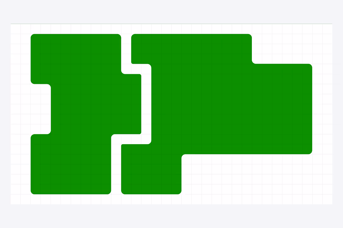
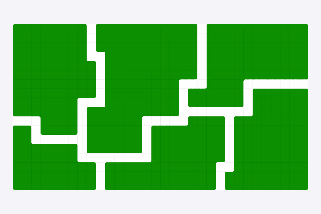
Drawing our containers is as simple as following the corresponding grid.
Once the container has been drawn around the content we simply use the ‘Union selection’ in Figma (‘Unite’ in Illustrator) to make the compound block. From there we can add our corner radius to the entire shape.
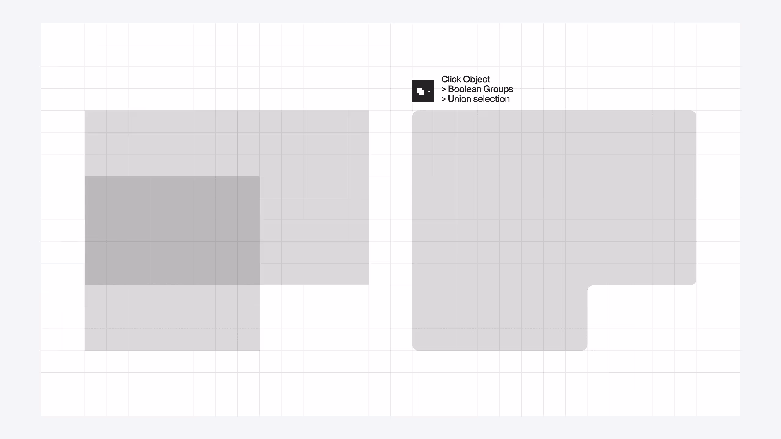
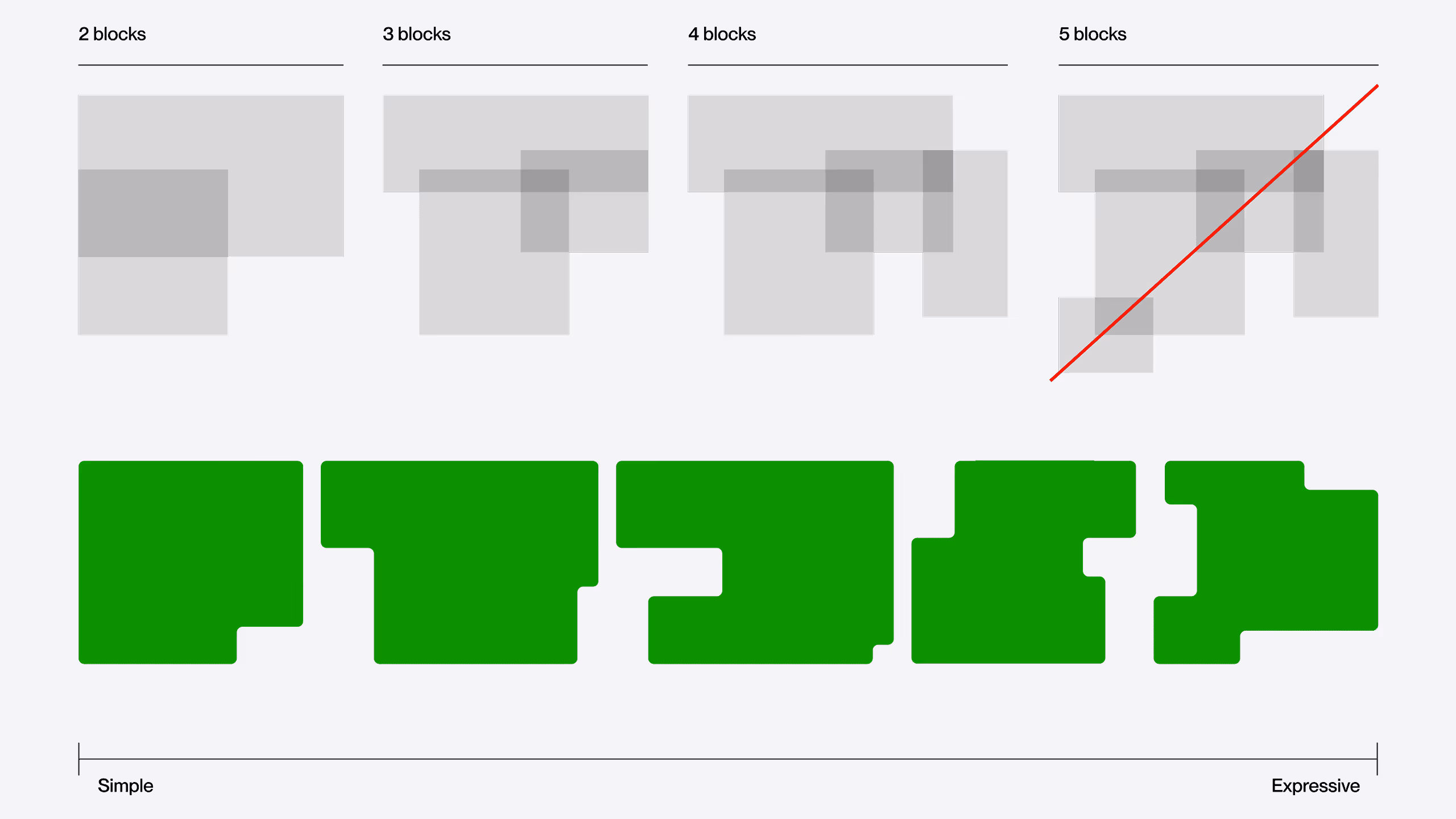
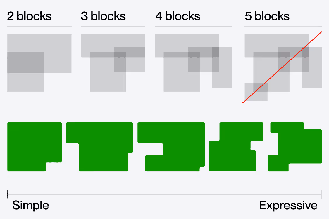
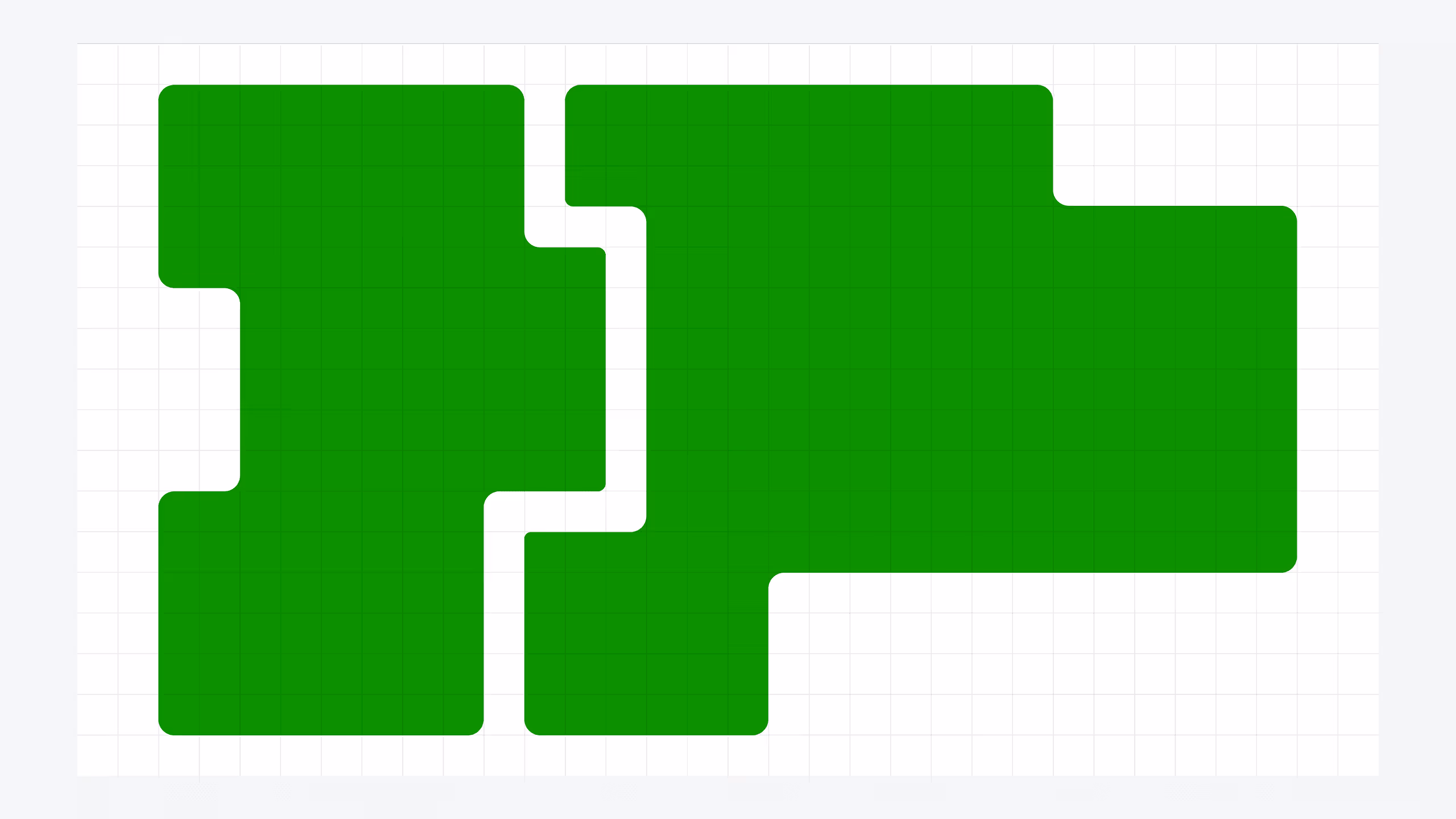
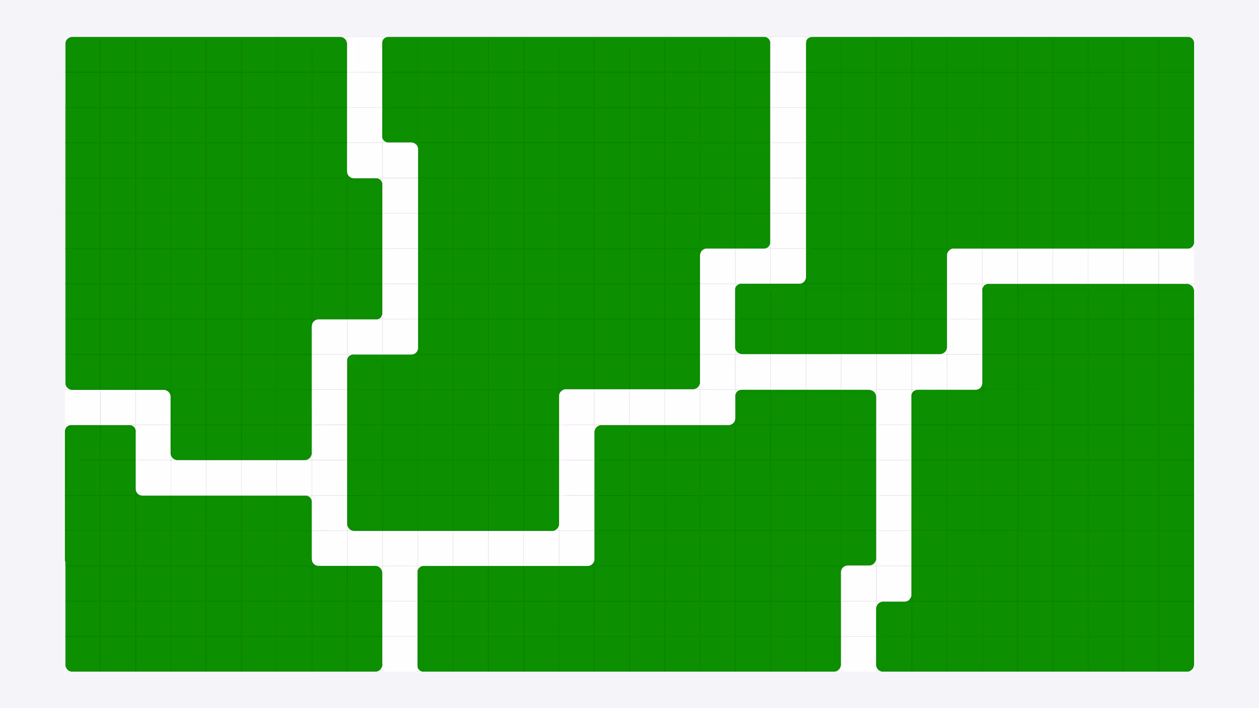
Our containers are made up of 2, 3, or 4 blocks. Anything more than that begins to look too complicated and should be avoided.
Using up to 4 blocks keeps it feeling consistent across a wide scale and also allows us to express simple to expressive shapes.
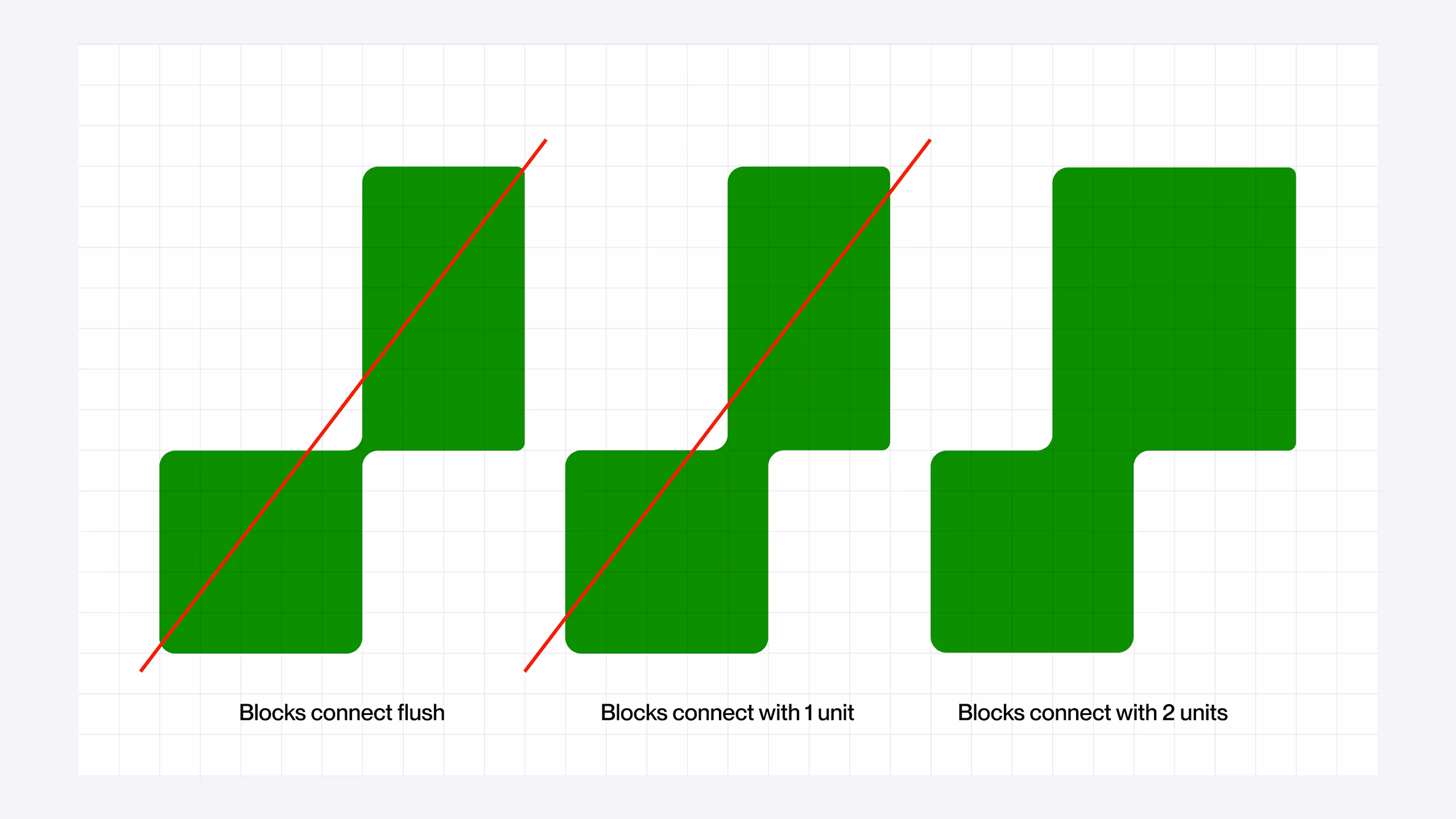
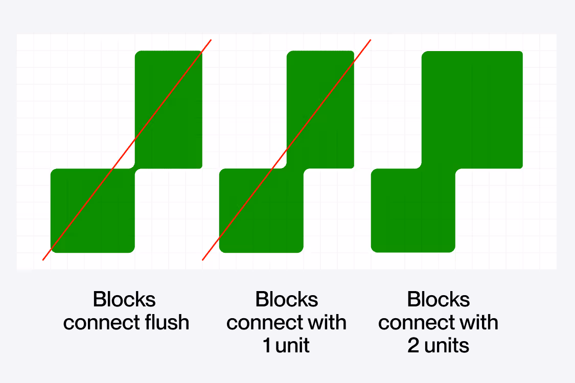
The way our containers connect is very important. Anything too thin feels fragile and dainty.
We should always be connecting our containers by at least two units on our grid as shown.
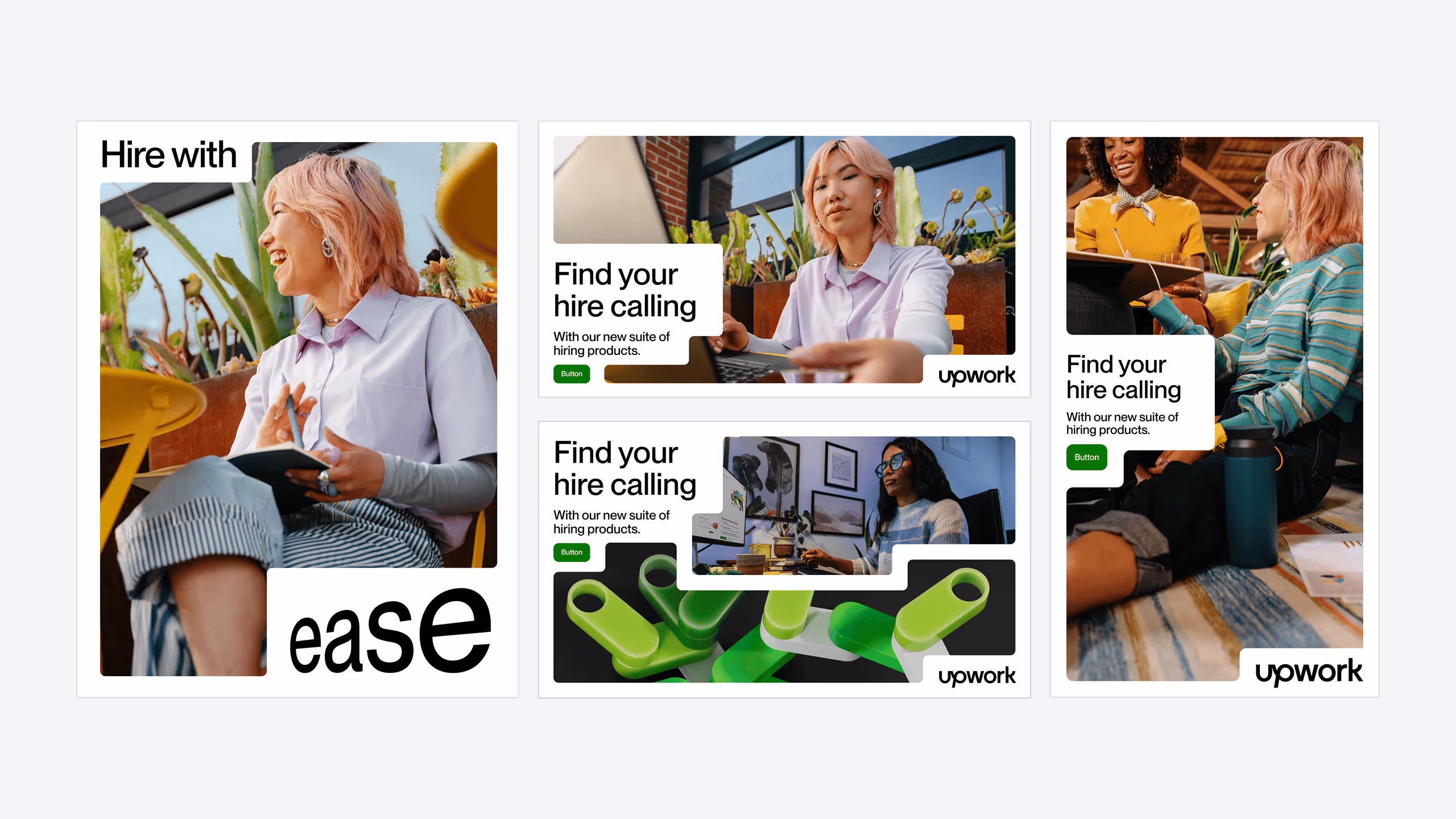
Interlocking containers are a big part of the graphic identity and great for story telling. We can use them to illustrate the connection between teams and co-workers and even emphasize the ability to connect remotely no matter our location.
When connecting containers there are a few rules to follow:
1. Avoid blank spots
2. Leave one unit of space between blocks
3. There should be at least one point of connection between the shapes but multiple works as well
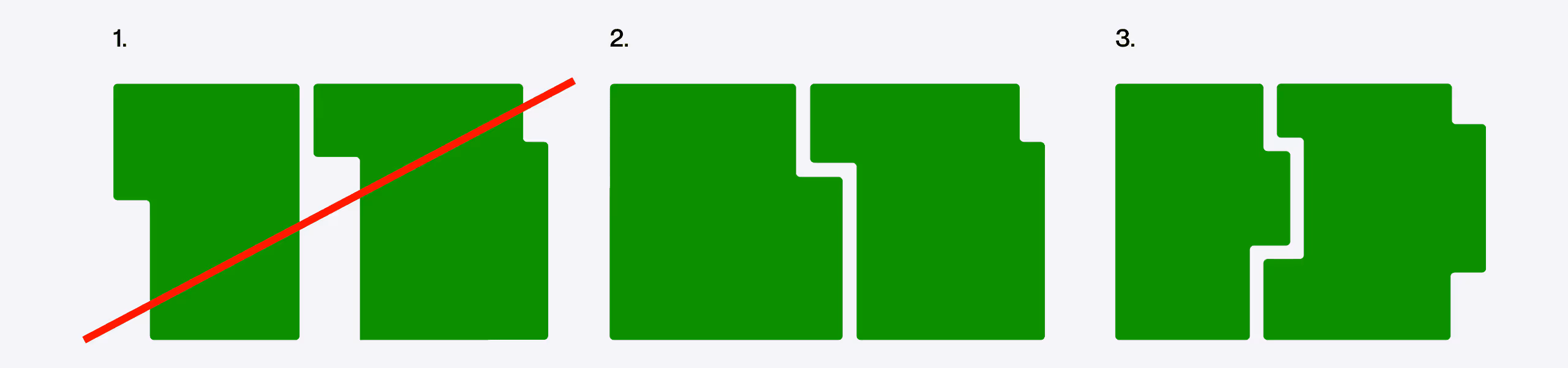
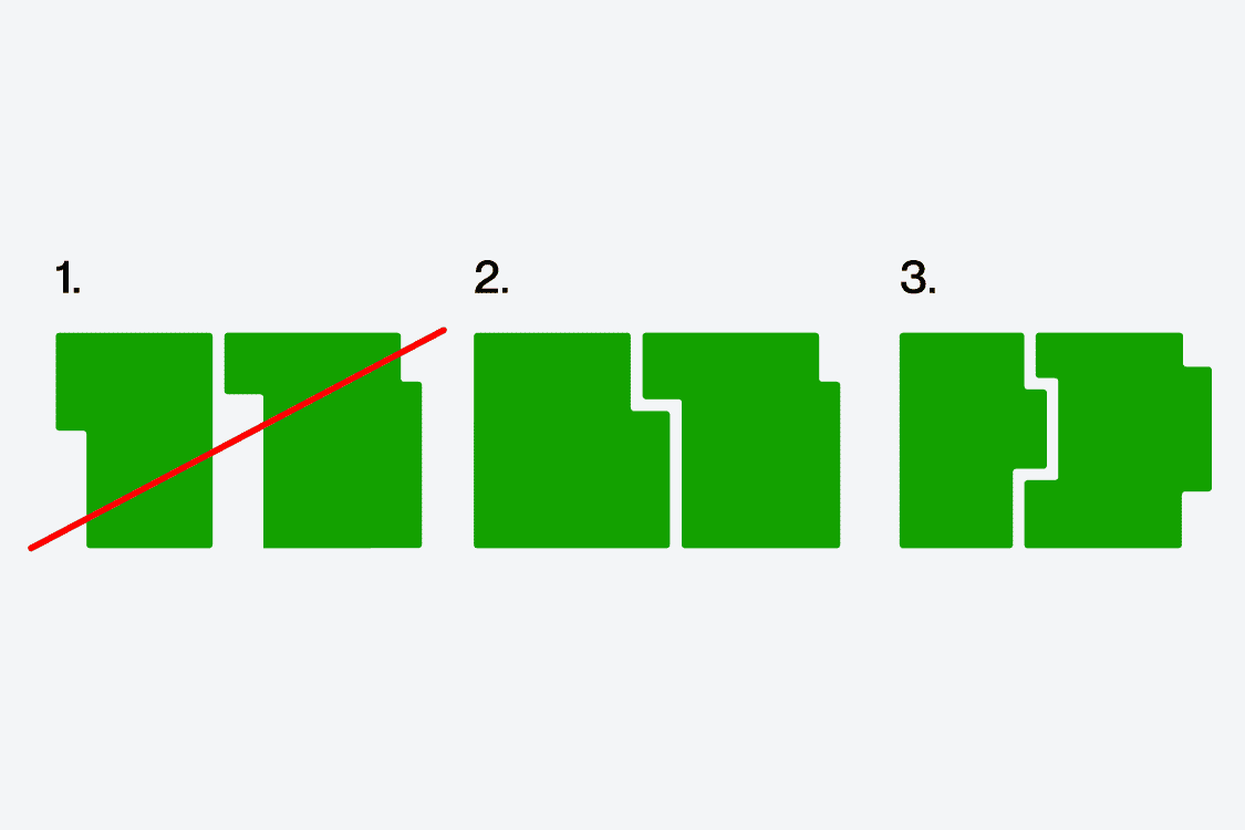
Following these rules previously listed will keep our shapes looking consistent and clean. We can use them to build endless layouts and compositions.
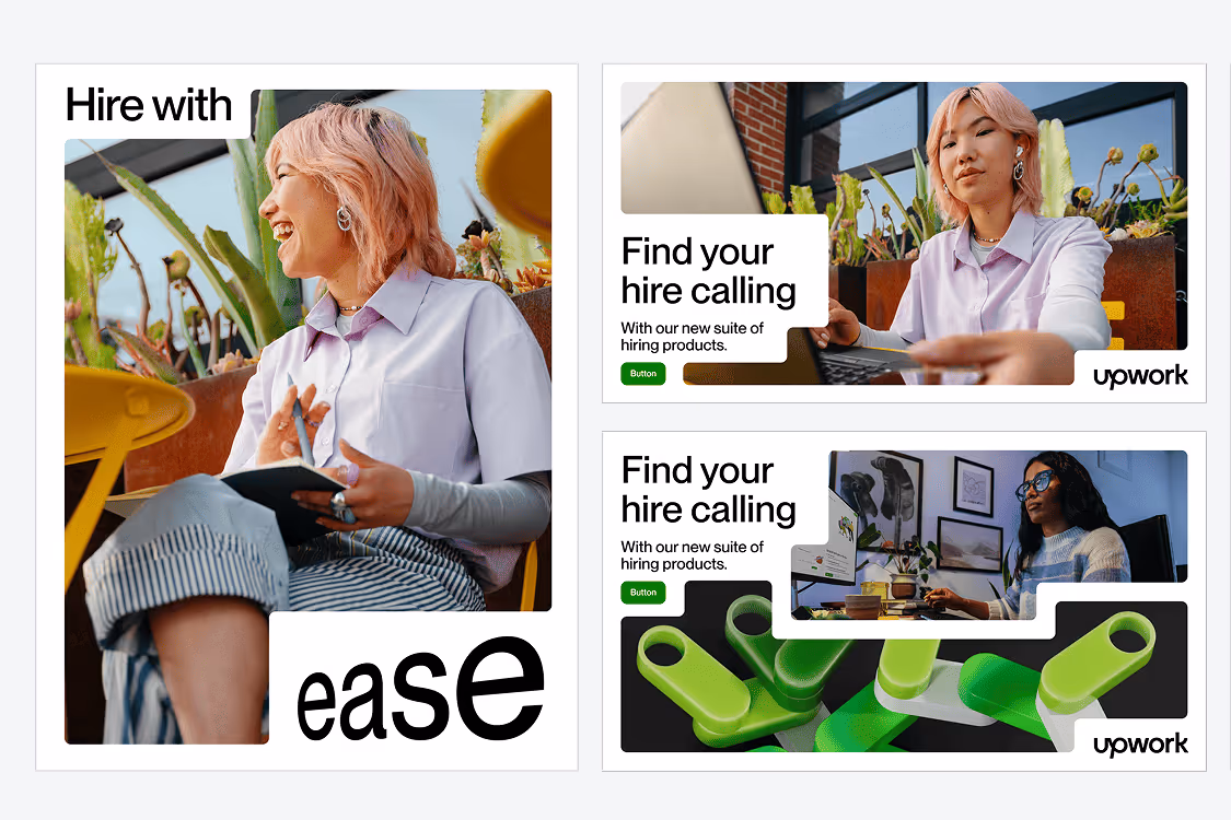
We’ve covered how our brand works with our flexible working blocks but there are also examples of high impact moments that do not use a flexible block.
These are used for high impact, short headlines that show up in socials or campaigns. They shouldn’t be used for digital ads, long headlines, compositions with lots of copy or CTAs.