Thank you! Your submission has been received!
Oops! Something went wrong while submitting the form.
Typography is an important element of our identity. It lets us communicate in a broad range of tones while remaining consistent throughout.
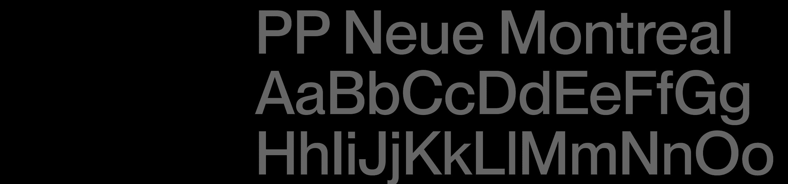
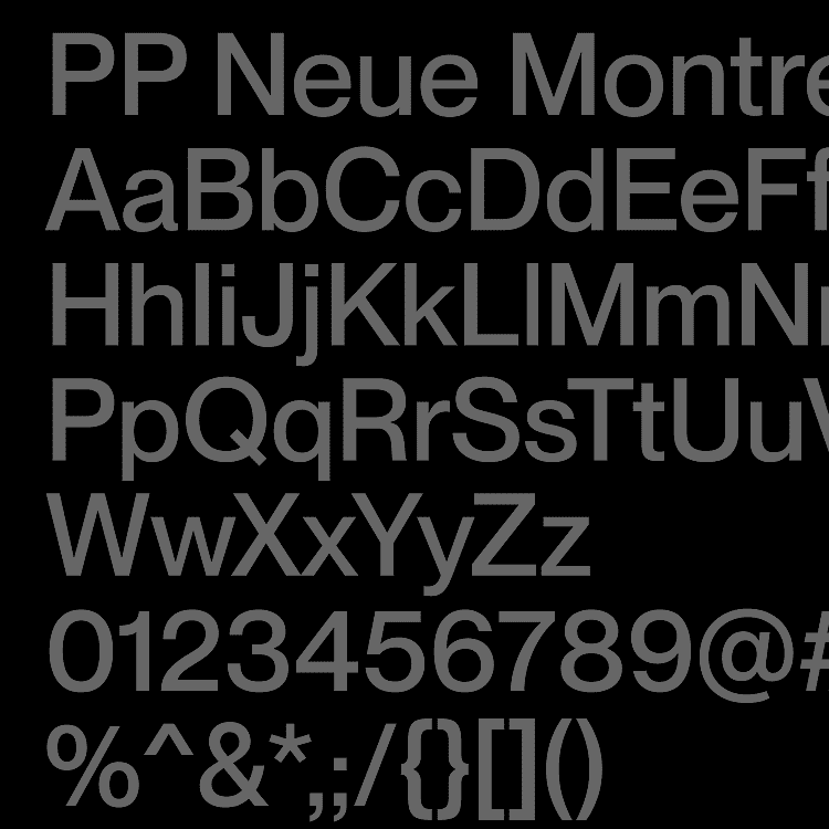
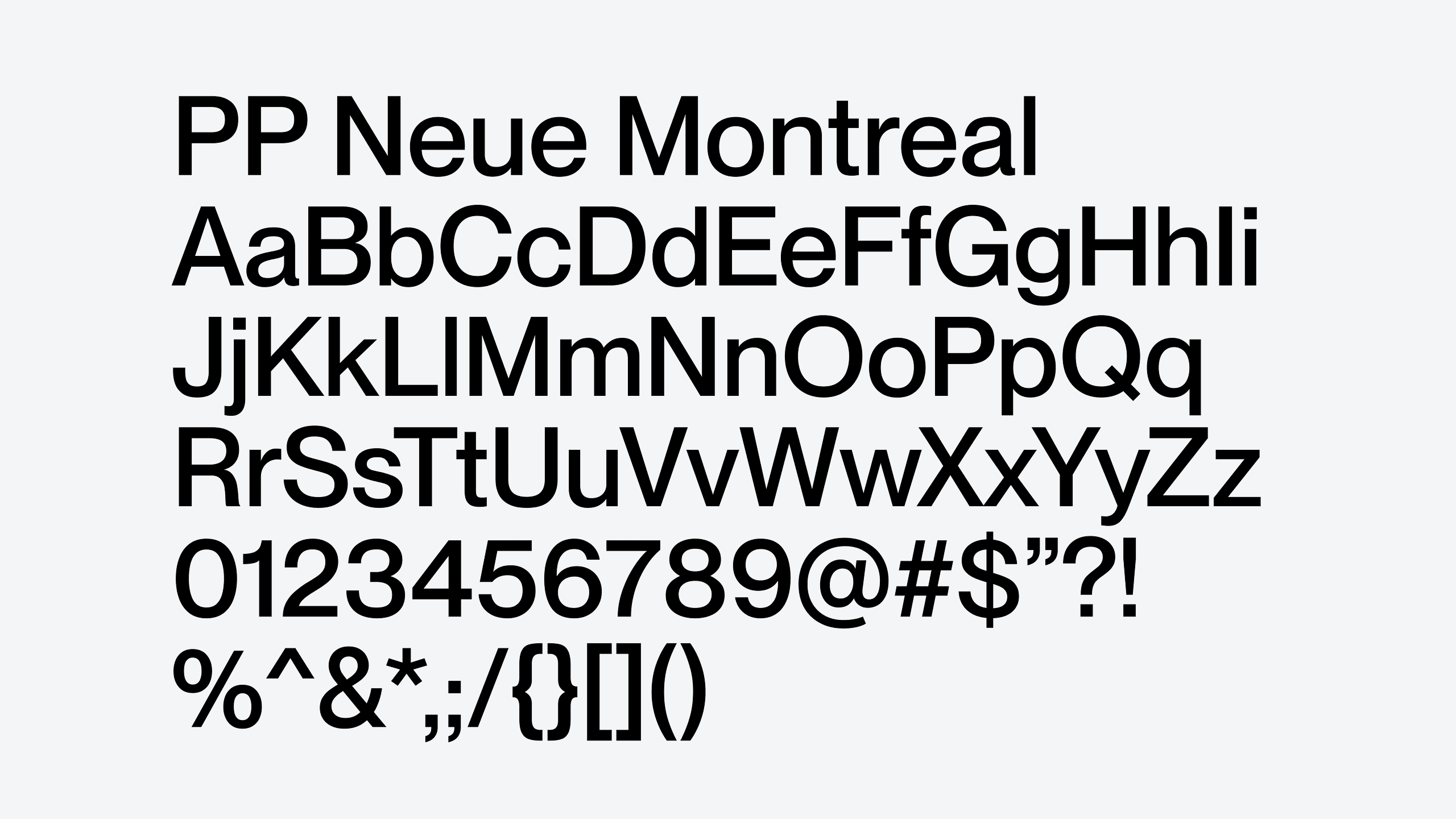
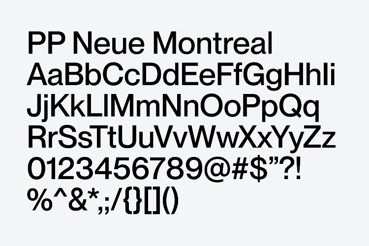
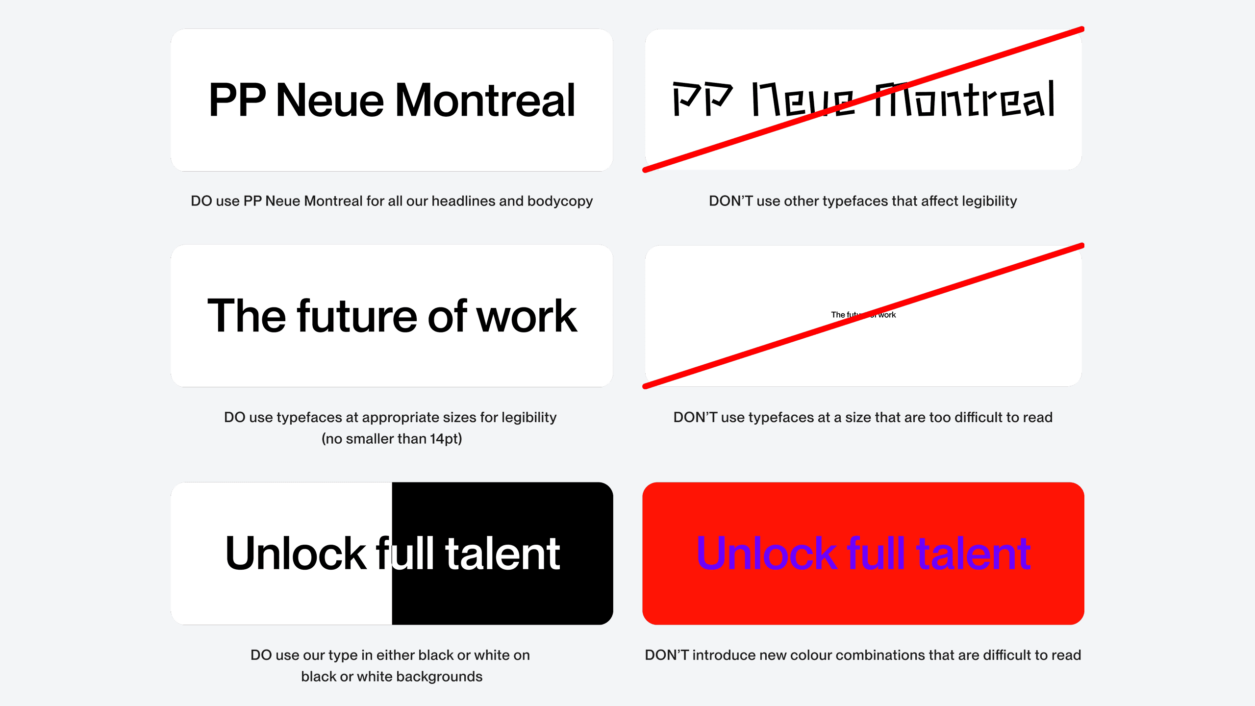
We only use one typeface: PP Upwork Neue Montreal. There are various weights for various occasions but we remain consistent throughout.
PP Neue Montreal is a versatile Grotesque typeface with the spirit of a display font, released by the Pangram Pangram Foundry. We use the variable typeface and a lot of our communication is in the 550 weight. There are additional weights used for specific moments when needed.
Our leading for headlines is set to 104% of the type size. Anything tighter and our ascenders and descenders begin to crash into each other and anything larger feels too loose.
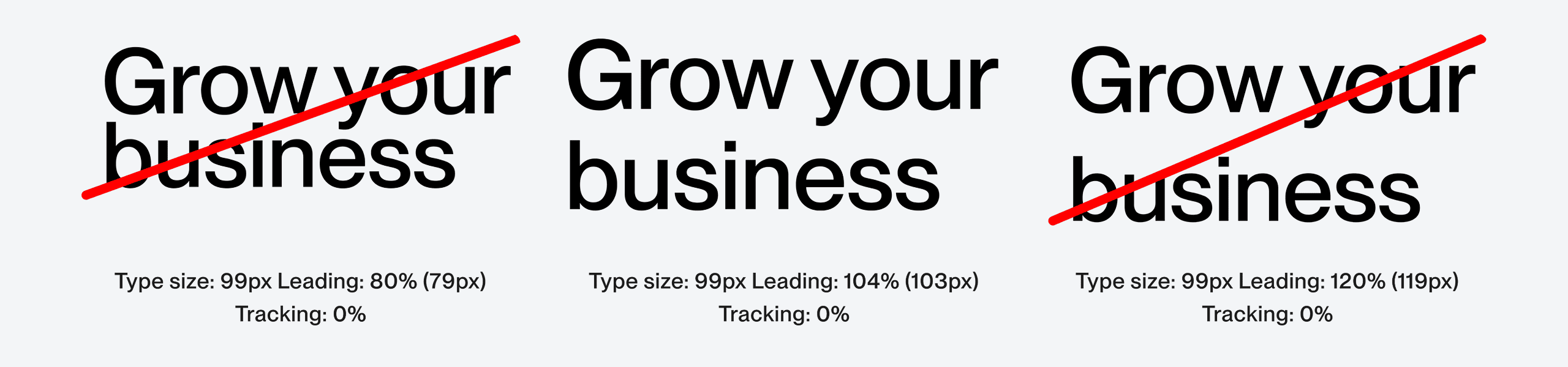
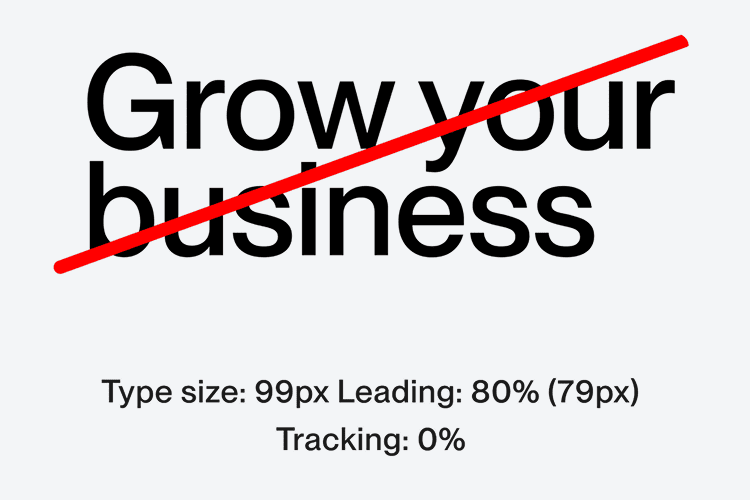
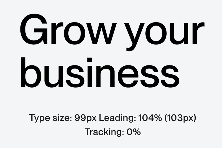
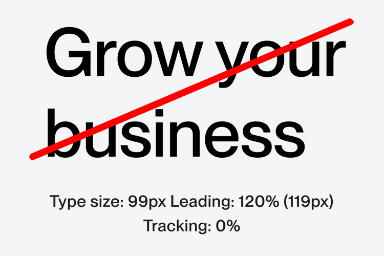
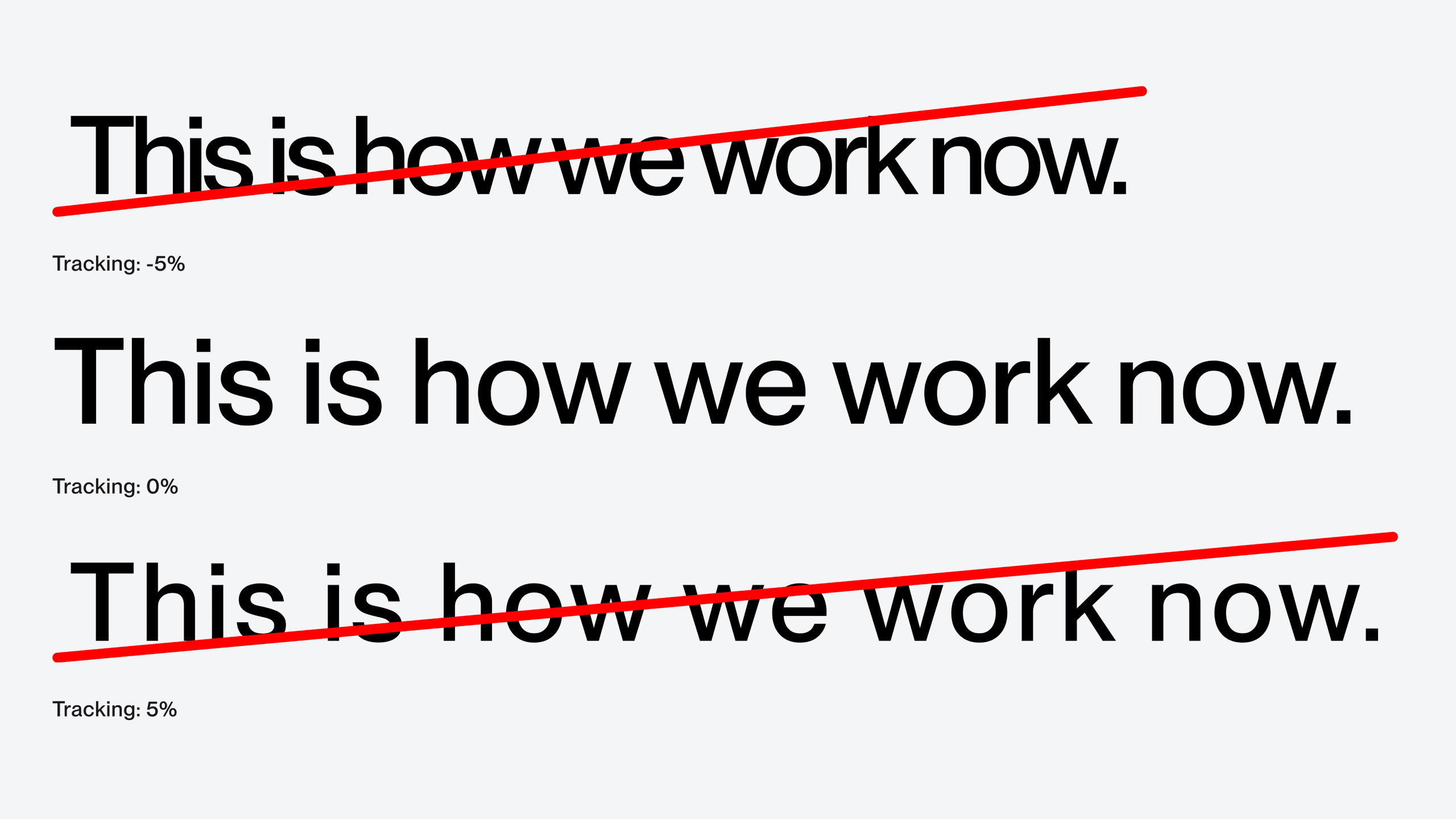
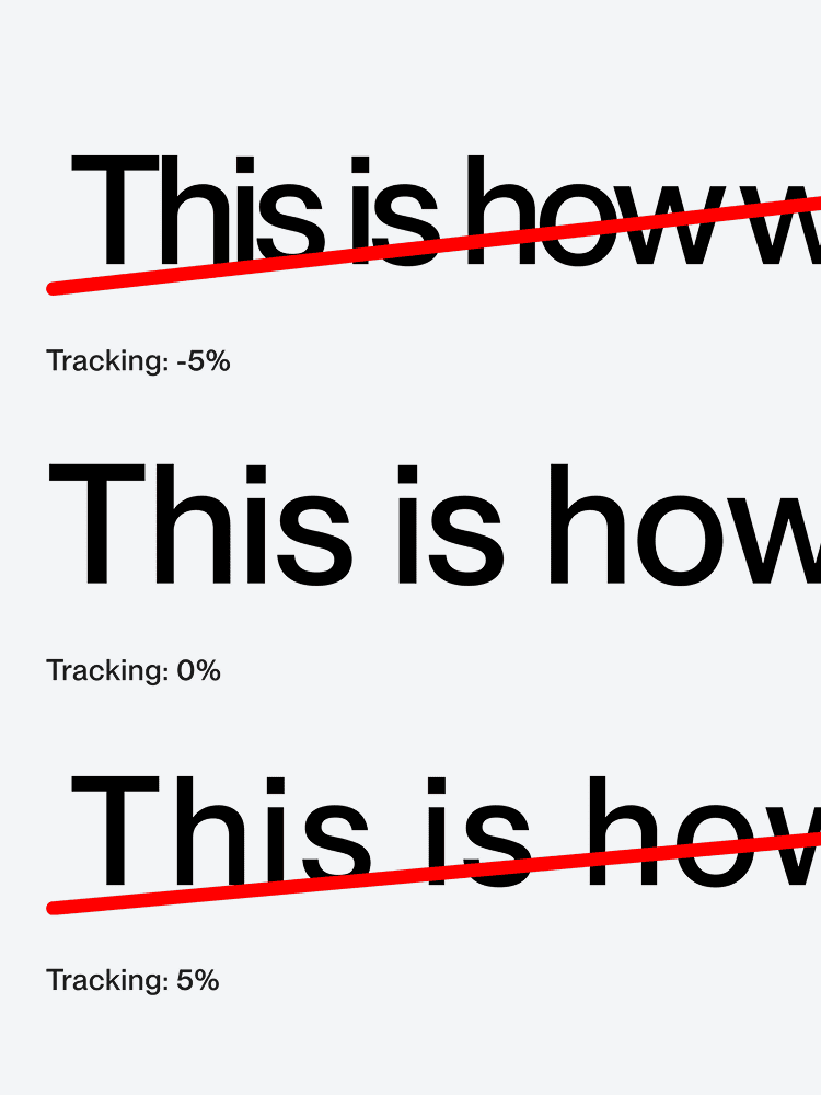
Letter spacing should be kept at 0%. This keeps our type not too wide or not too tight.
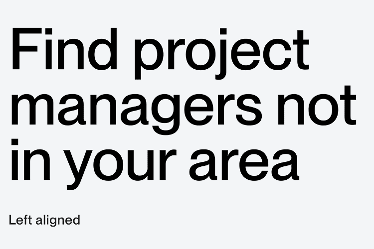
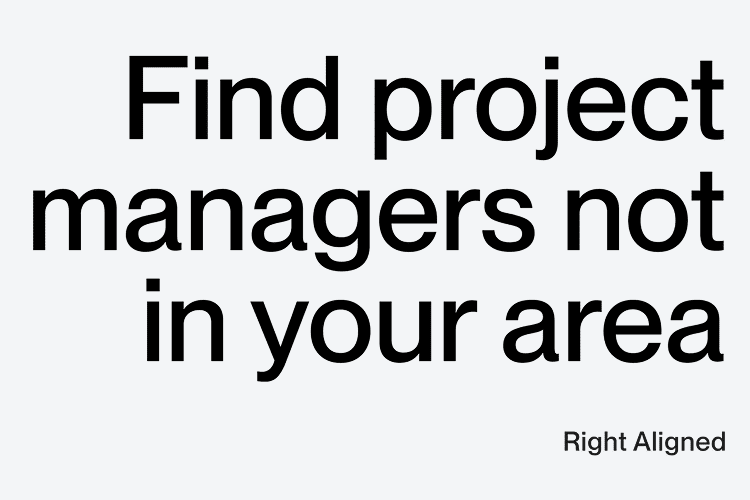
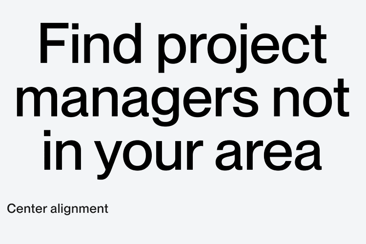
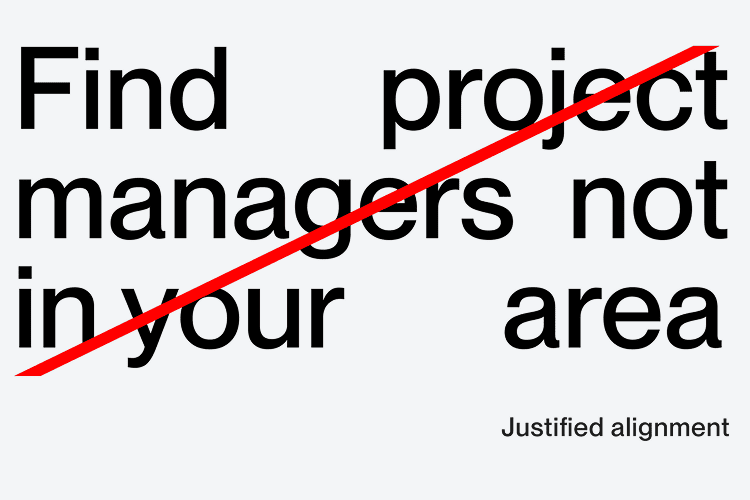
For marketing our typography can be aligned left, right or centrally.
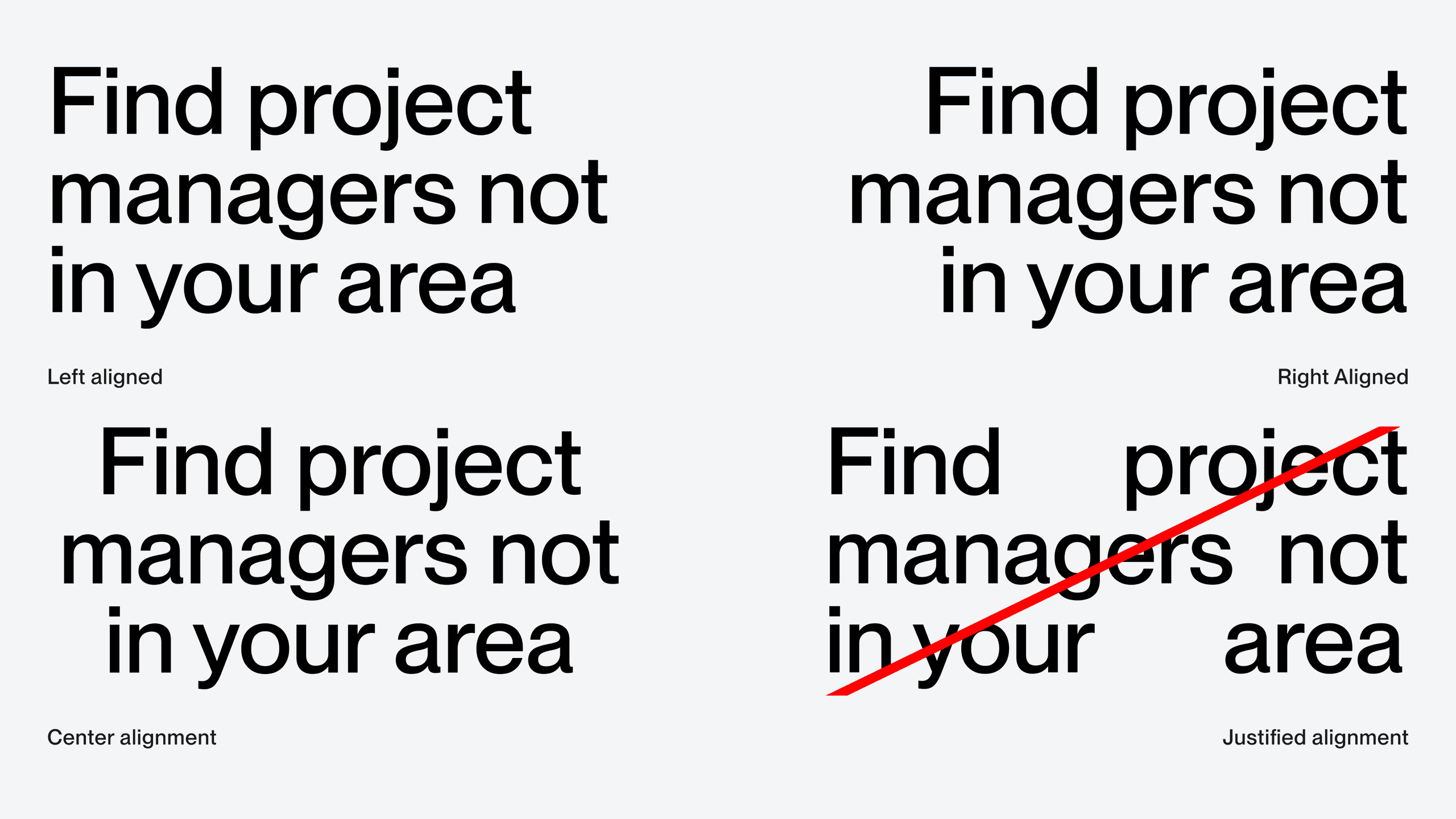
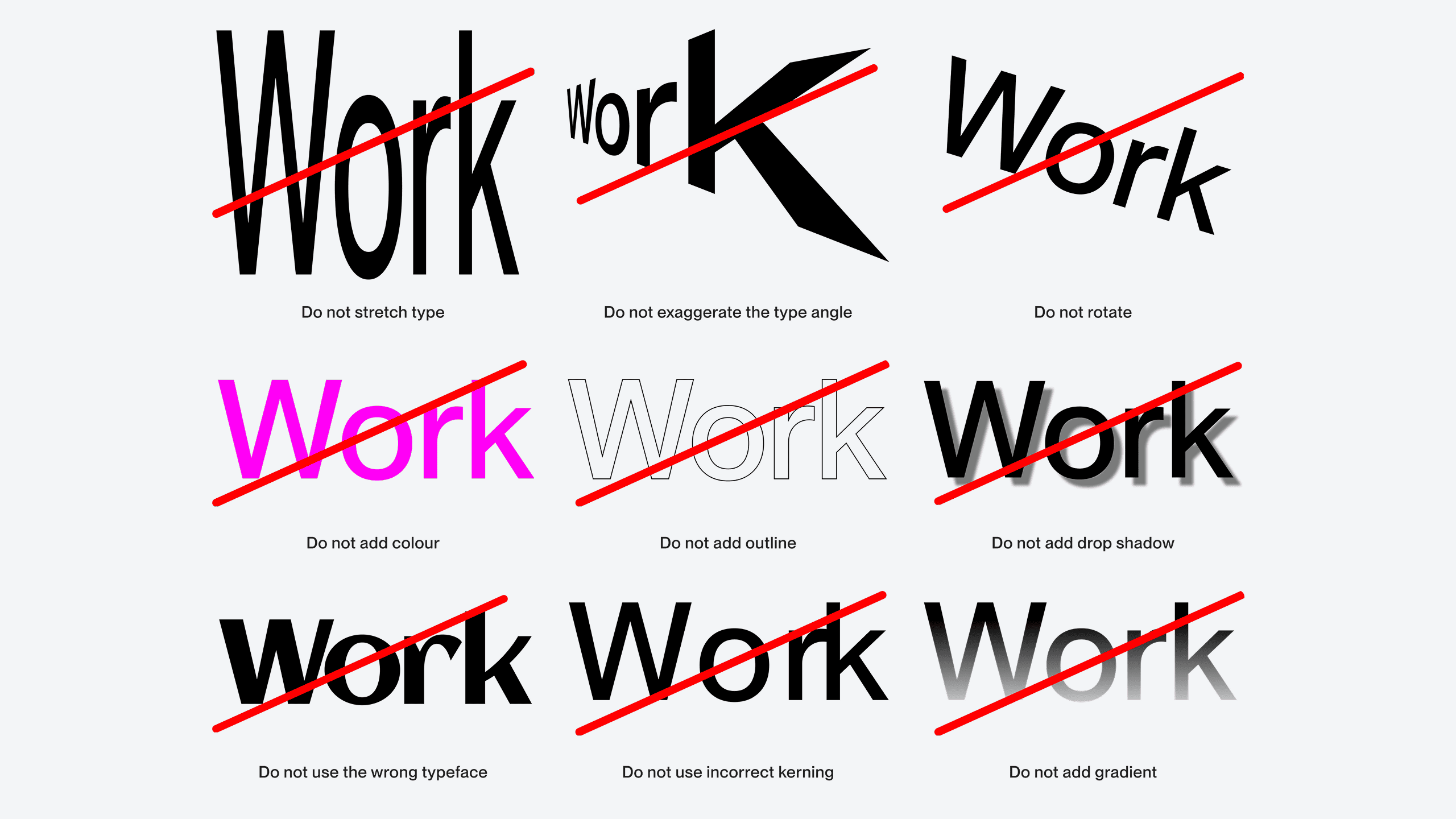
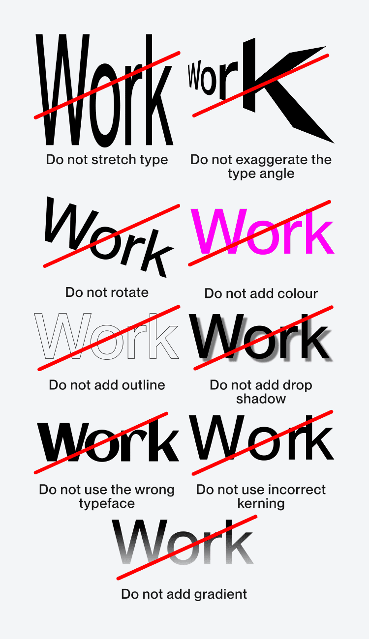
It’s important to ensure that our typography is legible and accessible whenever used. These offer a guide of things to avoid when typesetting. Further guidance for accessible typesetting on screen can be found in the product guidelines.
.png)
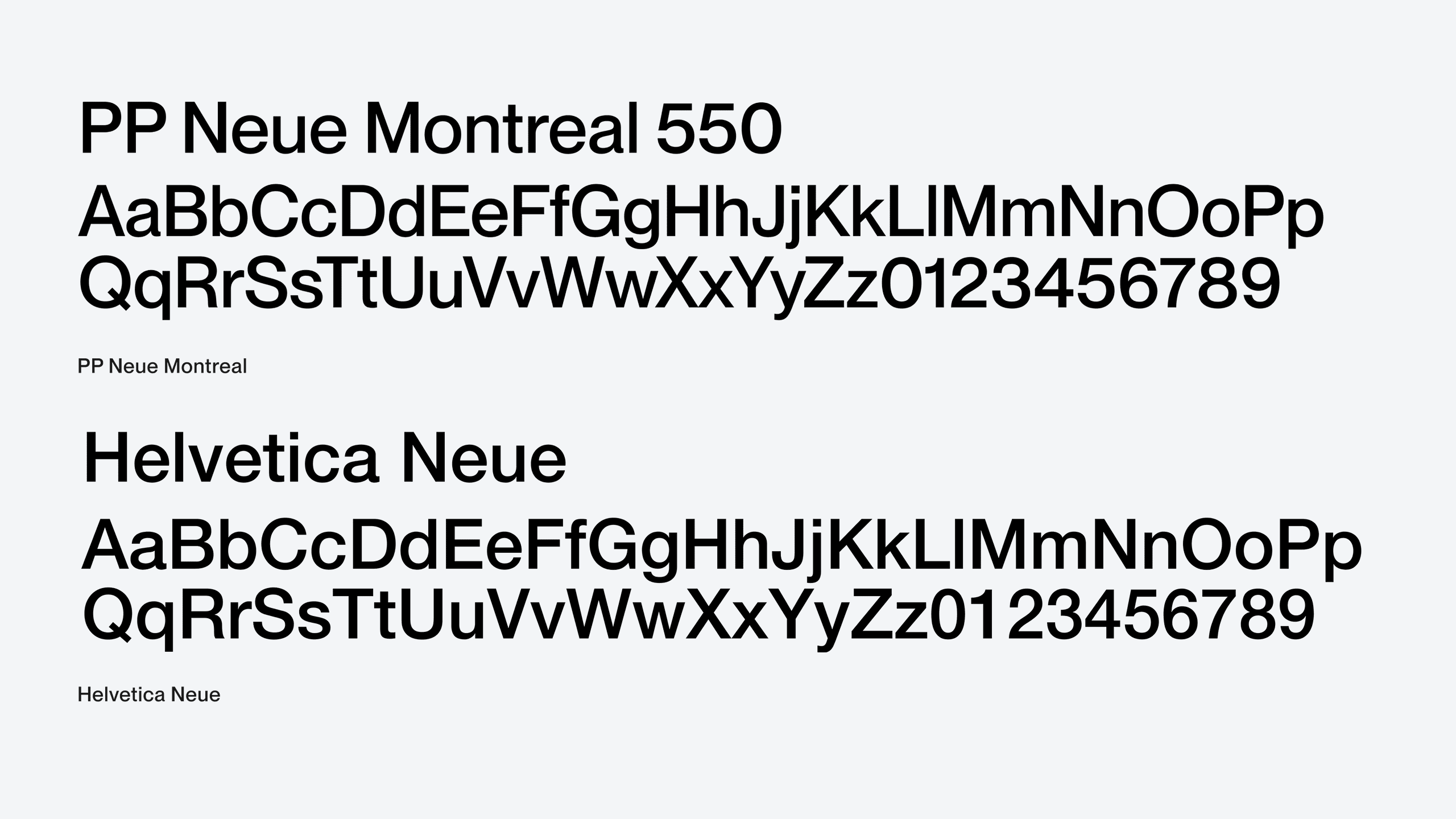
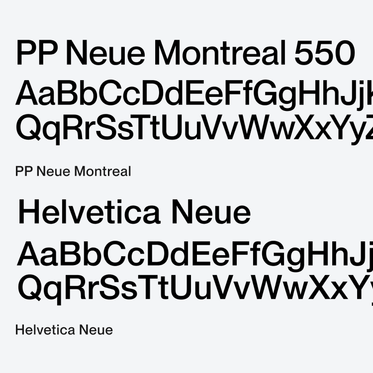
There may be occasions where PP Neue Montreal can't be used. In these cases, Helvetica Neue should be a our default option. This includes Google slides, and any web development where our primary typeface can’t be used. Any other typefaces need to be approved.
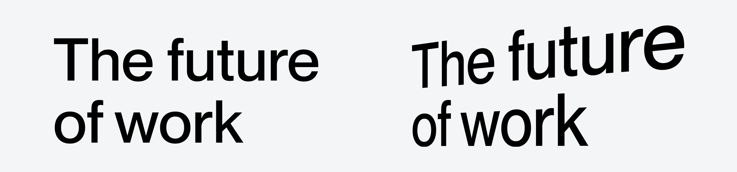
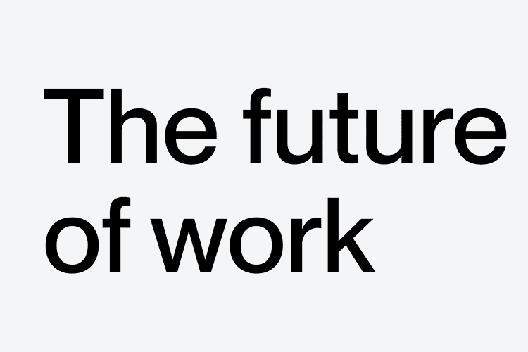
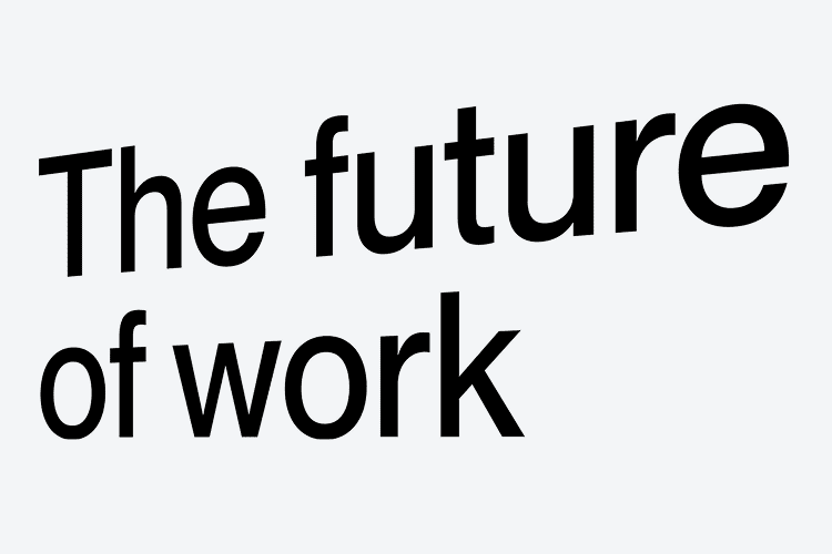
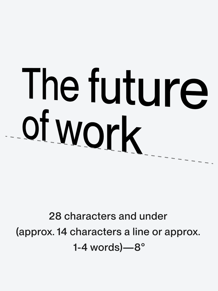
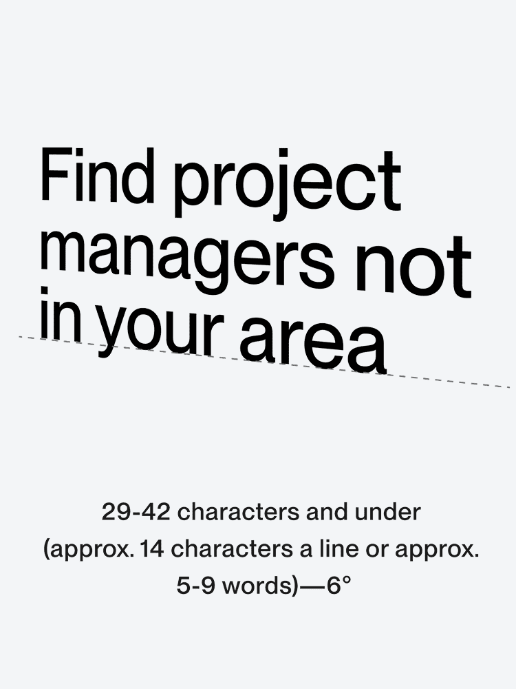
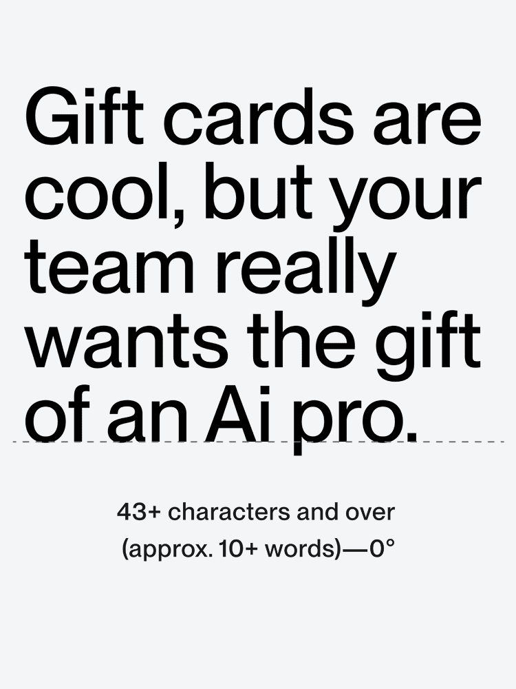
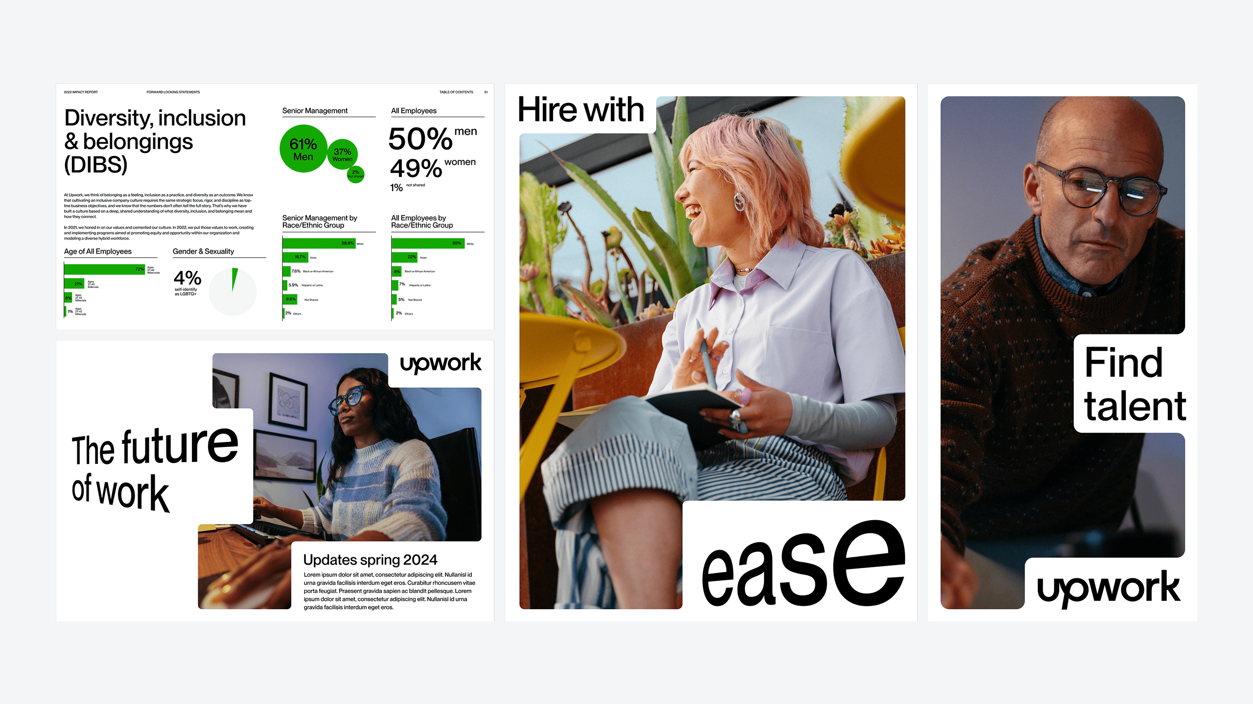
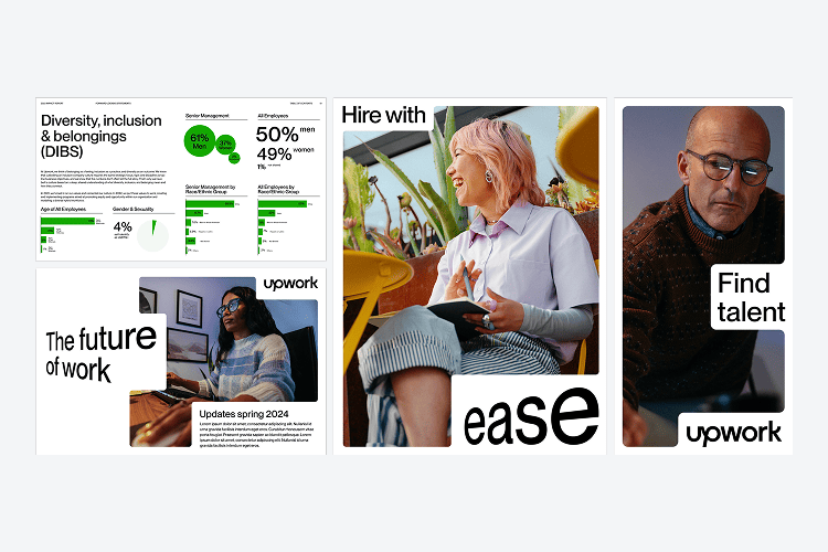
An element to our type system is ‘Angled type’. This adds another layer of dimension to our brand voice. It is used for high impact placements, bold headlines, or where the tone of a project allows–our dimensional type can be used to add greater visual intrigue and reinforce key messaging. The dimensional type is a clear expression of ‘A new dimension of work’ - visually leading us to the future.
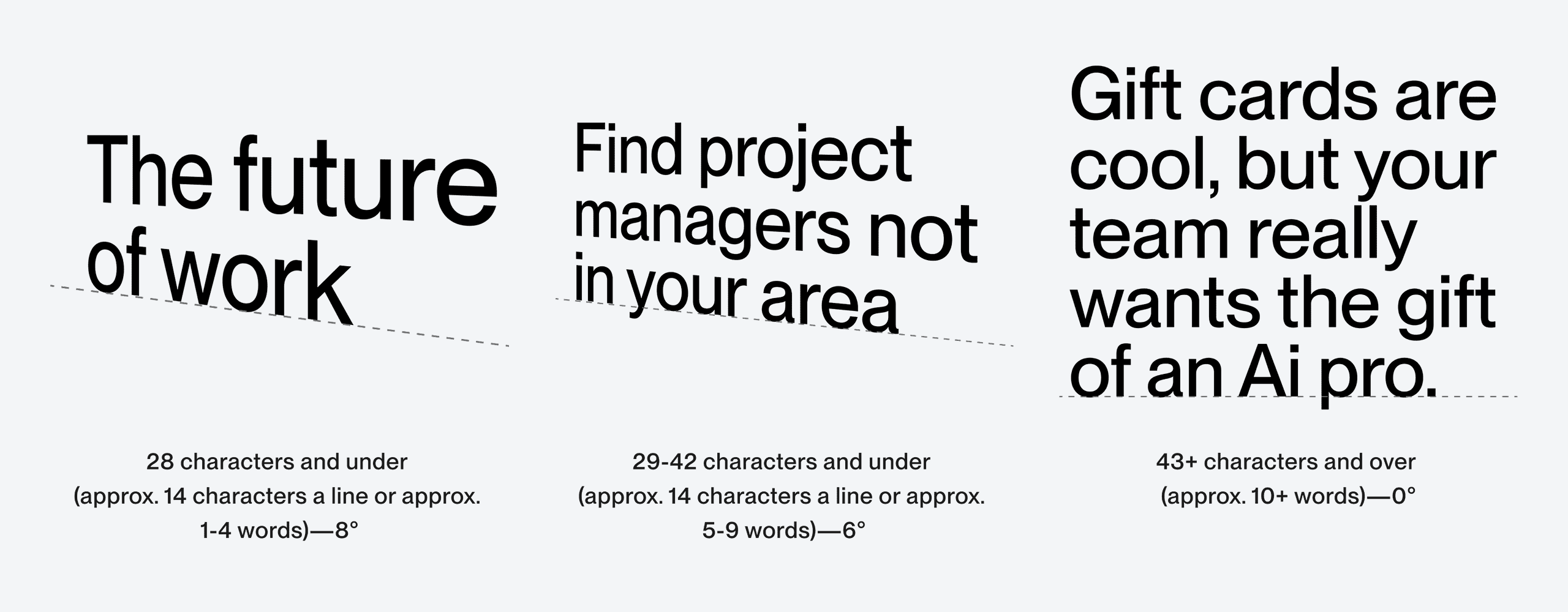
Our dimensional type can be expressed in three ways:
1. Bottom Angle
2. Top Angle
3. Perspective
These three expressions allow the type to align to edges within our compositions.
The angle of our dynamic type is affected by the number of characters in the headline. If a headline is too long (43+ characters) the dynamic treatment should no longer be used due to legibility issues.
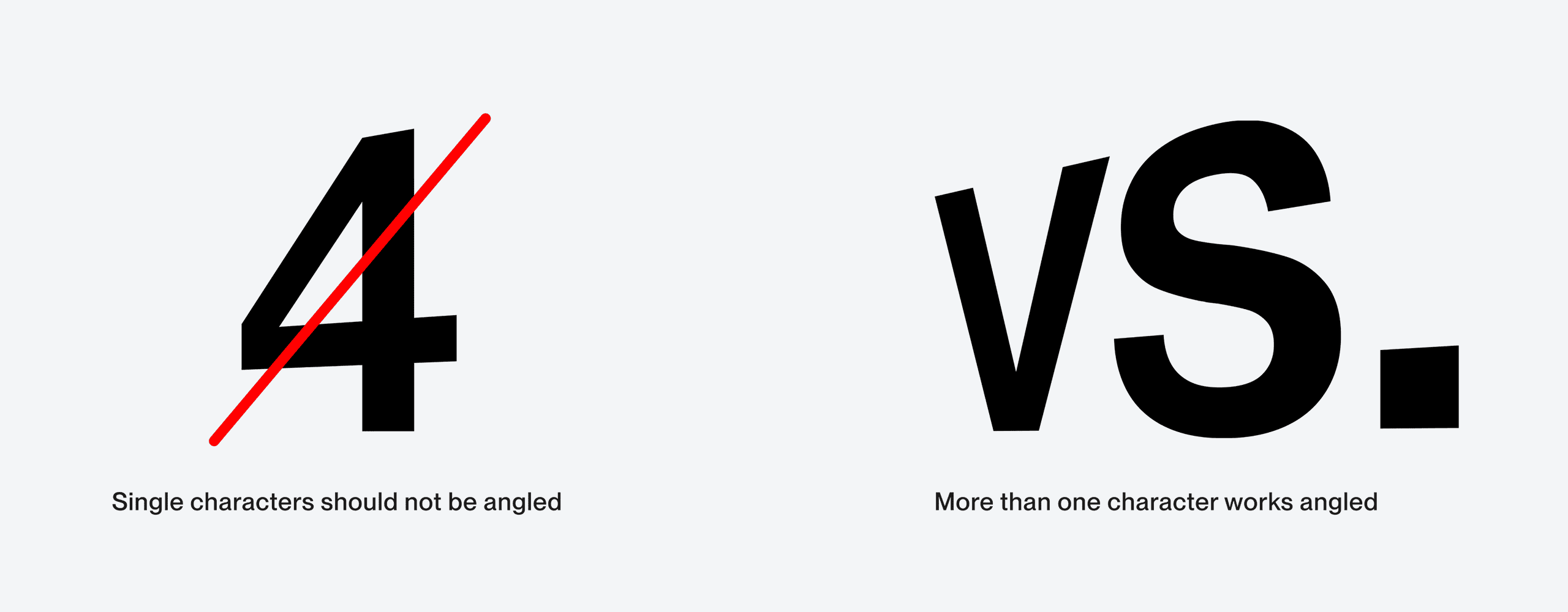
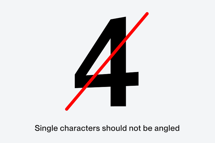
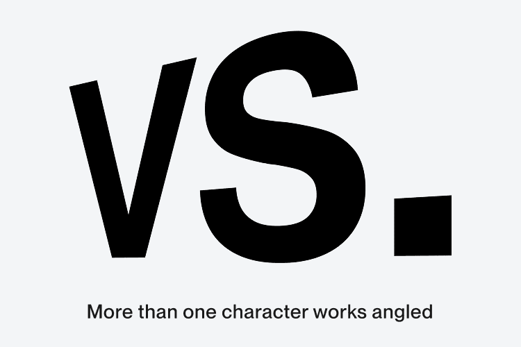
Single characters do not express enough of an angle when our dimensional type is applied and should be avoided. In these circumstances, the type should remain straight if it’s a single character.
We can see by following our type principles we can create dynamic layouts and endless combinations to bring the brand to life.
Here are some things you should never do when setting type for Upwork.