You will get your data easily mapped using the user friendly visualization
Project details
You will get your data transformed into an excellent visualisation and can share it with your teammates and clients for storytelling.
File Format
PDF, PNGInfographic Type
Data VisualizationWhat's included
| Service Tiers |
Starter
$35
|
Standard
$60
|
Advanced
$100
|
|---|---|---|---|
| Delivery Time | 2 days | 4 days | 5 days |
Number of Revisions | 2 | 3 | 5 |
Number of Data Points | 15 | 25 | 50 |
Source Files | |||
Commercial Use | |||
Conduct Research | - | ||
Post to Infographic Sites |
Optional add-ons
You can add these on the next page.
Fast Delivery
+$15 - $40
Additional Revision
+$10
53 reviews
(48)
(3)
(1)
(0)
(1)
This project doesn't have any reviews.
MM
Michael M.
Dec 11, 2025
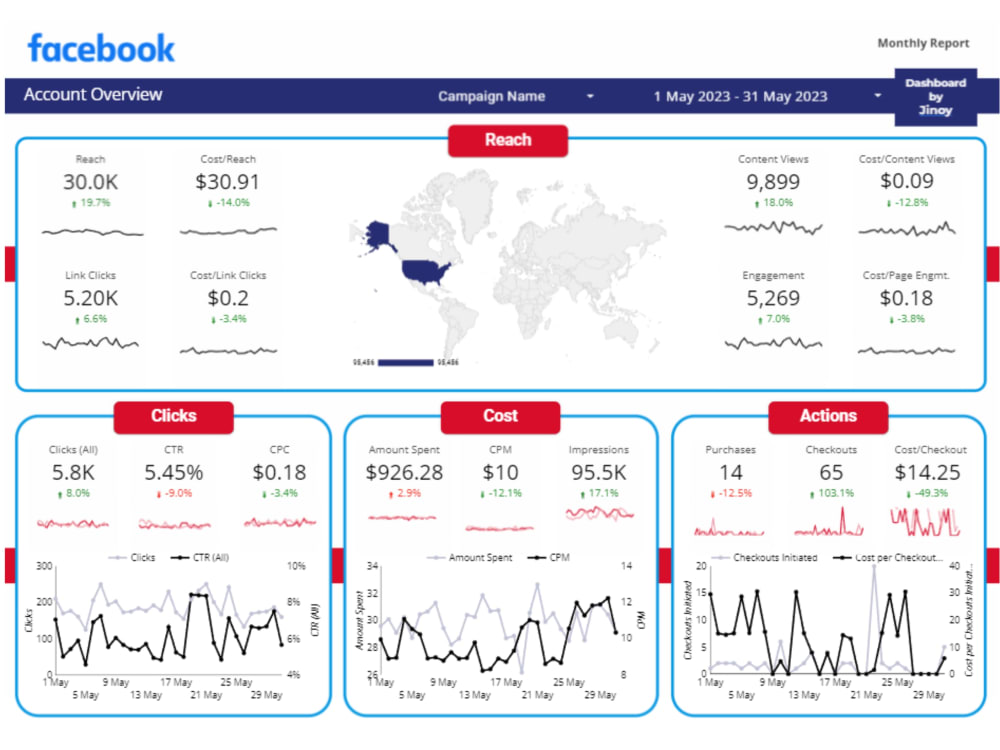
Looker Studios Performance Dashboard
AA
Andre A.
Oct 28, 2025
Data Analyst
We ended up going in a different direction with scope.
SH
Shelly H.
Jul 21, 2025
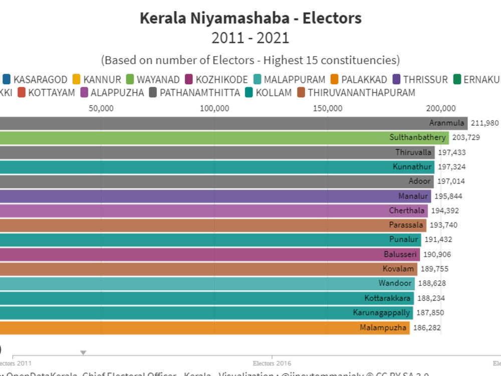
Educational Foundation Chart in Flourish
BT
Ben T.
Dec 3, 2024
Data enrichment in Apollo.io
Jinoy is highly recommended. He is exceedingly detailed oriented and precise, thoughtful, and kind.
CF
Christopher F.
Dec 3, 2024
Helping NYC Real Estate Team
Jinoy is highly recommended. He is exceedingly detailed oriented and precise, thoughtful, and kind.
About Jinoy Tom
Data Viz | Dashboards | Project Management | Maps, Charts & Graphs
100%
Job Success
Thrissur, India - 6:08 pm local time
➡ Are you drowning in spreadsheets but struggling to extract actionable insights? I help businesses turn complex data into clear, interactive visualizations and dashboards that make decision-making effortless.
What I Deliver:
✅ Data Visualization & Interactive Dashboards – I transform raw data into compelling visual stories using Looker Studio (Google Data Studio), Power BI, Flourish Studio, Canva and custom infographics that your team will actually understand and use.
✅ Real Results, Not Just Pretty Charts – My clients don't just get dashboards; they get clarity. I've helped organizations visualize election data, COVID-19 trends, geographic mapping, and business KPIs that reduced reporting time by 70% and increased data-driven decisions across teams.
✅ Data Scraping, Cleaning & Transformation – Raw data is messy. I use OpenRefine, Google Sheets, Excel, Tabula, and Python to clean, refine, and structure your data so it's ready for analysis and visualization saving you hours of manual work.
Steps for completing your project
After purchasing the project, send requirements so Jinoy Tom can start the project.
Delivery time starts when Jinoy Tom receives requirements from you.
Jinoy Tom works on your project following the steps below.
Revisions may occur after the delivery date.
Data Visualisation
Gather requirements Clean up data Create a short visualisation Deliver first draft Incorporate edits Deliver final draft
Q&A
Will share the Questions if any and the clients provides the answer