You will get a SaaS Dashboard UI Design for Data & Analytics (Figma)
Project details
Get a clean, modern SaaS dashboard UI design in Figma that improves clarity, reduces friction, and helps users move through your product faster.
This project is ideal for startups, SaaS founders, and teams who need a better dashboard or web app interface for analytics, reporting, operations, or internal tools.
What you can expect:
1. Clear dashboard layouts and user flows
2. Structured data presentation for better usability
3. Reusable UI components for consistency
Responsive design for desktop and mobile
4. Organised Figma files ready for developer handoff
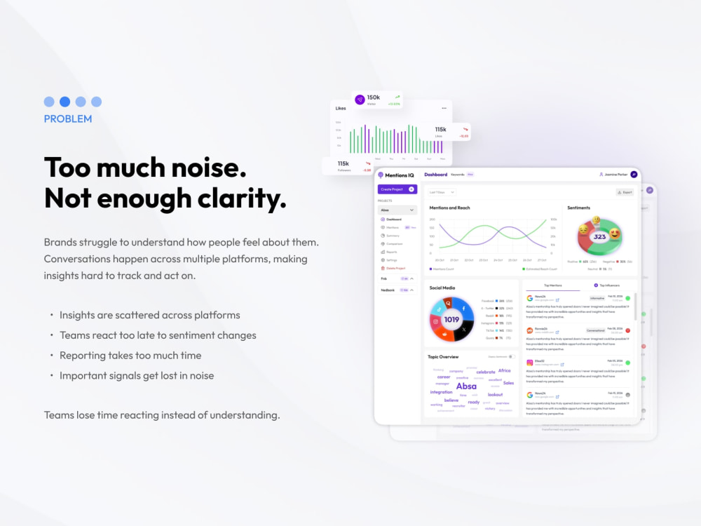
I focus on product clarity, not decoration. My work is designed to reduce confusion, improve navigation, and make complex information easier to understand.
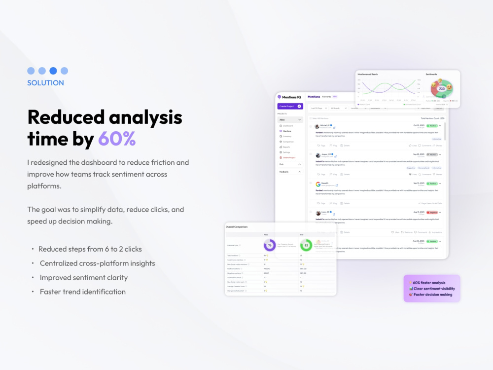
In one recent dashboard project, I redesigned the experience to reduce analysis time by 60% through better structure, clearer data hierarchy, and simpler flows.
You will receive polished UI screens, revision rounds, and a clean handoff file built for real product teams.
This project is ideal for startups, SaaS founders, and teams who need a better dashboard or web app interface for analytics, reporting, operations, or internal tools.
What you can expect:
1. Clear dashboard layouts and user flows
2. Structured data presentation for better usability
3. Reusable UI components for consistency
Responsive design for desktop and mobile
4. Organised Figma files ready for developer handoff
I focus on product clarity, not decoration. My work is designed to reduce confusion, improve navigation, and make complex information easier to understand.
In one recent dashboard project, I redesigned the experience to reduce analysis time by 60% through better structure, clearer data hierarchy, and simpler flows.
You will receive polished UI screens, revision rounds, and a clean handoff file built for real product teams.
Main Type
Landing Pages, Web AppsFile Format
JPG, PDF, PNG, SVGWhat's included
| Service Tiers |
Starter
$200
|
Standard
$450
|
Advanced
$950
|
|---|---|---|---|
| Delivery Time | 3 days | 6 days | 12 days |
Number of Pages | 1 | 3 | 6 |
Number of Revisions | 2 | 3 | 4 |
Source Files | |||
Commercial Use | |||
Convert to HTML/CSS | - | - | - |
Responsive Design | |||
Interactive Mockup |
Optional add-ons
You can add these on the next page.
Fast Delivery
+$150 - $400
Additional Page
(+ 2 Days)
+$150
Additional Revision
+$75
Design System Documentation
(+ 2 Days)
+$400
Dark Mode Variant
(+ 2 Days)
+$300
UX Audit Report
(+ 2 Days)
+$200Frequently asked questions
About Lebogang
SaaS Product Designer | Dashboards, Web Apps & Conversion-Focused UX
Randburg, South Africa - 9:04 am local time
I design dashboards, web apps, and high-converting websites that simplify the experience, reduce friction, and help users take action faster.
If your product feels complex or your website is not converting, I can help you fix it.
Here’s how I help:
✔️ SaaS dashboards and web app design
✔️ UX audits to identify friction and improve usability
✔️ Conversion-focused landing pages and websites
✔️ Structured user flows that make products easier to use
Recent work includes:
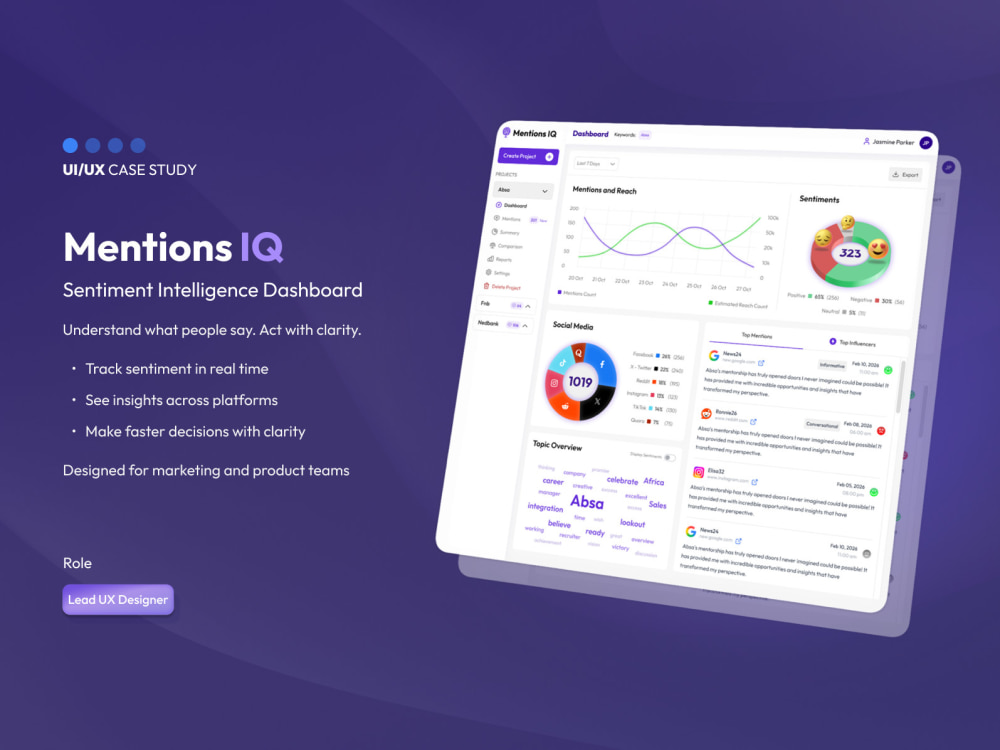
1. Designing a real-time sentiment tracking dashboard (mentionIQ) to simplify data and decision-making
2. Building recruiter workflows, candidate pipelines, and HRMS interfaces to improve hiring processes
3. Designing CRM systems focused on lead tracking, pipeline visibility, and user efficiency
4. Creating conversion-focused websites for service businesses
My approach is simple:
1. Understand the problem first
2. Map the user flow
3. Design for clarity, not just visuals
4. Focus on real outcomes, not just screens
If you have a product, dashboard, or website that needs improvement, send me a message, and I’ll suggest the best way to move forward.
Tools: Figma, Framer, Webflow
Steps for completing your project
After purchasing the project, send requirements so Lebogang can start the project.
Delivery time starts when Lebogang receives requirements from you.
Lebogang works on your project following the steps below.
Revisions may occur after the delivery date.
Share your product details
You send your goals, key features, references, and any existing product screens or wireframes.
UX structure and screen planning
I map the layout and structure to improve clarity, reduce friction, and organise the core user flow.