You will get 🎯Dashboard UI/UX Design in Figma
Top Rated
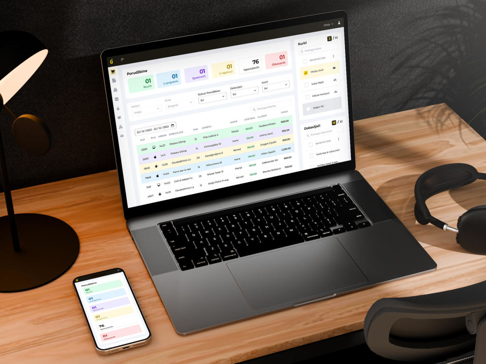
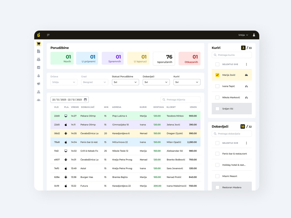
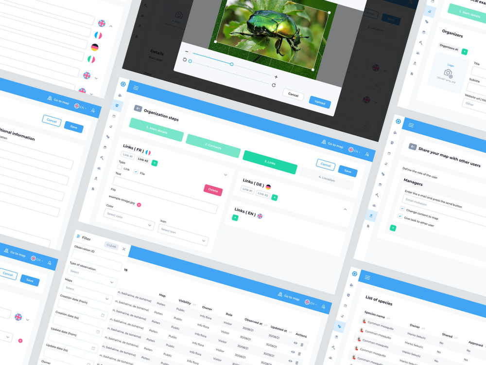
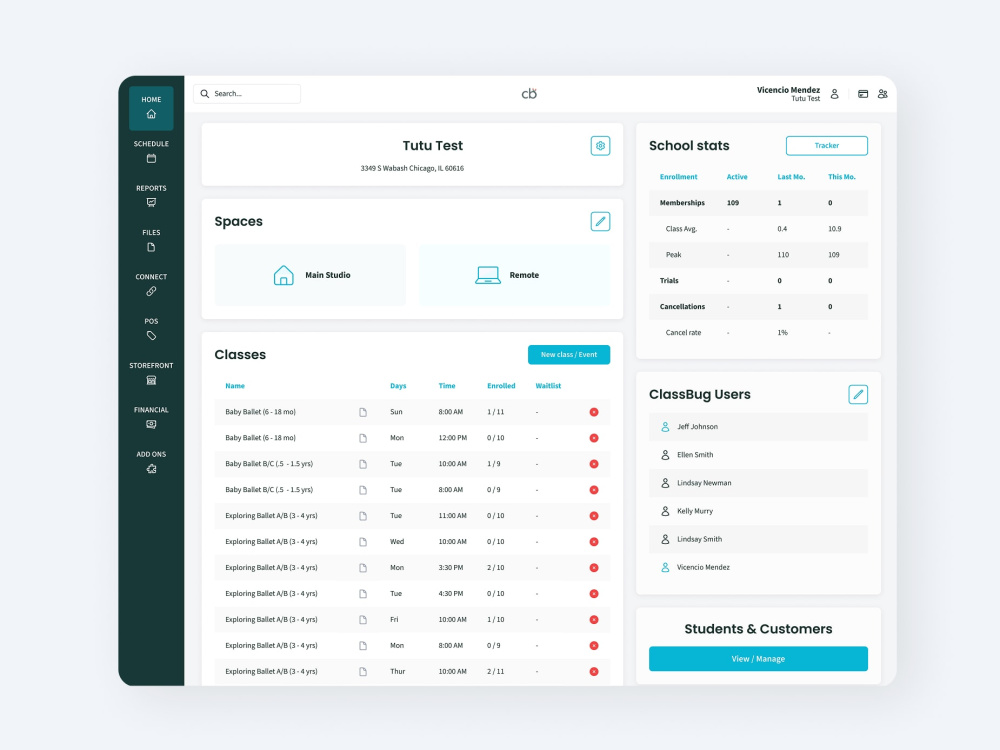
Project details
With over 10 years of experience designing 𝗨𝗜/𝗨𝗫 for dashboards, SaaS platforms, and web apps, I craft 𝗰𝗹𝗲𝗮𝗻, 𝗺𝗼𝗱𝗲𝗿𝗻, 𝗮𝗻𝗱 𝘂𝘀𝗲𝗿-𝗳𝗿𝗶𝗲𝗻𝗱𝗹𝘆 𝗶𝗻𝘁𝗲𝗿𝗳𝗮𝗰𝗲𝘀 in Figma.
This package includes 𝗨𝗜 𝗱𝗲𝘀𝗶𝗴𝗻 𝗳𝗼𝗿 𝗼𝗻𝗲 𝘀𝗰𝗿𝗲𝗲𝗻, focused on layout, hierarchy, and visual clarity.
If you need 𝗨𝗫 design (user flows, wireframes, logic), or responsive layouts and reusable components, those are available as add-ons.
👉 𝗣𝗹𝗲𝗮𝘀𝗲 𝗰𝗼𝗻𝘁𝗮𝗰𝘁 𝗺𝗲 𝗯𝗲𝗳𝗼𝗿𝗲 𝗼𝗿𝗱𝗲𝗿𝗶𝗻𝗴 so I can recommend the best setup based on your product.
This package includes 𝗨𝗜 𝗱𝗲𝘀𝗶𝗴𝗻 𝗳𝗼𝗿 𝗼𝗻𝗲 𝘀𝗰𝗿𝗲𝗲𝗻, focused on layout, hierarchy, and visual clarity.
If you need 𝗨𝗫 design (user flows, wireframes, logic), or responsive layouts and reusable components, those are available as add-ons.
👉 𝗣𝗹𝗲𝗮𝘀𝗲 𝗰𝗼𝗻𝘁𝗮𝗰𝘁 𝗺𝗲 𝗯𝗲𝗳𝗼𝗿𝗲 𝗼𝗿𝗱𝗲𝗿𝗶𝗻𝗴 so I can recommend the best setup based on your product.
Main Type
Landing Pages, Mobile Apps, Web Apps, WebsiteFile Format
JPG, PDF, PNG, PSD, AI, EPS, SVGWhat's included $150
These options are included with the project scope.
$150
- Delivery Time 2 days
- Number of Pages 1
- Number of Revisions 3
- Source Files
- Commercial Use
Optional add-ons
You can add these on the next page.
Responsive Design
(+ 1 Day)
+$70
Interactive Mockup
(+ 1 Day)
+$40
UX Flow / Wireframe
(+ 1 Day)
+$50
Design System Components
+$60
Dark Mode Version
(+ 1 Day)
+$50Frequently asked questions
328 reviews
(320)
(8)
(0)
(0)
(0)
This project doesn't have any reviews.
IK
Irakli K.
Jul 7, 2026
Blood-Glucose Monitoring App Icon Design
IK
Irakli K.
Jul 7, 2026
Blood-Glucose Monitoring App Screenshots
ER
Elliot R.
Jun 27, 2026
Legacy Collector – App Icon Refinement & Navigatio
ER
Elliot R.
Jun 27, 2026
30 minute consultation
AD
Arman D.
Jun 12, 2026
App Icon Designer (Apple Vision Pro Game)
About Marko
App Icon Specialist | Vector Icons | Senior UI/UX Designer
100%
Job Success
Novi Sad, Serbia - 6:38 pm local time
🏆𝟭𝟬+ 𝘆𝗲𝗮𝗿𝘀 𝗼𝗳 𝗲𝘅𝗽𝗲𝗿𝗶𝗲𝗻𝗰𝗲, 𝟯𝟗𝟬+ 𝗰𝗼𝗺𝗽𝗹𝗲𝘁𝗲𝗱 𝗽𝗿𝗼𝗷𝗲𝗰𝘁𝘀, 𝟰,𝟓𝟬𝟬+ 𝗵𝗼𝘂𝗿𝘀 𝗯𝗶𝗹𝗹𝗲𝗱 across the US, EU & UK.
🔧 𝗪𝗵𝗮𝘁 𝗜 𝗱𝗼 𝗯𝗲𝘀𝘁
• 𝗔𝗽𝗽 𝗶𝗰𝗼𝗻 𝗱𝗲𝘀𝗶𝗴𝗻 (𝗶𝗢𝗦 & 𝗔𝗻𝗱𝗿𝗼𝗶𝗱)
• 𝗨𝗜/𝗨𝗫 𝗶𝗻 𝗙𝗶𝗴𝗺𝗮 — extending visual systems into clear, functional product interfaces
• 𝗦𝗰𝗮𝗹𝗮𝗯𝗹𝗲, 𝗽𝗶𝘅𝗲𝗹-𝗽𝗲𝗿𝗳𝗲𝗰𝘁 𝘃𝗲𝗰𝘁𝗼𝗿 𝗶𝗰𝗼𝗻 𝘀𝗲𝘁𝘀
• 𝗥𝗲𝘀𝗽𝗼𝗻𝘀𝗶𝘃𝗲 𝘄𝗲𝗯 𝗨𝗜 & dashboard layouts
• 𝗟𝗼𝗴𝗼 & 𝘃𝗶𝘀𝘂𝗮𝗹 𝗶𝗱𝗲𝗻𝘁𝗶𝘁𝘆 𝘀𝘆𝘀𝘁𝗲𝗺𝘀
▪ Currently refining 𝗶𝗰𝗼𝗻 𝘃𝗶𝘀𝘂𝗮𝗹𝘀 for improved clarity, proportions, and lighting
🧠 𝗠𝘆 𝗱𝗲𝘀𝗶𝗴𝗻 𝗮𝗽𝗽𝗿𝗼𝗮𝗰𝗵
• 𝗖𝗹𝗮𝗿𝗶𝘁𝘆 first — decoration second
• Every icon should 𝘁𝗲𝗹𝗹 𝗮 𝘀𝘁𝗼𝗿𝘆 at a glance
• Interfaces must 𝗴𝘂𝗶𝗱𝗲 𝘂𝘀𝗲𝗿𝘀 without friction
• Files are 𝗼𝗿𝗴𝗮𝗻𝗶𝘇𝗲𝗱, 𝗹𝗶𝗴𝗵𝘁 & dev-ready
🔎 𝗨𝗜/𝗨𝗫 𝗘𝘅𝗽𝗲𝗿𝘁𝗶𝘀𝗲 𝗜𝗻𝗰𝗹𝘂𝗱𝗲𝘀
• 𝗠𝗼𝗯𝗶𝗹𝗲 𝗨𝗜/𝗨𝗫 (𝗶𝗢𝗦 & 𝗔𝗻𝗱𝗿𝗼𝗶𝗱)
• 𝗪𝗲𝗯 𝗨𝗜 for landing pages & SaaS
• 𝗗𝗮𝘀𝗵𝗯𝗼𝗮𝗿𝗱 𝗨𝗜/𝗨𝗫
• 𝗥𝗲𝘀𝗽𝗼𝗻𝘀𝗶𝘃𝗲 layouts (desktop/tablet/mobile)
• 𝗪𝗶𝗿𝗲𝗳𝗿𝗮𝗺𝗲𝘀 & prototypes
• 𝗙𝗶𝗴𝗺𝗮 𝗔𝘂𝘁𝗼-𝗹𝗮𝘆𝗼𝘂𝘁 & constraints
• 𝗗𝗲𝘃-𝗿𝗲𝗮𝗱𝘆 handoff with specs
• 𝗟𝗶𝗴𝗵𝘁/𝗱𝗮𝗿𝗸 mode
• UX flows & onboarding
• Focus on clean structure, consistent spacing, and 𝗱𝗲𝘃-𝗿𝗲𝗮𝗱𝘆 Figma files
🎯 𝗔𝗽𝗽 𝗜𝗰𝗼𝗻 𝗗𝗲𝘀𝗶𝗴𝗻 𝗜𝗻𝗰𝗹𝘂𝗱𝗲𝘀
• Custom icons for 𝗶𝗢𝗦 & 𝗔𝗻𝗱𝗿𝗼𝗶𝗱
• 𝗙𝗹𝗮𝘁, 𝟯𝗗, 𝗴𝗿𝗮𝗱𝗶𝗲𝗻𝘁 & 𝗺𝗶𝗻𝗶𝗺𝗮𝗹 styles
• 𝗣𝗶𝘅𝗲𝗹-𝗽𝗲𝗿𝗳𝗲𝗰𝘁 exports (1024×1024, 512×512)
• 𝗟𝗶𝗴𝗵𝘁/𝗱𝗮𝗿𝗸 background variants
• A/B variants
• Icons for 𝗔𝗜 tools, navigation & productivity
• Product suite icon systems
• Sketches & concept exploration
• Color palette + shape consistency
• Icons aligned with 𝗯𝗿𝗮𝗻𝗱 personality
• Currently refining 𝗶𝗰𝗼𝗻 𝘃𝗶𝘀𝘂𝗮𝗹𝘀 for improved 𝗰𝗹𝗮𝗿𝗶𝘁𝘆, proportions, and lighting
✨ 𝗟𝗼𝗴𝗼 & 𝗜𝗱𝗲𝗻𝘁𝗶𝘁𝘆 𝗜𝗻𝗰𝗹𝘂𝗱𝗲𝘀
• 𝗟𝗼𝗴𝗼 design: wordmark, symbol, combo
• 𝗕𝗿𝗮𝗻𝗱 identity: logo, colors, type
• 𝗡𝗲𝗴𝗮𝘁𝗶𝘃𝗲 space or geometric logos
• Multiple 𝗰𝗼𝗻𝗰𝗲𝗽𝘁𝘀 + revisions
• BW & color versions
• Figma brand board & usage guidelines
• 𝗩𝗲𝗰𝘁𝗼𝗿 files (AI, PDF, SVG)
• Web, mobile & print export kit
• Visual logic & storytelling
🚀 𝗟𝗲𝘁’𝘀 𝗯𝘂𝗶𝗹𝗱 𝘀𝗼𝗺𝗲𝘁𝗵𝗶𝗻𝗴 𝗰𝗹𝗲𝗮𝗻, 𝗲𝗹𝗲𝗴𝗮𝗻𝘁, and 𝘁𝗮𝗶𝗹𝗼𝗿𝗲𝗱 𝘁𝗼 𝘆𝗼𝘂𝗿 𝘂𝘀𝗲𝗿𝘀 — feel free to reach out.
Steps for completing your project
After purchasing the project, send requirements so Marko can start the project.
Delivery time starts when Marko receives requirements from you.
Marko works on your project following the steps below.
Revisions may occur after the delivery date.
Initial briefing & review
I’ll review the provided references, guidelines, and requirements to ensure a clear understanding of the project scope before starting the design.
Create initial design concepts
Develop 1–2 polished design concepts based on the provided requirements, ensuring alignment with brand style and usability standards.