You will get Convert Figma/XD/PSD to Pixel-Perfect Responsive HTML & CSS

Project details
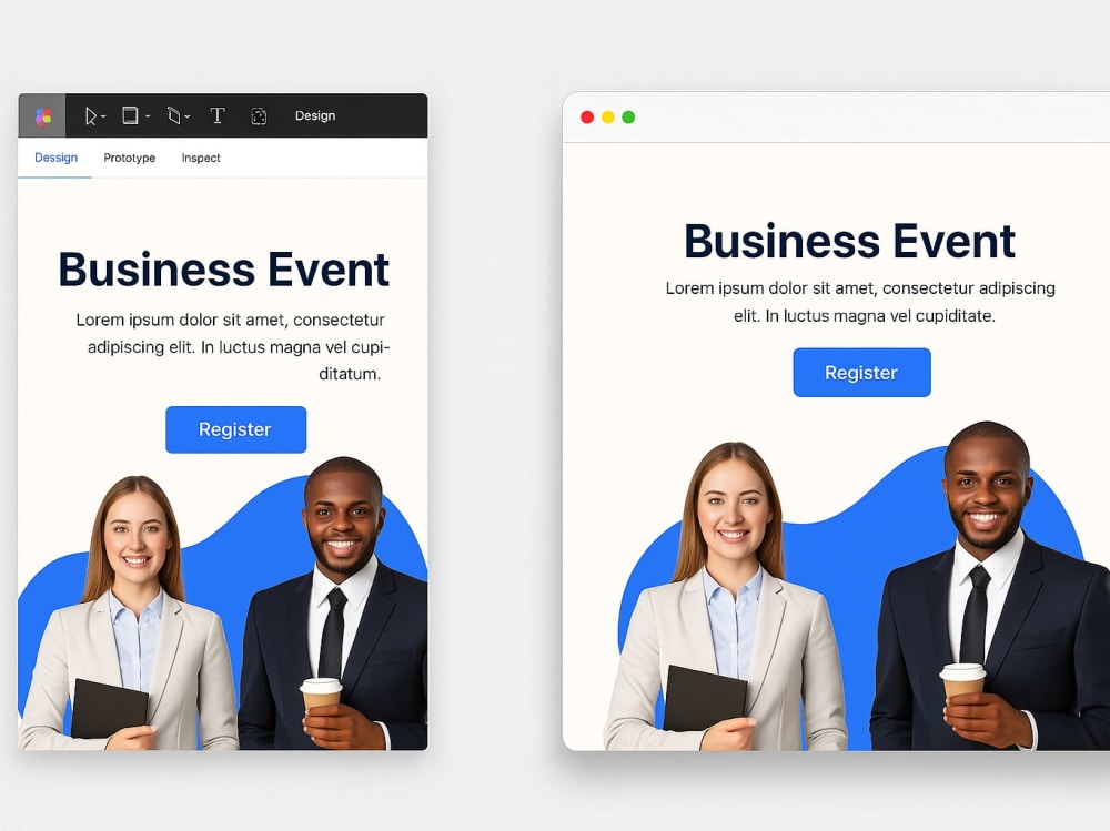
I will convert your Figma design into pixel-perfect, responsive HTML and CSS code. Your design will be transformed into a clean, fast-loading, and SEO-friendly webpage, ensuring responsiveness across all devices (desktop, tablet, and mobile). I maintain semantic structure, organized code, and cross-browser compatibility. Whether it's a single-page layout or a full website, I deliver quality you can build on.
Programming Languages
HTML & CSSCoding Expertise
PSD to HTML, Performance Optimization, DesignWhat's included
| Service Tiers |
Starter
$40
|
Standard
$90
|
Advanced
$150
|
|---|---|---|---|
| Delivery Time | 2 days | 4 days | 6 days |
Number of Revisions | 2 | 6 | Unlimited |
Number of Pages | 1 | 3 | 5 |
Design Customization | |||
Content Upload | - | - | - |
Responsive Design | |||
Source Code |
Optional add-ons
You can add these on the next page.
Fast Delivery
+$10 - $30
Additional Revision
+$10
Additional Page
(+ 1 Day)
+$20Frequently asked questions
About Ali
Web Debugging & Automation Expert | JavaScript HTML/CSS Puppeteer
Riyadh, Saudi Arabia - 9:41 pm local time
I'm a Web Debugging & Automation specialist with deep knowledge of JavaScript, HTML/CSS, Puppeteer, and browser scripting.
What I can help you with:
✅ Fix broken web pages
✅ Debug JavaScript errors
✅ Build Puppeteer scrapers
✅ Convert Figma designs to HTML
✅ Optimize site speed
I deliver clean, well-commented code — on time. Let’s work together!
Steps for completing your project
After purchasing the project, send requirements so Ali can start the project.
Delivery time starts when Ali receives requirements from you.
Ali works on your project following the steps below.
Revisions may occur after the delivery date.
Convert Figma to Responsive HTML/CSS
I’ll carefully review your Figma design, extract assets, and hand-code responsive HTML/CSS with clean structure, semantic tags, and cross-browser compatibility.
Mobile Optimization & Testing
I will ensure your layout works seamlessly on desktop, tablet, and mobile using responsive breakpoints, and test across major browsers.